


Building a travel pitch deck shouldn’t feel like you’re packing for a 6-month backpacking trip with one carry-on. This page is the hands-on execution guide: what slides to include, what each slide must prove, and how to structure the story so it reads cleanly and holds up under scrutiny.
It does not define how capital decisions are made—that evaluator logic sits upstream in Consumer Brand Capital Decision Context. Here, we stay in the weeds: sequencing, clarity, evidence, and slide mechanics—so your deck is easy to review, easy to remember, and hard to misunderstand.
What is a travel pitch deck?
A travel pitch deck is a structured presentation that explains a tourism or travel business in a way that’s fast to understand and easy to validate. It turns your venture into a clear set of claims—problem, customer, offer, business model, market, go-to-market, ops, and financial assumptions—so a reader can quickly see what you’re building, why it matters, and how it works.
Think of it less like a “hype deck” and more like a decision document in slides: concise narrative, consistent numbers, and visuals that clarify (not decorate).
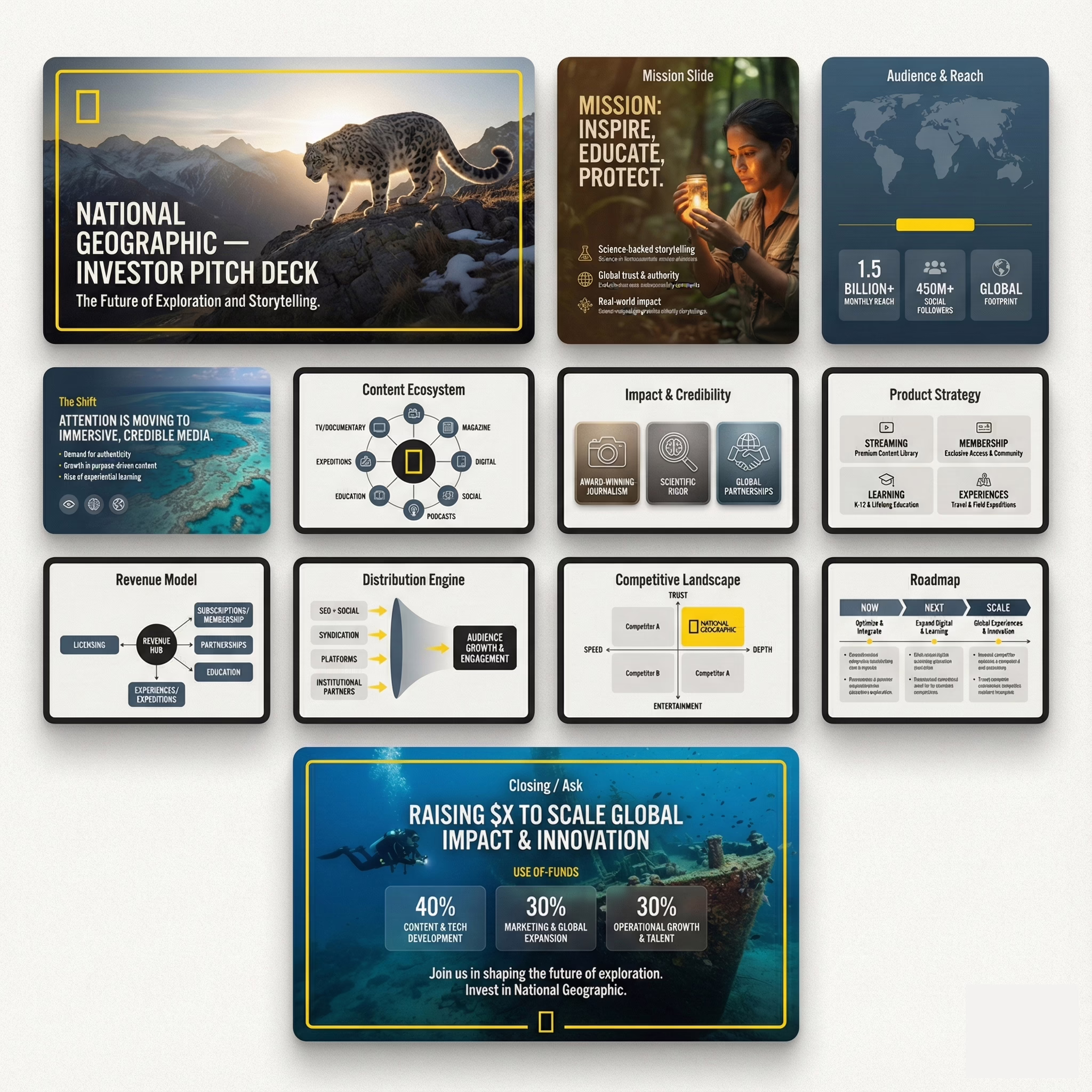
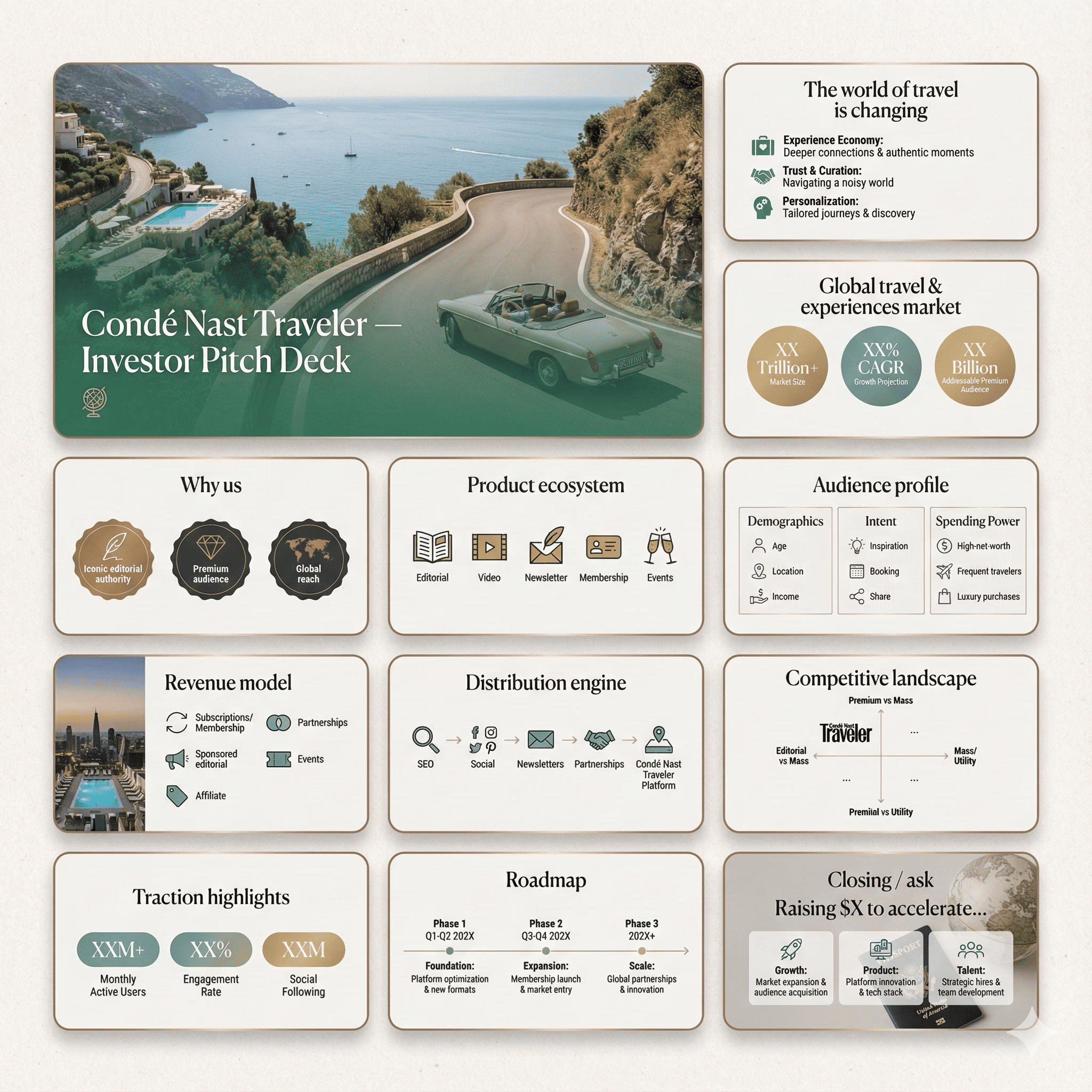
Step-by-step: How to build a travel startup pitch deck (that gets past the “meh” scroll)
1) Pick the audience + decision context (before you touch slides)
Are you pitching angels, VCs, a strategic partner, or a bank-ish committee? Travel gets judged differently depending on who’s holding the pen (seasonality, regulation, supply risk, margins, etc.).
If you’re pitching multiple types, build one “core deck” and adapt emphasis later (don’t Frankenstein it).
2) Set hard constraints: slide count + format
Decide whether this is a live presentation or a leave-behind deck (they behave differently). Use your own rulebook on deck slide count and pacing, and decide early whether you’re going more words or more visuals.
Deliverable: a target range (ex: 12–15 slides) + “live vs send” decision.
3) Write the one-line spine (your deck’s backbone)
If you can’t say it in one sentence, you can’t sell it in 12 slides. Use a variation of your one-sentence positioning formula and make it travel-specific (who, what pain, what mechanism, what outcome).
Deliverable: 1 sentence you’d put on the first slide without apologizing.
4) Outline the deck in “ugly mode” (headlines only)
No design. No paragraphs. Just slide headlines that answer one question each. If you need a clean baseline sequence, use your master build guide: how to structure a pitch deck.
Deliverable: 12–15 slide titles that feel inevitable in order.
5) Problem slide: define the constraint (not the vibe)
Travel decks fail when the problem is “people love travel” (yes, and people love oxygen too). Use a specific constraint: cost, time, trust, fragmented supply, poor conversion, refund chaos, itinerary friction, compliance, etc.
Deliverable: 1–2 quantified problem statements + who suffers most.
6) Solution slide: show the mechanism
Don’t list features. Explain how the thing works in one pass: input → magic → output. Make it tangible: booking flow, inventory model, itinerary builder, supplier onboarding, dynamic packaging, etc.
Deliverable: one-liner + a simple “how it works” visual.
7) Market slide: definitions first, math second
Travel market sizing gets roasted when it’s a copy-paste of “global tourism = $X trillion.” Define who counts, what counts, and where you start. Then present the sizing properly via a TAM/SAM/SOM structure that doesn’t embarrass you.
Deliverable: a market slide that survives a skeptical analyst.
8) Business model: how money moves (and who pays)
Travel can be commissions, take-rate, subscriptions, SaaS to operators, B2B2C fees, booking margins, add-ons, insurance, concierge, etc. Say:
- who pays
- when they pay
- what you keep
- why margins don’t collapse at scale
Deliverable: revenue streams + 2–3 unit economics drivers (CAC, AOV, take rate, retention, seasonality assumptions).
9) Go-to-market: your distribution wedge
Nobody funds “we’ll do social media.” Pick a wedge: SEO, partnerships (hotels/DMOs/airlines), creator funnels, corporate travel contracts, outbound to operators, marketplace liquidity loops, etc. Make it realistic and staged.
Deliverable: 2 channels now + 2 later, with a clear “why this works in travel.”
10) Competition: categories, not logo soup
Travel is crowded. That’s fine—if you position correctly. Use a category map and explain the axis (price vs experience, inventory depth vs personalization, B2B tooling vs consumer UX, etc.). If you need a clean structure, lean on competitive positioning for startups.
Deliverable: one clean map + one sentence differentiation per category.
11) Traction: signal > vanity
Show proof that the machine works: revenue, repeat bookings, retention, conversion lift, supply signed, pipeline quality, LOIs, partnerships, waitlists, cohort behavior. If you’re early, frame momentum properly using traction & growth proof patterns.
Deliverable: 3 proof points + what they imply about scalability.
12) Financials: tell a 3-year story, not a spreadsheet dump
Travel investors want sanity: seasonality, margins, supply costs, refund exposure, CAC sensitivity. Build projections that feel grounded using a realistic projections guide, then present them cleanly with financial slide execution rules.
Deliverable: 3-year topline + key assumptions + burn/runway logic.
13) The ask: what you’re raising, what it buys, what changes after
Amount + runway + milestones + use-of-funds buckets. No poetry. Investors don’t fund dreams—they fund de-risking.
Deliverable: raise amount + 3 milestones + use-of-funds breakdown.
14) Design pass: hierarchy and readability (so it looks credible)
Only now do you “make it pretty.” Use your own principles for designing an investor-grade deck and avoid the common visual traps in pitch deck layout mistakes.
Deliverable: a deck that can be read in 4 minutes without squinting.
15) Final QA: remove filler, tighten claims, stress-test logic
Before you send, run a ruthless cleanup. If you want a quick checklist of what usually breaks decks, use these pitch deck mistake patterns.
Deliverable: fewer slides, sharper claims, cleaner numbers.
Visual Language for Travel Pitch Decks
Travel decks should read like airport signage: fast, obvious, hard to misinterpret. Your visuals aren’t decoration — they’re evidence delivery.
Use visuals that do work:
- Context-first photography: one strong image per slide that clarifies who/where/when (not “pretty mountain” filler).
- Maps that explain focus: routes, density clusters, footprint visuals — only when they explain the market story.
- Real UI over fake mockups: screenshots reduce ambiguity and improve trust.
- One visual job per slide: don’t stack UI + charts + bios on one page.
Make the opening readable in seconds:
Build the first few slides using hook slide structure and check them against the first 15 seconds test.
Typography + color should support hierarchy:
Use pitch deck font psychology to keep type choices credible, and pitch deck color hierarchy principles to keep contrast readable in PDFs and on laptops.
Visuals need a narrative frame:
If the deck feels like a collage, tighten the storyline with pitch deck framing patterns and keep emotion controlled via emotional storytelling mechanics for pitches.
Metrics Cheat Sheet (Appendix): Travel KPIs that belong in pitch decks
This list is designed for one thing: making your claims easy to validate.
| Metric | What it signals | Where it shows up |
|---|---|---|
| Take rate | Monetization strength | Business Model / Financials |
| Contribution margin per booking | Real profitability | Financials |
| AOV | Booking size + upsell room | Traction / Financials |
| Conversion rate | Funnel health | Traction |
| Repeat booking rate | Retention in travel context | Traction |
| Cancellation rate | Demand quality + ops friction | Traction / Risk |
| Refund rate | Liability exposure | Financials / Risk |
| Chargeback rate | Fraud + payments risk | Risk / Ops |
| CAC | Acquisition efficiency | GTM / Financials |
| Payback period | Growth sustainability | Financials |
| Supplier retention (marketplaces) | Supply stability | Traction / Ops |
| Incident rate (on-trip issues) | Reliability | Ops / Traction |
| NPS / rating | Experience quality | Traction |
To keep metrics from turning into spreadsheet soup, present them using simplification rules for dense slides and structure the “numbers story” with data-driven visual storytelling.
Glossary: Travel pitch deck terms (quick definitions)
- OTA: Online travel agency (intermediary).
- Take rate: % of booking value you keep.
- AOV: Average order value (avg booking size).
- Contribution margin: revenue minus variable costs per booking.
- Inventory: bookable supply (rooms/seats/tours).
- Allotment: reserved inventory block from a supplier.
- Lead time: time between booking and travel date.
- Chargeback: payment reversal initiated by cardholder.
- Refund liability: exposure created by refunds/disputes.
- Liquidity: enough supply + demand to transact (marketplaces).
- Cohort: users acquired in same period/channel.
- NPS: loyalty proxy (Net Promoter Score).
- ADR / RevPAR: hotel pricing + revenue efficiency metrics.
If you want slide-level clarity, build glossary terms into headlines using pitch deck headline patterns instead of dumping jargon in body text.
FAQ: Travel pitch deck questions founders actually ask
How long should a travel pitch deck be?
Typically 10–15 slides. Travel sometimes needs one extra slide for seasonality or supply — only if it materially changes the model.
Where should seasonality show up?
Usually in Financials (monthly/quarterly view) and sometimes GTM (campaign timing). Keep it visual, not defensive.
Do I need a competitor slide in travel?
Yes. Crowded markets punish vague positioning. Show the category map and your wedge, not a logo wall.
What if I don’t have traction yet?
Use proxy proof (LOIs, supplier agreements, conversion tests) and be ready to explain it cleanly with Q&A handling structure.
Should I tailor the deck to different investor types?
Yes — same core deck, different emphasis. Use deck tailoring mechanics by investor type instead of rewriting everything.
Mistakes: Travel pitch deck errors that get decks ignored
Mistake 1: “Global tourism is huge” as market sizing
That’s not sizing — that’s a trivia fact. Define who counts and what they buy.
Mistake 2: Pretending cancellations/refunds don’t exist
In travel, the messy parts are the product. A deck that ignores this looks naive.
Mistake 3: Hiding unit economics behind revenue graphs
Revenue is loud. Margin logic is persuasive. Show the margin stack.
Mistake 4: Generic positioning in a crowded category
If it sounds like “Airbnb for X,” it’s forgettable. Tighten claims using content precision rules for decks.
Mistake 5: Over-designed slides that reduce readability
A pretty slide that’s hard to parse is still a bad slide. Audit against visual design mistakes that kill clarity.
Mistake 6: Storytelling that reads like marketing copy
Decks are decision documents in slides. Clean it up using storytelling pitfalls in pitch decks.
Mistake 7: The ask slide is vague
Money must convert into milestones. Otherwise it’s a donation request with better fonts.