


You’ve got a story that could light up the screen — but turning that vision into a funded production requires more than talent. It needs a presentation that speaks the same language as the people reviewing your proposal.
This article is part of Viktori.co’s Hub 4 Execution Series, translating evaluator expectations defined in Hub 2 — review criteria context for consumer-brand style pitches into practical mechanics you can apply right now.
Here, we focus purely on how to build, structure, and format a professional film pitch deck. The decision logic — why certain slides, metrics, or visuals matter — is determined upstream. Your job at this level is simple: execute clearly, present professionally, and align your materials with existing review standards.
Quick Recap – What Is a Film Pitch Deck?
A film pitch deck is a concise, visual document that bridges your creative idea with production partners and funding reviewers. It distills the story, tone, team, and financial outline of your film into a presentation that can be assessed quickly for readiness and coherence.
At the execution level, the deck serves as your film’s operational blueprint — not a script, not a funding argument, but a clear, visual summary that allows reviewers to understand what you’re building, how it looks, and how it fits within the existing financing and distribution landscape defined in Hub 2.
Step-by-step: How to build a film pitch deck
Step 1: Lock the purpose and delivery context
Before you open Keynote/PowerPoint, decide what this deck is for and where it will be used: email send-out, pitch meeting, festival lab, sales agent intro, etc. That context changes what you emphasize, how much detail you include, and how fast the deck needs to communicate.
Do this mechanically:
- Write a one-sentence “job statement” for the deck (e.g., “This deck is built to support indie film financing conversations + attract production partners.”).
- Choose a single primary audience context (don’t build a Frankenstein deck for everyone).
- Set a hard constraint: max slide count + max read time.
If you keep bloating the deck, use a simple rule set for deck length boundaries from this guide: deck length constraints by stage.
If you’re torn between a tight version vs a fuller version, use: when to go short vs expanded.
And if you need a “fast skim” version for intros, build a companion one-pager: one-page deck format.
Step 2: Build the slide spine (structure first, then design)
A film pitch deck lives or dies by sequence. Your structure should feel like a guided walk: hook → story → vision → audience → team → production → money → close.
Do this mechanically:
- Draft slide titles only (no body text yet).
- Keep one idea per slide.
- Mark which slides are “visual-first” vs “text-first”.
To keep your structure clean, start with a proven slide order, then adapt it: how to frame a deck so it reads smoothly.
If your slides feel cluttered or inconsistent as you build, you’ll usually find the culprit here: common layout breakdowns.
Step 3: Write the core narrative blocks (so the deck can “read” without you)
Even a visual medium needs tight writing. Your deck should still make sense if someone skims it on a phone.
Do this mechanically:
- Write the logline as one clean sentence, then test it out loud.
- Write a 3–5 sentence synopsis (no lore dumps, no character lists).
- Turn your “why this story” into 2–3 bullets: theme, tension, transformation.
For your opener, sharpen the one-liner using: a one-sentence pitch framework.
If the opening slide doesn’t grab fast enough, fix the “first slide physics” here: building a strong hook slide.
And if your headlines sound like placeholders, this helps: headline patterns that actually pull attention.
Step 4: Design the visual system (credibility is mostly formatting)
Design isn’t decoration. It’s the system that makes the deck feel “real” and intentional.
Do this mechanically:
- Pick a grid and stick to it (consistent margins, alignment, spacing).
- Use 2 fonts max (heading + body), and set 3–4 consistent text sizes.
- Choose a restrained palette that matches tone (no template confetti).
- Decide your visual rule: concept frames, moodboards, poster-style stills, or a hybrid.
If you need a practical workflow for building slides that look intentional (not templated), use: a clean slide design workflow.
Typography mistakes are usually silent killers—use: how typography changes perception.
Color is the other silent killer—use: color choices that support tone.
And if your deck feels visually “flat,” apply these: visual storytelling techniques.
Step 5: Add production + financing mechanics (make the numbers readable)
This is where many film pitch decks collapse—not because the budget is “wrong,” but because the deck makes the money feel messy, vague, or hard to parse.
Do this mechanically:
- Build a budget top sheet (major buckets only).
- Add a timeline (pre-pro / production / post) with clear dates or ranges.
- State what’s secured vs what’s needed (simple table).
- Keep comps minimal and readable (2–4 comps, one clean takeaway each).
For presenting numbers without losing the room, use: how to present financials clearly.
If you’re using projections or revenue scenarios, keep them structured and defensible with: financial projections formatting guide.
Step 6: Polish for skimming (the “email test”)
Most decks are consumed quickly, not lovingly.
Do this mechanically:
- Run a “3-minute skim” test: does each slide communicate without you talking?
- Remove paragraphs wherever possible.
- Convert dense slides into visual blocks, tables, or 3–5 bullets.
If you’re unsure whether your deck is drifting into “too wordy,” use: balancing text vs visuals.
If everything still feels like it’s fighting for attention, apply: how to simplify without losing meaning.
Step 7: Prep delivery + follow-up (so the deck survives the room)
A film pitch deck is the tool; the pitch meeting is the environment.
Do this mechanically:
- Rehearse the pitch to 10–15 minutes.
- Make a one-page “talk track” (not slide notes).
- Prepare short answers to the predictable follow-ups.
To structure follow-up responses cleanly, use: handling pitch Q&A without spiraling.
And if you want a simple performance constraint, practice the opener using: the first 15 seconds test.
Now that we saw the steps, let’s go a bit deeper into specific execution strategies.
Film Pitch Deck Inputs Checklist
Story materials
- Logline (1 sentence)
- Short synopsis (100–200 words)
- Long synopsis (1 page)
- Main character cards (3–6 characters, 2–4 bullets each)
- Theme + tone words (5–10 words total)
Vision materials
- 8–15 reference frames (lighting, composition, palette, mood)
- 2–4 visual “rules” (e.g., handheld close-ups, wide static frames, neon nights)
- Music references (2–3 tracks) + 3 adjectives per track (pace, tension, vibe)
Production materials
- Timeline: pre-pro / production / post (weeks + milestone bullets)
- Locations list (even if rough)
- Practical constraints (season, weather, availability, permits, VFX needs)
Team materials
- One-paragraph bios (director, producer, writer)
- Select credits (3–5 max each, relevant only)
- Any confirmed attachments (name only + role, no hype)
Money materials
- Budget top sheet buckets (development / production / post / marketing placeholder)
- “Secured vs needed” numbers (simple, clean)
- 2–4 comps (formatted consistently: title / year / budget / outcome metric)
If you want a simple companion deliverable for quick intros, build a one-page summary alongside the deck: a one-page pitch format.
Deck Architecture Rules
These are mechanical constraints, not “style opinions”:
- One idea per slide.
If the slide needs a paragraph, it’s two slides. - Use a grid and obey it.
Same margins, same alignment, same spacing—every slide. - Two fonts max.
One for headings, one for body. Everything else is noise. - Repeat layout patterns on purpose.
If you introduce a pattern (image-left/text-right), reuse it across sections. - Keep text blocks short and scannable.
Think “skim in 90 seconds,” not “read like a short story.” - Visual hierarchy is a rule, not a preference.
Headline first, then 3–5 bullets max, then supporting micro-text.
If your decks keep feeling “messy” even when the content is fine, you’ll usually find the issue in spacing and alignment discipline—this helps: common slide layout pitfalls.
If you keep adding “just one more thing,” use: simplification techniques that keep meaning intact.
Slide-by-Slide Writing Prompts
Below is a prompt framework per slide: headline formula + bullet prompts + avoid list.
Use this to write cleanly, fast, and consistently.
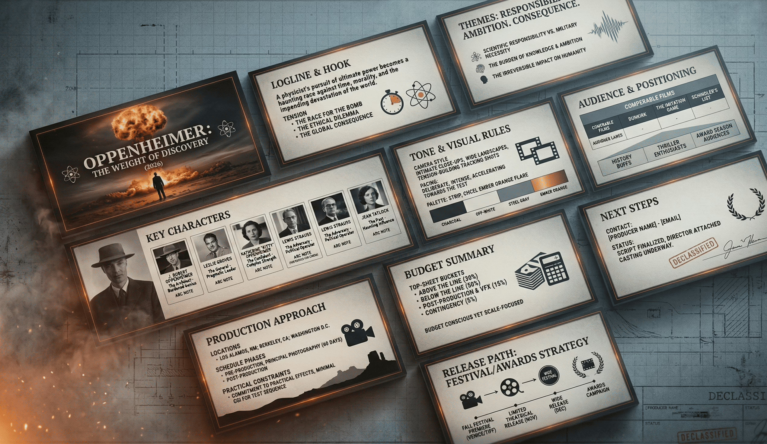
Slide 1 — Elevator Pitch
Headline formula: [Film Title] — [genre descriptor] with [emotional hook]
Write:
- 1-sentence logline
- Genre + tone (2–4 words each)
- “For fans of…” comps (2–3)
Avoid: backstory, character lists, vague adjectives (“unique”, “powerful”)
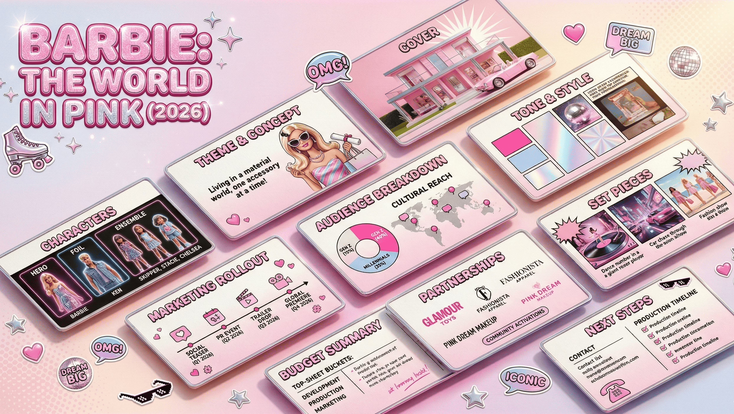
Slide 2 — Project Snapshot (high-level facts)
Headline formula: At-a-glance: what this project is
Write:
- Format (feature/short/series), runtime target
- Stage (script draft status), intended language/region
- Any confirmed attachments (role + name only)
Avoid: exaggerated claims, awards you don’t have
Slide 3 — The Story (short synopsis)
Headline formula: The story in 5 lines
Write:
- Setup (1 line)
- Inciting incident (1 line)
- Escalation (1 line)
- Turning point (1 line)
- Stakes / ending direction (1 line, no spoilers if you prefer)
Avoid: plot dumping, “and then… and then…”
Slide 4 — Characters
Headline formula: The characters who drive the engine
Write:
- Protagonist: want / flaw / change
- Antagonist or opposing force: pressure applied
- Key relationship: how it breaks or transforms
Avoid: biographies, side characters with no function
Slide 5 — Tone & Themes
Headline formula: What it *feels* like
Write:
- 3 theme bullets (human-level, not academic)
- Tone words (5 max)
- What the audience should feel at the end (1 line)
Avoid: moral lectures, generic “hope/dream” statements
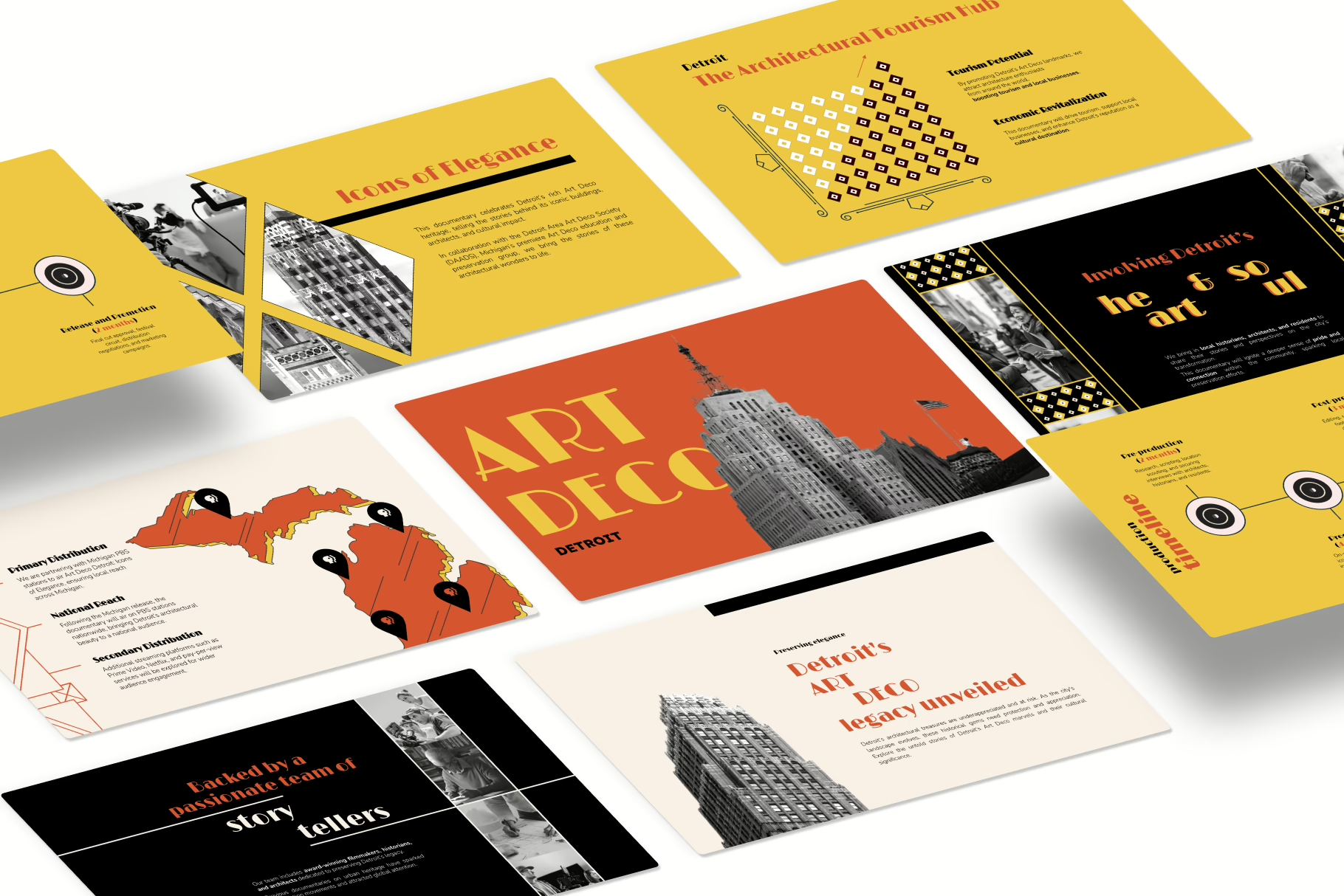
Slide 6 — Visual Language (moodboard slide)
Headline formula: The visual rulebook
Write:
- 6–10 frames (curated, consistent)
- 3 visual rules (camera, lighting, palette)
- 1–2 “anti-rules” (what you will not do)
Avoid: random image collage chaos
Slide 7 — Audience Snapshot
Headline formula: Who this is for (in plain terms)
Write:
- Primary audience (1 line)
- Secondary audience (1 line)
- Where they discover films like this (platforms, festivals, communities)
Avoid: “everyone,” or demographic soup
Slide 8 — Comparables (formatted, consistent)
Headline formula: Comparable titles (for positioning)
Write:
- 2–4 comps, same format each
- One takeaway per comp (“similar tone”, “similar budget band”, etc.)
Avoid: 10 comps, inconsistent data, cherry-picked chaos
Slide 9 — Team
Headline formula: The people executing the work
Write:
- 3–5 bullets per key person
- Relevant credits only
- What each person is responsible for (1 line each)
Avoid: long bios, unrelated achievements
Slide 10 — Production Plan
Headline formula: How this gets made
Write:
- Timeline in phases + weeks
- Key milestones
- Known constraints (season, locations, VFX)
Avoid: fluffy “we’ll figure it out” language
Slide 11 — Budget Summary
Headline formula: Budget overview (top sheet)
Write:
- Buckets + totals
- Secured vs needed
- Contingency line (even small)
Avoid: granular line-items, unreadable tables

Slide 12 — Close
Headline formula: Next step
Write:
- 2-line recap (story + tone + execution readiness)
- Contact line / point person
Avoid: begging, pressure language
If you struggle to keep text lean, use: how to balance text-heavy vs image-heavy decks.
If your slides feel “designed” but still look templated, check: deck mistakes that scream template.
Lookbook vs Film Pitch Deck
A lookbook is a visual argument. A film pitch deck is a visual + narrative + plan summary. You can:
Option A — Combined deck (most common)
- Use a normal deck structure
- Include 1–2 moodboard slides + a concise “visual rules” slide
- Best when you’re sharing one file via email
Option B — Separate lookbook (cleaner for very visual projects)
- Pitch deck stays tight (story, team, plan, budget summary)
- Lookbook becomes a standalone PDF (visual world, tone, references)
- Best when visuals are complex (sci-fi, stylized period, heavy design language)
Mechanical rule: if visuals dominate the conversation, separate the lookbook. If the deck needs to “stand alone” as one attachment, combine it.
To keep your visuals from becoming random, apply: visual storytelling fundamentals for slides.
Image Sourcing + Rights-Safe Workflow
This is a workflow that keeps your deck visually strong without becoming a legal or ethical mess.
Step A — Source references from “safe-ish” pools
- Your own photography / stills (best)
- Licensed stock (paid, clear license terms)
- Press kits you’re permitted to use (read usage terms)
- Public domain archives (verify status)
Step B — Keep a simple credit log
Create a tiny tracker (even in Notion/Sheets):
- Image name
- Source
- License type / permission
- Credit line (if required)
Step C — Don’t use key art like a thief
Avoid pulling recognizable movie posters / studio stills as if they’re yours. If you must reference comps visually, do it minimally and clearly as “reference only,” not as your own artwork.
Step D — Standardize the look
Even legally sourced images can look chaotic if styles clash. Curate like an art director:
- consistent grain/contrast vibe
- consistent palette direction
- consistent framing (wide vs close-up balance)
If you keep fighting “visual inconsistency,” it’s usually a system issue, not an image issue—use: how to build a cohesive slide design system.
Typography & Readability for PDF Viewing
Most decks are read as PDFs, fast, and often on smaller screens. These are execution standards that prevent “looks great on my MacBook” syndrome.
Minimums that usually work
- Body text: 18–24 pt (PDF viewing reality)
- Headings: 36–54 pt
- Line spacing: 1.15–1.35
- Max line length: keep paragraphs short; prefer bullets
Contrast rules
- Dark text on light background is safest for readability
- If using dark backgrounds, increase font weight and size, and avoid thin fonts
Spacing rules
- Add real breathing room: padding around text blocks
- Don’t stack multiple dense elements on one slide
Font discipline
- Use a single type family with multiple weights (clean, consistent)
- Avoid decorative fonts; the deck is not a movie poster
If you want the “why” behind typography choices (and how it changes perception), use: how type choices affect credibility.
For palette decisions that support tone without hurting readability: color psychology for decks.
PDF Export + File Delivery Standards
Most decks die in the last 2%: bad export, messy filenames, huge file size, missing fonts, broken links. Fix it with boring discipline.
Export settings (practical defaults)
- Format: PDF (standard), not “print” unless asked
- File size target: 5–15 MB (big visuals, still email-friendly)
- Image quality: high, but compressed (avoid 80MB “cinema-grade” PDFs)
- Embed fonts (so your type doesn’t shift)
- Include clickable links if you reference socials / email / website
Naming conventions (signals competence)
FILM_TITLE_PitchDeck_v1_2026-01-08.pdf- If sharing variants:
…_Short.pdfvs…_Full.pdf
Version control
- Never send “final_final2_REALfinal.pdf”
- Date-stamp versions
- Keep a “sent” folder so you can track what people actually saw
If you’re using tools and want a quick comparison for building/exporting decks cleanly, see: presentation tools worth using.
If you’re tempted by AI deck generators, keep expectations realistic here: AI pitch deck tools overview.
Common Film Pitch Deck Mistakes
These are the repeat offenders that make a deck feel sloppy even when the idea is strong:
- The logline is vague.
If it can describe 40 films, it’s not doing its job. - Too much plot, not enough structure.
A deck isn’t your screenplay. - Moodboard chaos.
Random images = random confidence. - Inconsistent formatting slide-to-slide.
Different margins, fonts, and alignment reads like “no system.” - Text walls.
If someone has to read your deck, you’re making them work. - “Numbers” slide that isn’t readable.
Confusing budgets look risky even when they aren’t. - Everything is emphasized.
If you bold everything, you bold nothing.
For an expanded breakdown of visual mistakes that kill credibility fast, use: visual design errors that show up in decks.
If you want a broader “what not to do” checklist: 10 pitch deck mistakes to avoid.
Before You Send: The 10-Minute QA Pass
Do this every time. It’s fast, and it prevents dumb losses.
Minute 1–3: The skim test
- Scroll the deck fast: do slide headlines alone tell a coherent story?
- If not, rewrite headlines until they do.
Minute 4–6: Layout discipline
- Check alignment and spacing consistency
- Make sure the same slide patterns repeat intentionally
- Fix any “one slide looks different for no reason” moments
Minute 7–8: Text hygiene
- Remove filler words (“really”, “very”, “unique”)
- Tighten bullets to one line where possible
- Check capitalization consistency (Title Case vs sentence case)
Minute 9–10: PDF reality
- Open on your phone
- If you can’t read it comfortably, resize or cut content
If you want a clean mental model for simplifying without losing meaning: simplification as a slide skill.
Appendix: Optional Slides Library
This isn’t “more slides for fun.” It’s a library you pull from only when the project demands it.
Useful optional slides
- Festival pathway (high level): where it fits and why (1 slide)
- Distribution path diagram: theatrical → streaming → ancillary (simple flow)
- Audience communities: where fans of this genre actually gather
- Location map / setting board: if place is a character
- World rules (for sci-fi/fantasy): 5–7 “rules of the world,” not lore dumps
- Character relationship map: only for ensemble stories
- Production partners / support: if you have meaningful collaborators
If you need to keep optional slides from bloating the deck, use: short vs long deck structuring.
AI-Assisted Drafting Workflow
AI can speed up execution if you use it for structure and clarity—not for inventing facts.
What AI is good for (execution-only)
- Logline variants (10 options, pick 1, then rewrite yourself)
- Synopsis compression (1 page → 200 words → 50 words)
- Slide headlines (generate alternatives for clarity)
- Bullet tightening (turn paragraphs into 3–5 bullets)
- Consistency checks (tone words, repeated phrases, jargon)
What AI is NOT for
- Fake stats, fake market numbers, fake comps performance
- Fake credits, fake attachments, fake partnerships
- “Investor psychology” claims (belongs upstream anyway)
Practical prompt templates
- Logline variants: “Rewrite this logline 10 ways. Keep genre consistent. No extra plot.”
- Synopsis compression: “Compress this synopsis to 120 words. Preserve stakes and turning point.”
- Slide headlines: “Give 12 headline options for this slide. Make them specific and skimmable.”
If you want an execution-level guide to using ChatGPT for deck building without turning it into generic slop: using ChatGPT for pitch decks.
Glossary: Film Financing Terms
This section helps readers interpret common terms they’ll see around film financing conversations—without turning your page into a finance lecture.
- Soft money: Non-equity financing sources that reduce cash needed (e.g., incentives, grants)
- Pre-sales: Selling distribution rights in advance, often by territory
- MG (Minimum Guarantee): A distributor commits a minimum payment for rights
- Gap financing: Financing against projected future sales not yet contracted
- Sales agent: Represents the film to buyers/distributors and helps structure sales
- Waterfall / recoupment: The order in which revenue is distributed back to participants
- Attachment: A confirmed creative element (cast, director, producer, key crew)
- Completion bond: Insurance-like mechanism ensuring the film gets finished to spec
If you want to keep this glossary tight and readable, treat it as a scannable appendix—not a full page of theory.