


Architecture pitch decks are often treated as design exercises. In practice, most problems with them are structural.
Slides appear in the wrong order. Context is introduced too late. Visuals carry information that should be explained. Technical details are scattered instead of grouped. The result is a document that looks complete but is difficult to review.
This guide focuses on the execution layer of an architecture pitch deck: how it is structured, how slides are sequenced, and how information is distributed across the presentation. It does not address how projects are evaluated or how decisions are made. Its purpose is to help you assemble a deck that is clear, readable, and logically constructed. It does not define evaluation criteria or decision frameworks. Those are established upstream within sector-specific real estate capital evaluation processes and broader institutional review models.
What Is an Architecture Pitch Deck?
An architecture pitch deck is a structured presentation document used to describe an architectural project, development concept, or firm capability in a format that can be reviewed and assessed.
From an execution standpoint, it is a sequenced set of slides designed to present information in a predictable order. Each section serves a specific function: orientation, context, response, specification, and summary. The goal is not to persuade, but to make the project understandable without requiring interpretation.
Well-built decks feel straightforward to navigate. Poorly built decks feel confusing even when the content itself is strong. The difference is usually structural, not conceptual.
Standard Architecture Pitch Deck Structure
While details vary by project type and scale, most architecture pitch decks follow the same underlying structure. Problems usually arise when this sequence is disrupted or when multiple functions are combined into a single slide.
Below is the standard functional order, described at execution level.
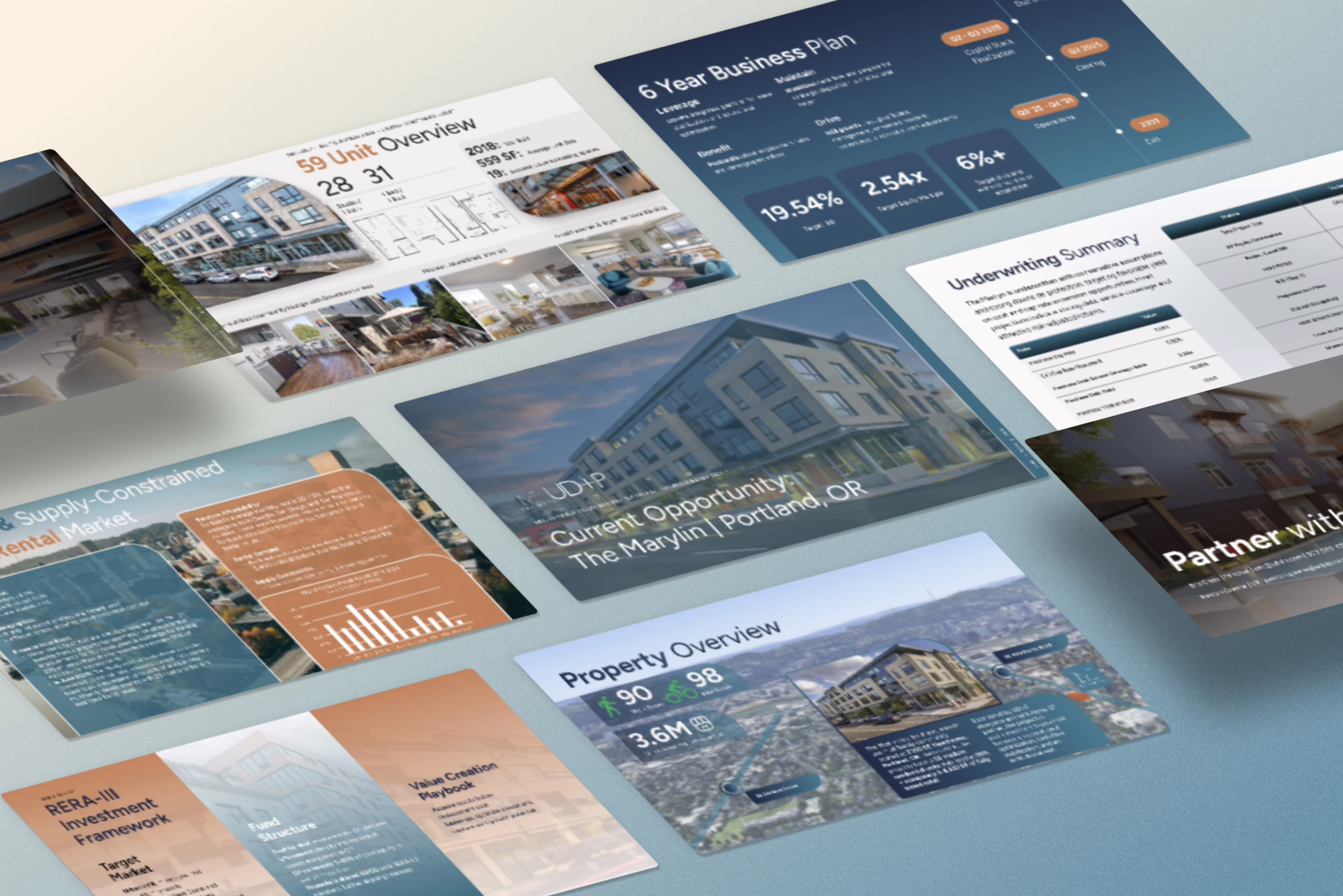
1. Project Identification
This slide establishes what the project is.
It typically includes the project name, location, development type, and a short descriptor. Its purpose is orientation. The reader should immediately understand what they are looking at.
2. Site and Context
This section describes the physical setting of the project.
Location maps, surrounding conditions, access points, and immediate context are usually shown here. The intent is to establish the environment in which the project exists before introducing design decisions.
3. Constraints and Contextual Drivers
This slide or group of slides explains the conditions shaping the project.
These may include zoning limits, density requirements, site limitations, urban fabric considerations, or regulatory constraints. This section provides the background needed to understand the architectural response that follows.
4. Architectural Response
This is where the design concept is introduced.

Massing strategy, spatial organization, and program distribution are typically presented here. The focus is on how the architecture responds to the constraints described in the previous section.
5. Design Language and Form
This section addresses visual and formal aspects of the project.
Facade treatment, material direction, form language, and light strategy are usually shown. The emphasis is on design intent rather than decoration.
6. Program Breakdown
This slide explains how space is allocated within the project.
Residential, commercial, public, and private areas are typically broken down here, often with diagrams or area tables. The goal is functional clarity.
7. Key Metrics and Specifications
This section anchors the project in measurable terms.
Total area, height, unit count, parking, and sustainability features are commonly included. This is a factual layer, not a narrative one.
8. Phasing and Timeline
This slide outlines the sequence of development.
Concept, design, approvals, construction, and delivery phases are usually shown. The purpose is to communicate order and dependency.
9. Team and Roles
This section identifies the parties involved.
Architects, developers, consultants, and partners are listed with their roles. It provides accountability context rather than promotion.
10. Relevant Work or Precedents
This slide shows related projects or prior experience.
The intent is to demonstrate familiarity with the project type or problem space.
11. Summary
The final slide consolidates the project into a short recap.
It restates what the project is, what it does, and how it responds to its context. It should be brief and functional.
How to Create an Architecture Pitch Deck (Step-by-Step)
This process focuses on structure, slide construction, and execution mechanics. It is intended to help you build a deck that is readable, coherent, and review-ready. It does not cover evaluation criteria or decision logic.
Step 1: Define the project in one sentence
Before opening any design tool, write a single sentence that answers:
- What is the project?
- Where is it located?
- What type of development is it?
- What stage is it in?
This is the same discipline used when crafting a one-sentence elevator pitch, and it prevents decks from drifting into vague territory.
Example structure:
“[Project Name] is a [development type] in [location], currently at [stage], designed to [primary function].”
This sentence becomes your reference point. Every slide should support it.
Step 2: Collect all source material in one place
Create a folder and gather:
- Site plan or location map
- Context images (street view, aerial, surroundings)
- Early massing sketches or diagrams
- Renders (even early versions)
- Program list (spaces, rough areas)
- Key metrics (area, floors, units, parking)
- Timeline assumptions
- Team list and roles
- Any relevant precedent projects
This step avoids the common mistake of building slides around missing information, which is a frequent cause of content imbalance in pitch decks.
Step 3: Set the slide order before designing anything
Create placeholder slides in this sequence:
- Project Identification
- Site & Context
- Constraints / Drivers
- Architectural Response
- Design Language
- Program Breakdown
- Key Metrics & Specifications
- Phasing / Timeline
- Team & Roles
- Relevant Work / Precedents
- Summary
Locking structure before visuals helps prevent layout drift and sequencing errors later. This is also where deck length discipline starts.
Step 4: Assign one function to each slide
Each slide must do one job.
Examples:
- Site & Context → explains physical setting
- Constraints → explains conditions shaping the project
- Program Breakdown → explains how space is allocated
When slides try to do multiple things, they become unclear. This is one of the most common pitch deck layout mistakes.
Step 5: Use a consistent content pattern on every slide
A practical structure for most slides:
- Title: states the function of the slide
- Main visual or diagram: one primary element
- 3–5 bullets: only what is needed to understand the visual
- Optional caption: short clarification or assumption
This approach aligns with the principles behind text-heavy vs image-heavy pitch decks, where clarity comes from balance, not volume.
Step 6: Build clear “Context → Response” continuity
Your deck should read in sequence:
- Constraints / Drivers explain the conditions
- Architectural Response shows how the design reacts to them
- Design Language shows how that response becomes form and material
This is basic visual storytelling technique applied to architecture.
If these slides do not clearly connect, the deck will feel disjointed.
Step 7: Convert visual material into reviewable graphics
Do not rely only on renders. Add:
- Simple massing diagrams
- Program block diagrams
- Annotated site maps
- Area tables or metric summaries
This reduces dependence on narration and avoids the common visual design errors founders make in pitch decks.
Step 8: Centralize all key metrics
Create one clear slide (or grouped section) for:
- Total area (specify GFA/NFA)
- Number of floors
- Units or capacity
- Parking
- Sustainability features (only what is known)
Scattering numbers across slides is one of the main reasons financial credibility breaks down in decks.
Step 9: Add a timeline appropriate to the project stage
Match timeline detail to reality:
- Early concept: broad phases only
- Design development: add approval stages
- Pre-construction: include procurement and build phases
Overly detailed timelines at early stages are a classic rookie storytelling mistake.
Step 10: Standardize visual rules across the deck
Choose and apply:
- One typeface pair (headline + body)
- One grid system
- One diagram style
- One image treatment approach
This aligns with core principles in font psychology for pitch decks and color psychology in presentations.
Consistency is more important than style.
Step 11: Run a readability check
Before finalizing, review:
- Can each slide be understood in 10 seconds?
- Are any slides overloaded?
- Are there repeated points that should be combined?
- Does the deck flow logically without explanation?
This is the same discipline used in the first 15 seconds test.
If something requires verbal justification, the slide is doing too much.
Step 12: Final pass – reduce friction, don’t add content
Your last edits should focus on:
- Cutting unnecessary text
- Removing decorative elements that add no clarity
- Aligning spacing and margins
- Ensuring titles describe function, not mood
This is the same mindset used to avoid deck mistakes that make your pitch look templated.
How Long Should an Architecture Pitch Deck Be?
There is no fixed slide count for an architecture pitch deck. Length is dictated by project maturity, design complexity, and the amount of context required for the presentation to stand on its own. A feasibility concept deck and a pre-construction development deck simply do not carry the same informational burden, and treating them as if they do is one of the most common structural mistakes.
Understanding pitch deck length by stage is critical before any layout or visual work begins. Slide count should be a consequence of what needs to be explained, not an arbitrary target.
Early Concept / Feasibility Stage (8–12 slides)
At this stage, the architecture pitch deck usually contains:
- site context
- early massing
- conceptual response
- high-level program assumptions
The purpose here is orientation, not resolution. You are establishing what the project could be, not proving what it will be. Trying to compress everything into a single narrative arc at this point often leads to content density problems, where slides feel both crowded and vague at the same time. This pattern is described in detail in content mistakes in pitch decks, and it shows up frequently in early architecture decks.
Developed Concept / Design Development Stage (12–18 slides)
Once the design language is established and the program is defined, decks naturally expand to include:
- program breakdown diagrams
- preliminary metrics
- design rationale
- phasing logic
At this stage, pitch deck layout structure starts carrying real weight. Visual hierarchy, spacing, and sequencing begin to influence comprehension as much as the content itself. Poor layout decisions here quickly reduce clarity, which is why it’s important to understand and avoid common pitch deck layout mistakes before the deck grows in length.
Advanced / Pre-Construction Stage (18–25+ slides)
At this stage, decks often include:
- regulatory context
- technical diagrams
- construction phasing
- coordination logic
Here, length is driven by complexity, not ambition. Trying to force this level of detail into a short format usually creates gaps in explanation that surface later as misunderstandings. This is where understanding the difference between a short vs long pitch deck becomes practical rather than stylistic.
Architecture Pitch Deck for Different Project Types (Residential, Mixed-Use, Commercial)
The core structure of an architecture pitch deck remains consistent, but the emphasis and slide weighting change significantly depending on the project type. Residential, mixed-use, and commercial projects each require different explanation mechanics. Treating them the same is one of the reasons many architecture decks feel generic.
Residential Architecture Pitch Deck
Residential decks are typically more:
- spatial
- lifestyle-oriented
- context-sensitive
Execution emphasis usually falls on:
- site integration
- unit logic
- privacy and orientation
- circulation clarity
A common execution error here is leaning too heavily on visuals without enough explanation, which is a classic case of text-heavy vs image-heavy pitch deck imbalance. When imagery replaces structure, clarity drops even if the design quality is high.
Mixed-Use Architecture Pitch Deck
Mixed-use decks must explain:
- how programs stack
- how flows separate
- how uses interact
These decks are structurally demanding because they need to communicate multiple systems at once. This is where how to design a pitch deck with clear structure becomes essential, as diagrams often carry the primary narrative load.
Commercial Architecture Pitch Deck
Commercial decks are usually:
- function-first
- efficiency-driven
- logistics-focused
A frequent mistake is applying the same visual language across all project types, which results in templated-looking decks that fail to communicate intent. Commercial projects require explanation of function and flow more than atmosphere.
Common Architecture Pitch Deck Mistakes (and How to Fix Them)
Most architecture pitch decks fail for structural reasons, not design quality. The issues below appear consistently across residential, mixed-use, and commercial projects.
Mistake 1: Treating the deck like a design board
When slides are arranged for aesthetics instead of sequence, the story collapses. Visual coherence does not compensate for narrative confusion.
Fix: Use proven storytelling frameworks to control flow and progression through the deck.
Mistake 2: Overloading slides with mixed information
Combining program, metrics, visuals, and narrative on the same slide destroys readability and forces the viewer to decode instead of understand.
Fix: Identify and split pitch deck slides that need to be separated so each slide serves a single function.
Mistake 3: Ignoring visual hierarchy
When everything is the same size, nothing stands out. This is especially common in architect-led decks.
Fix: Correct common visual design errors founders make in pitch decks by establishing clear headline, subhead, and body levels.
Mistake 4: Over-explaining obvious elements
Long paragraphs explaining self-evident design choices slow the deck down and dilute the message.
Fix: Apply the art of simplification to your slides by using diagrams, labels, and short captions instead of prose.
Mistake 5: Designing before structuring
Jumping into design tools without defining structure almost always leads to sequencing issues later.
Fix: Start with a one-pager pitch deck structure before building slides.
Mistake 6: Forcing emotion into technical slides
Trying to “sell” in slides meant to explain mechanics creates tonal confusion and undermines clarity.
Fix: Use emotional storytelling for pitch decks only where it supports the narrative, not where it replaces explanation.
Mistake 7: Repeating the same message in different forms
When text, visuals, and captions all say the same thing, slides feel padded and inefficient.
Fix: Avoid common rookie storytelling mistakes in pitch decks by ensuring each element adds new information.