


Typography and color do not decorate a pitch deck.
They signal how information should be interpreted under evaluation pressure.
Before an investor reads a word, the font choice, font weight, and color palette establish expectations about credibility, clarity, and discipline. This happens fast—well before logic, numbers, or narrative structure are consciously processed.
In pitch environments, fonts and colors function as pre-verbal framing devices. They influence whether information feels stable or speculative, precise or vague, institutional or improvised. This is why font psychology and color psychology are not aesthetic concerns—they are perception mechanics.
This dynamic consistently shows up across pitch decks regardless of sector, and is structurally expressed through how typography and color systems are applied in full-length investor presentations, such as those outlined in the broader context of how information is typically structured in a complete pitch deck (what is an investor pitch deck).
What Role Do Fonts and Colors Play in a Pitch Deck
Fonts and colors aren’t decoration in a pitch deck. They’re pre-meaning—signals that tell the brain how to interpret whatever comes next. In evaluation environments, people don’t start by judging your argument. They start by judging whether the information environment feels controlled, legible, and consistent enough to trust. That’s why pitch deck design often shapes the speed and depth of reading long before the content is consciously evaluated.
1) They set “reading mode” (scan vs scrutinize)
Typography (typeface, font size, spacing) is the quickest cue for whether the deck is meant to be scanned or carefully read. When a deck uses a stable presentation font with predictable hierarchy, evaluators can allocate attention efficiently: headlines behave like signposts, body text behaves like evidence. When typography is inconsistent—random font weights, shifting font styles, decorative fonts sneaking into body copy—the reader experiences friction and defaults to scanning, which is where nuance dies.
This is the same attention dynamic that shows up in content reduction and clarity work—when structure reduces load, comprehension rises—covered in the art of simplification and often reflected in the way sections are laid out in a full investor pitch deck guide.
2) They signal operational discipline (without saying “we’re disciplined”)
Investors rarely say “this team lacks typographic discipline,” but they react as if they did. Font choice becomes a proxy for care: consistent alignment, repeatable hierarchy, and restrained font pairing quietly imply the team can maintain standards. Sloppy typography implies sloppy thinking, even if the business is solid.
That’s why typography choices often correlate with the “template smell” problem—decks that feel assembled rather than designed. You see adjacent patterns in pitch deck design mistakes and, at the content layer, in 11 content mistakes in pitch decks.
3) They create hierarchy (what feels important becomes what gets remembered)
Font hierarchy is memory engineering. Strong hierarchy (headline font for framing, consistent subheads, readable body text) makes the deck feel navigable. Weak hierarchy makes everything feel equally important, which is the fastest route to “I don’t remember what mattered.”
This shows up most sharply in slides where recall matters: the “one-liner,” the value claim, the problem framing, and the traction summary. That’s why the hierarchy problem often manifests as weak punchlines on slides like the value proposition slide, the problem slide, and headline systems like pitch deck headlines that hook.
4) They regulate emotional temperature (calm evaluation vs heightened skepticism)
Colors don’t “make investors invest.” They regulate emotional arousal and perceived risk. Heavy saturation, aggressive contrast, and too many accent colors raise alertness and can increase skepticism (“this feels like marketing”). Controlled palettes (deep neutrals, calm accents) reduce emotional noise and increase tolerance for complexity (“this feels like a report, not a poster”).
That’s the core overlap with pitch deck color psychology, and it’s why palette decisions often mirror the emotional pacing used in narrative work like emotional storytelling for pitch decks—not because colors tell the story, but because they stop the story from feeling chaotic.
5) They shape credibility by matching category expectations
The “right fonts and colors” are often just the ones that fit the audience’s learned expectations for that category. A clean sans-serif font and restrained palette feels normal in a SaaS pitch; a more formal serif headline and institutional colors can feel more congruent in finance, banking, or government contexts. Congruence reduces “is this for me?” friction.
That category congruence is why structure and aesthetics tend to differ across applied guides like SaaS pitch deck guide, fintech pitch deck guide, banking pitch deck guide, and government pitch deck guide.
Bottom line: fonts and colors in pitch decks don’t add substance. They control whether substance is processed as credible, readable, and coherent. And in evaluation settings, coherence is half the battle—without anyone admitting it out loud.
The Best Fonts for Pitch Decks
There’s no universal “best font for presentations,” because the best font is the one that minimizes cognitive friction while matching the audience’s category expectations. In other words: the best font is the one that lets evaluators focus on meaning instead of decoding the text.
So instead of “pick X font,” the more accurate lens is: which font choices produce consistent reactions in pitch contexts?
What “best font” actually means in a pitch deck
A “best font” in a pitch deck is a font that:
- Stays legible under projection and compression (screen share, PDF export, smaller monitors)
- Supports hierarchy cleanly (headline vs body vs callouts)
- Doesn’t introduce personality noise (display font energy where you need analytical trust)
- Feels familiar enough to be invisible (because invisibility is what good typography looks like)
That’s why the safest default in pitch deck design is a sans-serif font for body text. It’s the most stable choice for on-screen readability and reduces the chance of decorative artifacts in export. This same “reduce the chance of friction” dynamic shows up alongside other clarity-first mechanics like how to create a short vs long pitch deck (because compression exposes weak typography fast).
Font categories and the psychology behind them
1) Sans-serif fonts: clarity, neutrality, modernity
Sans-serif fonts tend to read as clean and contemporary, and they hold up well across devices. In pitch environments, they often signal that the team prioritizes function and clarity. They also support fast scanning, which matters when evaluators jump between sections.
You’ll see this “screen-first legibility” bias show up in tech and digital products, which is why sans-serif-heavy systems are common in SaaS pitch decks and modern product narratives. They also align well with a simplified content system like the art of simplification, because typography and structure reinforce each other.
2) Serif fonts: authority, tradition, gravitas
Serif fonts can communicate seriousness and institutional tone—useful when the deck needs to feel like it belongs in conservative evaluation environments. But they can also feel heavy or dated if applied everywhere, especially in long body passages or modern interfaces.
This is why serif usage often manifests as headline-only (authority framing) rather than full-system usage, and why the same type choice can feel more congruent in contexts like finance, banking, or government—where category expectations are stricter—reflected in guides like banking pitch deck guide and government pitch deck guide.
3) Display fonts: emphasis, identity, risk
Display fonts are built to be noticed. That’s the problem and the point. Used sparingly, they can create punch and help a deck feel distinct. Used broadly, they introduce instability—because the reader starts tracking style instead of meaning.
You’ll often see display fonts become a hidden source of “template feel” or “marketing vibe,” which ties into the same failure mode described in 10 deck mistakes that make your startup pitch look like a template and more generally in pitch deck design mistakes.
4) Script fonts: human warmth, low analytical trust
Script fonts can suggest craft and personality, but they also reduce legibility and can read as informal. In pitch decks, that tends to lower analytical trust unless the category specifically benefits from artisanal cues (and even then, it’s usually logo-only or a single quote style).
When scripts are used in places where evaluators expect clarity—traction, financials, roadmap—they create friction that bleeds into credibility judgments. That’s why “legibility under pressure” becomes most obvious on slides like traction and growth and financial framing like how to present financials in a pitch deck.
“Best fonts for pitch decks” usually means “best system”
Investors don’t evaluate fonts in isolation. They evaluate whether the typography system behaves predictably across the entire deck:
- A stable font for headings (signals framing)
- A legible body font (delivers information)
- Controlled font weights (creates rhythm and hierarchy)
- Consistent sizing (prevents visual chaos)
When that system holds, key moments land harder because they’re not fighting the layout. You see that especially on narrative-critical slides like the elevator pitch slide and condensed articulation like one sentence elevator pitch, where the typography either makes the sentence feel like a thesis—or like a caption.
Practical takeaway (still descriptive)
So the “best font” is rarely a specific typeface. It’s usually a safe, legible font selection that stays invisible while the story stays readable. When typography becomes noticeable, it’s often because it’s causing friction.
2 Color Combinations Commonly Used in Pitch Decks
Color combinations in pitch decks persist for a reason.
Not because they’re trendy—but because they reliably stabilize perception during evaluation.
When investors review a pitch, color is processed before meaning. The palette sets expectations about seriousness, risk posture, and how much emotional restraint the deck is likely to maintain. Over time, certain combinations have emerged as defaults because they reduce interpretive noise and let structure do the talking.
1) Navy / Deep Blue + White or Light Gray
Signal: trust, discipline, analytical calm
This is the most common color pairing in institutional-facing pitch decks. Deep blues slow perception and reduce emotional volatility, while white or light gray creates contrast that preserves legibility. The result feels closer to a report than a campaign.
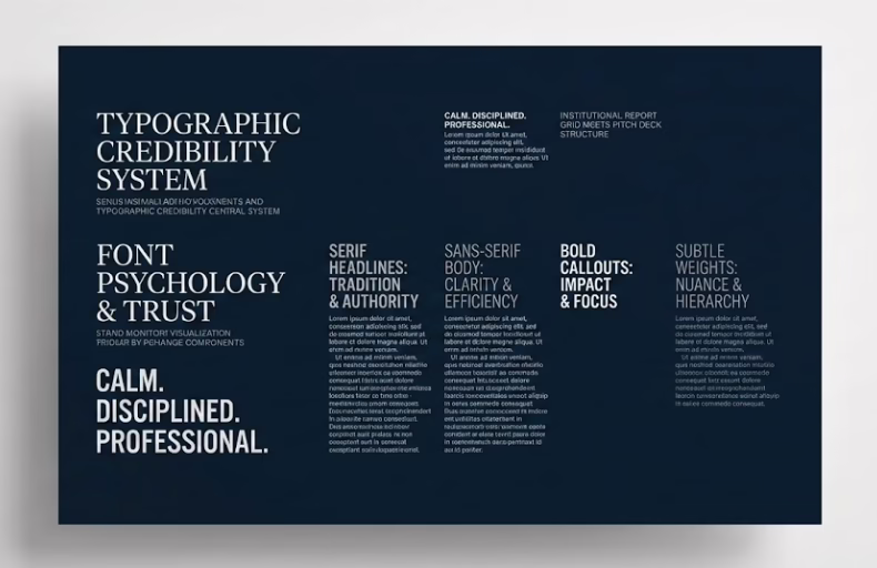
This combination shows up consistently in environments where credibility and scrutiny dominate—finance, banking, government, infrastructure—because it aligns with how evaluators are trained to read information. It encourages careful reading rather than emotional reaction.
You’ll see this palette reflected repeatedly in structurally conservative decks like those aligned with the banking pitch deck guide, government pitch deck guide, and capital-heavy narratives such as the investment fund pitch deck. The same calming effect is discussed more explicitly in the broader context of pitch deck color psychology.
Importantly, this combination also tolerates dense information well. Financial tables, risk explanations, and roadmap slides feel less aggressive when wrapped in restrained color systems—something that becomes obvious when comparing strong and weak approaches to how to present financials in a pitch deck.
2) Dark Neutral (Charcoal / Graphite) + Muted Accent
Signal: modern control, focus, selective emphasis
This combination is common in contemporary pitch decks where teams want to feel modern without triggering “startup hype” skepticism. Dark neutrals anchor the deck, while muted accent colors (soft green, desaturated teal, warm gray-blue) are used sparingly to guide attention.
The psychology here is precision. Accents don’t decorate—they point. Metrics, section breaks, and key claims become easier to locate without overwhelming the page. This is especially effective in decks that rely on scanning behavior, such as early-stage product or SaaS narratives.
You’ll see this pattern show up frequently in applied structures like the SaaS pitch deck guide, fintech pitch deck guide, and even modern verticals like the e-commerce pitch deck guide. The same restraint principle underpins clarity-focused thinking in the art of simplification.
Where this combination fails is when accent colors multiply. Too many highlights flatten hierarchy and erase meaning—an error that often overlaps with broader pitch deck design mistakes and content overload patterns described in 11 content mistakes in pitch decks.
Key pattern to notice:
These color combinations survive because they stay out of the way. They don’t try to impress. They let typography, hierarchy, and narrative structure carry the load—especially on slides where recall matters, such as the value proposition slide or the problem slide in your pitch deck.
How to Choose the Right Fonts and Colors for Your Pitch Deck
Fonts and colors are rarely chosen incorrectly because founders lack taste.
They’re chosen incorrectly because founders ignore context.
In pitch decks, the “right fonts and colors” are the ones that match the evaluation environment—not the ones that look good in isolation. Typography and color are interpreted relative to audience expectations, category norms, and the cognitive load of the material being reviewed.
Context beats preference every time
A pitch deck is not consumed like a website or a brand campaign. It’s reviewed under time pressure, often alongside dozens of similar decks. Fonts and colors therefore function as filters, helping evaluators decide whether to slow down or skim.
That’s why the same font and color system can feel appropriate in one context and amateur in another. A clean sans-serif font with muted colors feels normal in a SaaS pitch, but might feel lightweight in a government or banking context—where serif headlines or more institutional palettes feel congruent.
This context-dependence is why typography and color choices often shift when decks are adapted using frameworks like tailoring a pitch deck for different investors or when teams move between stages such as pre-seed vs series A.
Fonts and colors should reinforce structure, not compete with it
The primary job of typography and color is to support hierarchy. Headings should frame. Body text should explain. Accents should guide attention. When fonts and colors compete with structure, the deck feels chaotic—even if the content is strong.
This breakdown often shows up in slides that carry both narrative and data weight, such as traction and growth slides or dense explanation moments like problem-solution slides. Poor font selection or aggressive color use forces the reader to work harder than necessary.
The same principle explains why clarity-focused typography pairs well with narrative frameworks like emotional storytelling for pitch decks—not because fonts tell the story, but because they stop the story from feeling noisy.
Category expectations quietly dominate perception
People don’t evaluate decks in a vacuum. They compare them—often unconsciously—to what they’ve seen before. Fonts and colors that align with category norms feel “right” even when the evaluator can’t explain why.
This is why pitch decks in heavily regulated or capital-intensive sectors tend to converge visually, as seen across applied guides like the real estate pitch deck guide, energy pitch deck guide, or medical pitch deck guide. The visual language signals seriousness before content is judged.
When decks ignore these expectations, the reaction isn’t “this is bold.” It’s usually “this feels off.” The same mismatch dynamic appears in broader critiques of persuasion-heavy decks discussed in persuasion in pitch decks and cognitive misalignment patterns outlined in cognitive biases in pitching.
Fonts, colors, and memory formation
Typography and color also influence what survives recall. Clear hierarchy and restrained palettes make it easier for evaluators to remember the core idea, while visual clutter dilutes memory. This is why headline clarity and typographic emphasis matter so much on compression-heavy elements like the elevator pitch slide or distilled articulation such as the one sentence elevator pitch.
When fonts and colors are aligned, the deck feels coherent. When they aren’t, evaluators remember fragments—never the thesis.
The underlying rule
Fonts and colors don’t convince.
They either support or sabotage comprehension.
The right font selection and color system create an environment where information feels readable, credible, and intentional. And in pitch decks—where decisions are filtered through risk, comparison, and limited attention—that environment determines whether the content even gets a fair hearing.
If you want next, we can tighten this page further by cross-linking typography sections directly into slide-specific mechanics (problem, traction, financials) or rebalance neuron density without triggering repetition flags.
Frequently Asked Questions About Fonts, Colors, and Pitch Deck Typography
What is the best font for a pitch deck?
There is no single best font for a pitch deck in isolation. The best font is the one that fits the context of the pitch, the audience’s expectations, and the design constraints of presentations. In most cases, a clean sans-serif font is preferred for body text due to screen readability, while serif fonts are often used selectively for headings to signal authority and structure. Font psychology plays a critical role here—fonts influence how information is perceived before it is fully read.
Why does typography matter so much in pitch deck design?
Typography matters because fonts shape how people interpret clarity, credibility, and professionalism. In pitch deck design, typography affects reading speed, information hierarchy, and emotional response. Fonts matter because investors don’t just evaluate content—they evaluate how easy it is to process that content. Poor font choice, inconsistent font size, or decorative fonts can introduce friction and undermine good design.
How does font psychology affect a pitch?
Font psychology explains how different font styles evoke different reactions. Serif fonts are often associated with tradition and trust, sans-serif fonts with modernity and clarity, and display fonts with emphasis or personality. In a pitch, font psychology influences whether information feels serious, speculative, or reliable. The psychology behind font choice quietly shapes how a pitch deck is judged.
What is the best font for presentations?
The best font for presentations is one that remains legible across screens, projectors, and PDFs. Sans-serif fonts are often the safest choice for presentations because they scale well and maintain clarity. A good presentation font supports hierarchy through font weights and spacing rather than decoration. Fonts should feel invisible—when typography draws attention to itself, it usually means something is wrong.
How do I choose the right font for my pitch deck?
Choosing the right font starts with understanding the audience and the pitch context. The right font aligns with category expectations, supports readability, and reinforces the tone of the pitch. Font selection should prioritize legibility, consistency, and hierarchy. Choosing the right font is less about style preference and more about reducing cognitive load during evaluation.
Should I use serif or sans-serif fonts in a pitch deck?
Both serif and sans-serif fonts can work in a pitch deck, but they serve different roles. Serif fonts tend to communicate authority and stability, making them effective for headings or formal contexts. Sans-serif fonts are often better for body text because they improve readability on screens. Many good presentation fonts combine both through intentional font pairing.
How many fonts should a pitch deck use?
Most pitch decks work best with one or two fonts. Using different fonts without a clear system can make a deck feel inconsistent and unprofessional. A common approach is one font for headings and one for body text. Too many fonts weaken hierarchy and distract from the message, even if each font is individually well designed.
What are common font mistakes in pitch decks?
Common font mistakes include using decorative fonts, inconsistent font sizes, poor font pairing, and fonts that don’t scale well in presentations. Script fonts and experimental fonts should usually be avoided in pitch decks because they reduce clarity. Fonts should support content, not compete with it. When fonts feel noticeable, they are often hurting comprehension.
How do fonts and colors work together in a pitch deck?
Fonts and colors work together to guide attention and regulate emotional response. Typography establishes structure, while color psychology influences mood and perceived risk. Right fonts and colors reinforce hierarchy and make information easier to scan. Poor combinations can overwhelm the reader and weaken good design, even when the content is strong.
What colors work best with presentation fonts?
Neutral colors such as navy, charcoal, white, and light gray work well with most presentation fonts because they preserve contrast and legibility. Muted accent colors can be used sparingly to highlight key information. Colors in pitch decks should support typography, not overpower it. Strong color psychology helps maintain focus and reduce visual noise.
Does font size really matter in a pitch deck?
Yes. Font size directly affects readability and comprehension. Fonts that are too small force evaluators to strain, while inconsistent font sizes break hierarchy. Good pitch deck design uses font size intentionally to signal importance—headlines, subheads, and body text should be clearly differentiated.
Are custom fonts a good idea for pitch decks?
Custom fonts can work, but they introduce risk. Many fonts don’t render consistently across devices or presentation software. Web-safe fonts or well-tested font families are often safer choices. A custom font should only be used if it does not compromise readability or compatibility.
How do fonts influence investor perception?
Fonts influence investor perception by signaling discipline, clarity, and seriousness. Well-chosen fonts suggest operational maturity, while sloppy typography suggests disorganization. Fonts influence how credible a pitch feels, even when the numbers and narrative are strong. This is why font choice is a key part of pitch deck design.
What is font pairing and why does it matter?
Font pairing is the practice of combining complementary fonts—usually one for headings and one for body text. Good font pairing improves hierarchy and readability. Poor font combinations confuse the reader and weaken structure. In pitch decks, font pairing should feel deliberate and restrained.
Can fonts really affect whether a pitch deck feels professional?
Yes. Fonts are one of the fastest signals of professionalism. A clean, consistent font system creates trust and reduces friction. Fonts that clash, feel outdated, or appear decorative can make even strong content feel amateur. Fonts don’t convince—but they strongly influence how information is received.