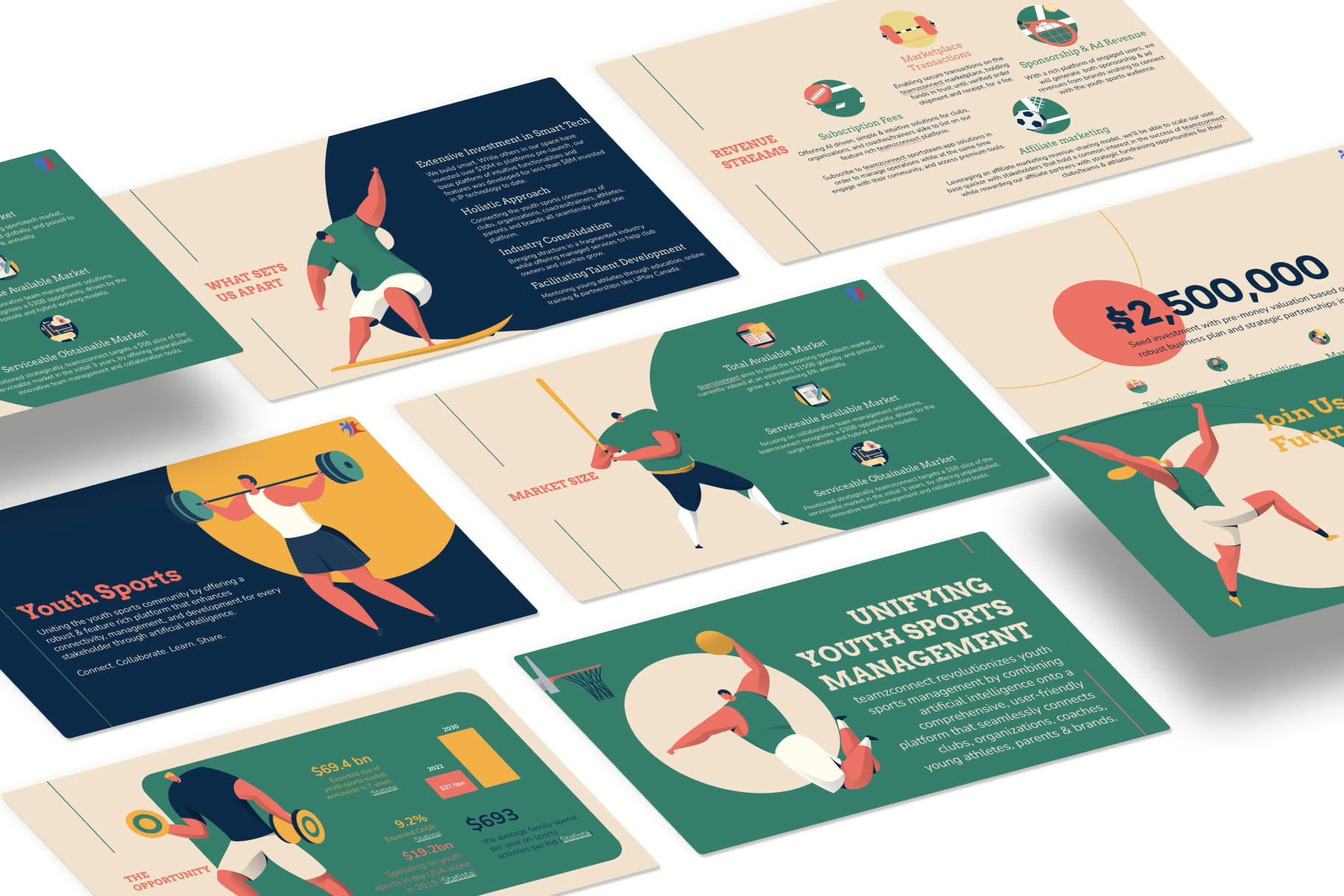
Why Color Psychology in Pitch Decks Matters More Than You Think

Author: Viktor
Pitch Deck Expert. Ex Advertising. Founder of Viktori. $500mill In Funding. Bald Since 2010.
When crafting a winning pitch deck, every detail counts. Among the most overlooked yet powerful elements is color psychology—the study of how colors affect emotions, perceptions, and decision-making.
The right color scheme can enhance the visual appeal, evoke trust, and guide investors’ focus, while the wrong color choice can make your pitch deck look unprofessional and fail to create an emotional connection.
I’m Viktor Ilijev, a pitch deck expert with over 13 years of experience helping startups and businesses secure funding through high-impact pitch decks. My team and I have crafted thousands of investor-ready decks, raising over $500 million for companies across tech, healthcare, SaaS, real estate, and more. From early-stage startups pitching VCs to corporate giants closing multi-million-dollar deals, we’ve seen what works—and what doesn’t.
One key takeaway? Color matters more than most founders realize.
After analyzing thousands of successful (and unsuccessful) pitch decks, we’ve found that the colors you choose don’t just affect design—they directly influence investor perception, emotional response, and decision-making. Founders often focus on content and numbers, but ignoring color psychology can be a costly mistake.
This article was born out of real-world experience, seeing how the right colors in a pitch deck can increase engagement, build trust, and ultimately secure more funding. We’ll break down how to use colors strategically so your pitch deck doesn’t just look good—it persuades, captivates, and converts investors into believers.
Why Color Psychology Matters in Pitch Decks
Color psychology matters because it allows you to:
- Influence Investor Perception – Colors like blue and green are often associated with trust.
- Evoke Emotions – Bright colors like red and yellow can create urgency and excitement.
- Enhance the Visual Appeal – A cohesive color palette ensures a visually appealing and effective presentation.
- Improve Readability – The background and text colors must have enough contrast for easy reading.
By choosing the right colors for your pitch deck, you can make your slides more engaging, persuasive, and memorable.
The Psychology of Colors in Your Pitch Deck

Let’s see how different categories of colors affect perception.
1. Warm Colors: Energy, Passion & Urgency
Warm colors, such as red, orange, and yellow, are attention-grabbing and create a sense of urgency, excitement, and enthusiasm. These colors work well together in industries that require bold action and high engagement.
Red → Power, Urgency, and Action
The color red is often associated with energy, passion, and intensity. It creates a sense of urgency and is frequently used in call-to-action buttons, important statistics, and branding elements in a pitch deck.
✅ Use Red If You Want To:
- Draw attention to key figures, data, or investor takeaways.
- Evoke strong emotions in a competitive or fast-moving industry.
- Create a bold and memorable presentation look.
🚀 Industries That Benefit from Red in Pitch Decks:
- Tech Startups → Innovation and disruption require bold colors.
- Marketing and Branding Agencies → Red helps convey energy and passion.
- Fast-Moving Consumer Goods (FMCG) → Red creates a sense of excitement and urgency.
⚠ Caution:
- Too much red can be overwhelming and may signal aggression or urgency in a negative way.
- Balance red with neutral colors like white, grey, or black to ensure readability.
Orange → Confidence, Creativity, and Enthusiasm
Orange is often associated with warmth, innovation, and optimism. It is a great color choice for brands that want to communicate creativity and approachability.
✅ Use Orange If You Want To:
- Create a friendly, welcoming tone in your presentation.
- Position your brand as energetic and forward-thinking.
- Enhance the visual appeal of your pitch without being overly aggressive.
🎨 Industries That Use Orange Successfully:
- Entertainment & Media → Orange captures playfulness and creativity.
- SaaS & Startups → Orange fosters a sense of approachability and innovation.
- E-commerce & Lifestyle Brands → Encourages action and consumer engagement.
⚠ Caution:
- Orange works best as an accent color—too much can reduce professionalism.
- Pair it with dark hues like navy or grey for a balanced look.
Yellow → Optimism, Happiness, and Energy
The color yellow is associated with positivity, clarity, and creativity. It is often used in brand identity and presentation design to convey a sense of brightness and enthusiasm.
✅ Use Yellow If You Want To:
- Highlight key points in a visually appealing way.
- Create a color scheme that enhances engagement.
- Add warmth and friendliness to your presentation look.
☀ Industries That Leverage Yellow:
- Consumer-Focused Industries → Encourages trust and optimism.
- Education & Training Startups → Creates a sense of energy and clarity.
- Advertising & Marketing Firms → Helps brands stand out.
⚠ Caution:
- Bright colors like yellow can be overwhelming if overused.
- Use yellow in small doses to avoid readability issues on a light background.
2. Cool Colors: Trust, Stability & Professionalism
Cool colors, such as blue, green, and purple, are known for their calming and reassuring properties. These hues are ideal for brands that want to convey reliability, stability, and sophistication.
Blue → Trust, Professionalism, and Security
Blue is one of the most commonly used colors in pitch decks because it creates a sense of trust and stability. Investors associate blue with logic, professionalism, and credibility, making it a safe and effective choice.
✅ Use Blue If You Want To:
- Build trust with investors and stakeholders.
- Make your pitch look more professional and structured.
- Enhance the overall presentation design while maintaining readability.
🏦 Industries That Rely on Blue:
- Fintech & Banking → Blue is associated with trust and security.
- SaaS & Tech → Blue enhances professionalism and credibility.
- Corporate & Consulting Firms → Blue conveys confidence and expertise.
⚠ Tip:
- Like blue, navy blue works well as a background color with light text to create high contrast.
Green → Growth, Sustainability, and Wealth
Green is often associated with nature, finance, and well-being. It creates a sense of balance and trust, making it an ideal color for brands focused on sustainability and financial success.
✅ Use Green If You Want To:
- Position your company as eco-friendly and sustainable.
- Create a sense of financial security and responsibility.
- Make your pitch deck visually appealing while maintaining a calming effect.
🌱 Industries That Use Green Successfully:
- Eco-Tech & Sustainability → Green represents growth and environmental responsibility.
- Fintech & Investment Firms → Green is associated with wealth and prosperity.
- Healthcare & Wellness → Conveys balance and well-being.
Purple → Luxury, Ambition, and Creativity
Purple is often associated with exclusivity, ambition, and creativity. It is a great color choice for brands that want to create a premium and sophisticated pitch deck.
✅ Use Purple If You Want To:
- Differentiate your brand as high-end or exclusive.
- Evoke creativity and ambition in your presentation look.
- Stand out while maintaining a sense of professionalism.
💎 Industries That Use Purple Effectively:
- Luxury Brands & High-End Tech → Purple signals prestige and quality.
- Creative Industries (Fashion, Beauty, Design) → Purple evokes innovation and uniqueness.
- Consulting & Coaching Businesses → Purple creates a sense of leadership and wisdom.
3. Neutral Colors: Professionalism & Balance
Neutral colors, such as black, white, and grey, provide a foundation for an effective pitch deck. These colors help create a cohesive look and are often used for text, backgrounds, and accents.
Black → Power, Elegance, and Sophistication
Black is a great color for luxury brands and high-value businesses. It adds a sense of prestige and works well together with gold, silver, or white.
White → Clarity, Simplicity, and Minimalism
White helps keep the pitch deck clean, readable, and distraction-free. It is often used as a background color with dark text to ensure high contrast.
Grey → Modern, Balanced, and Neutral
Grey is often associated with technology and consulting. It works well as a complementary color in a professional pitch deck.
The 12 slide pitch deck framework that got my clients $500m in funding.
I’ve developed 12 simple formulas that will save 40 hours of your time and show you how to craft content that makes investors invest.
Start using these formulas by downloading my detailed framework through the link below. Promo price available for the first 40 buyers. Few downloads remaining.
Choosing the Right Color Palette for Your Pitch Deck
Selecting the right color scheme for your pitch deck is not just about aesthetics—it’s about strategic communication. Color psychology plays a crucial role in how investors perceive your brand, influencing emotions, trust, and decision-making. The colors in your pitch deck should align with your brand identity, industry standards, and the message you want to convey.
A well-planned color palette enhances the effectiveness of your pitch, making it more visually appealing, professional, and engaging. In this section, we’ll break down how to create a color scheme that resonates with investors, using color theory, the color wheel, and industry-specific best practices.
Understanding the Color Wheel for Effective Color Combinations
The color wheel is a foundational tool in color theory that helps in choosing the right colors that complement each other. The color combination you choose should create a cohesive and visually appealing presentation look.
Here are three fundamental color schemes to consider when designing your pitch deck:
Complementary Colors: High Contrast & Impact

✅ Definition: Complementary colors are opposites on the color wheel, creating a high contrast look that makes key elements stand out.
✅ Example: Blue & Orange, Red & Green, Purple & Yellow.
✅ Best For: Call-to-action elements, data visualization, and drawing attention to important points in your presentation design.
✅ Use Case: A tech startup’s pitch deck might use a blue and orange color palette to balance trust (blue) with energy (orange).
⚠ Tip: Avoid overusing complementary colors as they can make a slide too harsh. Balance them with neutral colors like grey or white.
Analogous Colors: Creating a Sense of Harmony

✅ Definition: Analogous colors sit next to each other on the color wheel, creating a smooth, harmonious look.
✅ Example: Blue, Teal, and Green or Orange, Red, and Yellow.
✅ Best For: Brands that want a unified, calming visual identity without too much contrast.
✅ Use Case: A healthcare startup pitch deck might use green, teal, and blue to convey stability, reliability, and growth.
⚠ Tip: Use analogous color schemes to create a unified brand feel, but ensure key elements still contrast enough for readability.
Monochromatic Colors: Modern & Professional
✅ Definition: Monochromatic color schemes use different shades of the same color for a sleek and cohesive look.
✅ Example: Various shades of blue or different tints of grey.
✅ Best For: Professional and corporate pitch decks, finance and fintech brands, and minimalist presentations.
✅ Use Case: A fintech brand pitch deck could use a monochromatic blue palette to reinforce trust and stability.
⚠ Tip: Use darker shades for headlines and lighter ones for backgrounds to ensure a strong visual hierarchy.
The Right Color Scheme for Your Industry
Different industries leverage color psychology differently based on investor expectations and consumer behavior. The right color scheme for your pitch deck should align with marketing and branding trends in your field.
Here’s a guide to choosing the right colors based on industry standards:
| Industry | Recommended Color Palette | Psychological Impact |
|---|---|---|
| Fintech & SaaS | Blue, White, Grey | Trust, professionalism, and credibility. |
| Healthcare | Green, Blue, White | Calm, reliability, and well-being. |
| Luxury Brands | Black, Gold, Silver | Sophistication, exclusivity, and prestige. |
| Marketing & Branding | Red, Orange, Purple | Energy, creativity, and excitement. |
| Eco-Tech & Sustainability | Green, Brown, Beige | Nature, balance, and environmental consciousness. |
Why This Matters:
- Fintech & SaaS: Blue is associated with trust and reliability, making it the go-to for banks, investment firms, and software startups.
- Healthcare: Green and blue evoke trust and serenity, essential for medical startups and wellness brands.
- Luxury Brands: Black and gold create a high-end, sophisticated look—ideal for premium offerings.
- Marketing & Branding: Red and orange evoke energy, making them perfect for advertising firms and creative agencies.
- Eco-Tech: Earth tones like green and brown reinforce sustainability, ensuring authenticity in environmental branding.
⚠ Tip: Choosing the right color scheme doesn’t mean limiting yourself to just one or two colors—it means ensuring your palette aligns with your brand identity.
Implementing Colors in Your Pitch Deck for Maximum Impact

Once you’ve selected your color palette, the next step is implementing colors in your pitch to enhance readability, guide investor focus, and create an effective pitch deck.
A. Match Your Color Palette with Your Brand Identity
- Consistency is key—use your brand’s primary and secondary colors throughout your pitch deck.
- Ensure color harmony by balancing bold colors with neutrals for a cohesive presentation look.
- Use the color spectrum effectively to communicate the right emotions and branding message.
B. Use Color Psychology to Highlight Key Points
- Use red for call-to-actions and urgency elements.
- Use blue for trust-building and professional tone.
- Use green to create a sense of growth and stability.
- Use accent colors to draw attention to statistics, quotes, and key data points.
C. Ensure Color Contrast for Readability
- Dark backgrounds with light text → Ideal for modern, high-impact presentations.
- Light backgrounds with dark text → Best for clean and professional decks.
- Avoid low contrast between text and background (e.g., yellow text on white).
D. Limit Your Color Palette for a Professional Look
- Stick to 3-4 colors max to maintain a polished, visually appealing design.
- Use neutral tones like white, grey, or black as a foundation.
- Ensure elements stand out by using strategic pops of color (e.g., accent colors for key takeaways).
⚠ Tip: Overusing bright colors can make your pitch deck look chaotic—stick to a balanced palette for maximum impact.
How to Use Color Psychology for an Impactful Pitch Deck
A winning pitch deck is not just about content—it’s about visual storytelling. Color psychology plays a pivotal role in ensuring that your presentation design is visually appealing, professional, and easy to read. Choosing the right color scheme improves readability, investor engagement, and brand perception.
When implementing colors in your pitch deck, understanding color psychology will help you:
- Use color contrast for readability
- Highlight key data points effectively
- Maintain color consistency across slides
- Choose a color palette that aligns with investor preferences
By utilizing color strategically, your pitch deck will be more impactful, persuasive, and engaging.
1. Implementing Colors in Your Pitch Deck for Maximum Impact
One of the most critical elements of color psychology in pitch decks is color contrast. Without proper contrast, even the best content becomes difficult to read, reducing the effectiveness of your pitch.
Choosing the Right Color Contrast for Your Presentation Look
✅ Light Background with Dark Text → Clean, professional, and easy on the eyes.
🔹 Best For: Corporate, fintech, and SaaS brands using blue, grey, or green palettes.
🔹 Example: A fintech pitch deck may use a white background with dark navy blue text for a modern, trustworthy appearance.
✅ Dark Background with Light Text → Sleek, modern, and high-impact.
🔹 Best For: Tech startups, luxury brands, and entertainment companies.
🔹 Example: A high-end fashion brand may use a black background with white and gold text to evoke elegance and sophistication.
❌ Avoid Low Contrast Combinations
🔺 Yellow text on white or red text on black can make slides difficult to read.
🔺 Ensure enough contrast between text and background colors to improve readability.
⚠ Tip: Use contrast checkers to verify your color coordination and ensure an accessible, visually appealing pitch deck.
2. Highlight Key Information with Accent Colors
Using color psychology effectively means knowing when and how to use color to guide attention. Accent colors should be used strategically to highlight key elements without overpowering the design.
How to Use Accent Colors in Your Pitch Deck
✅ Use Bold Colors for Call-to-Actions (CTAs)
🔹 Red, orange, and yellow work well for buttons, action steps, and funding milestones.
🔹 Example: A tech startup pitch deck might use red text for “Funding Goal” and “Next Steps” sections to create urgency.
✅ Draw Attention to Key Data Points
🔹 Use bright accent colors sparingly on graphs, statistics, and investor takeaways.
🔹 Example: A SaaS pitch deck may use a green accent to highlight revenue growth trends.
✅ Ensure Your Accent Colors Complement Your Brand Palette
🔹 Stick to 1-2 accent colors that enhance the overall palette rather than overpower it.
⚠ Tip: Avoid using too many different colors—this can make your slides visually overwhelming.
3. Keep Your Color Scheme Consistent
A consistent color scheme enhances the professionalism of your pitch deck and reinforces your brand identity. Investors expect cohesive, well-structured presentations, not a mix of unrelated colors.
Best Practices for Color Consistency
✅ Stick to Your Brand Colors
🔹 Use color psychology to maintain a recognizable and impactful color palette.
🔹 Example: If your brand identity is built around blue and green, ensure these colors appear across every slide in your pitch deck.
✅ Use Presentation Templates to Maintain a Unified Look
🔹 Standardized pitch deck templates help maintain color harmony and prevent random color choices.
🔹 Example: A SaaS winning pitch deck should use a consistent blue-and-grey palette for every section.
✅ Align Your Color Choices Across All Marketing and Branding Materials
🔹 Your website, marketing materials, and pitch deck should reflect the same color identity.
❌ Avoid Using More Than 3-4 Colors
🔺 Too many different colors create visual confusion and make slides look cluttered.
⚠ Tip: Use color harmony principles to ensure your pitch deck is visually appealing and easy to navigate.
4. Choose a Color Scheme Based on Investor Preferences
Investors see hundreds of pitch decks, so choosing colors that work well together is key to making a great impression. The importance of color lies in evoking the right emotions while maintaining a clean and professional design.
Investor-Friendly Color Choices for a Visually Appealing Pitch Deck
✅ Safe Bets:
🔹 Blue & Green: Associated with trust, stability, and growth.
🔹 Neutral Tones (White, Grey, Black): Modern, professional, and easy to read.
🔹 Example: A fintech startup may use a blue palette to reinforce trustworthiness.
❌ Avoid Overpowering Bright Colors
🔺 Neon and overly saturated colors can appear unprofessional.
🔺 Example: A financial services pitch deck with a hot pink palette may lose credibility.
✅ Customize Your Color Scheme Based on Your Target Audience
🔹 Corporate investors prefer clean, muted palettes.
🔹 Creative industries allow for more expressive, vibrant colors.
⚠ Tip: Use color psychology principles to match your pitch deck’s tone with the expectations of your investors.
Best Pitch Deck Examples to Learn From
Learning from successful pitch decks can give you a blueprint for crafting an impactful, investor-ready presentation. Unfortunately, the great ones, don’t have a great design. They’re just plain old presentations.
If you need a specific example, reach out and I’ll be happy to share them with oyu. Alternatively, check out the pitch deck case study section for projects that we’ve built.
Final Thoughts: Making Color Psychology Work for Your Pitch Deck
A successful pitch deck is not just about content—it’s about presentation design. Using color psychology strategically ensures that your deck evokes emotions, builds trust, and enhances the overall impact.
Key Takeaways
✅ Choose a color palette that aligns with your brand identity.
✅ Use color contrast to improve readability and engagement.
✅ Limit your color scheme to 3-4 colors for a cohesive look.
✅ Highlight key points with bold accent colors.
✅ Create a visually appealing and effective presentation by maintaining consistency.
With the right color choices, your pitch deck will stand out, engage investors, and drive action.
Next Steps
🚀 Want a professionally designed pitch deck that wins investors’ trust?
✅ Get a free pitch deck audit today!
📩 Contact me at [your email] or visit https://viktori.co/pitch-deck-expert/ for expert pitch deck consulting.
Alternatively, book a call and get the full pitch deck done. Hands-off.
Slide by Slide Guides

Mastering the Financial Projections Slide: Turning First Impressions into Lasting Opportunities
Read More »Viktori. Pitching your way to your next funding.
Locations
Office 1: 633 North Wells Street Chicago, IL, United States, 60654
HQ: Boulevard P.O. 10000 Skopje, North Macedonia
Pitch Deck Resources
Case Studies
Client Reviews


