


Some tools help you move fast when you need a clean set of slides by tonight. Others give you total layout control when brand credibility is part of the pitch. Some are built for collaboration, some for data-heavy decks, and some for async pitching where your deck is read like a document — not presented like a performance.
The mistake founders make is picking tools based on templates and “what looks nice,” then wondering why investors don’t react. A deck doesn’t win because it’s pretty. It wins because it’s structured, clear, and easy to believe — and the tool you pick either supports that, or quietly fights you.
In this guide, I’ll break down the best tools for creating pitch decks — what each one is best for, where it falls short, and which workflow it fits. If you want the foundation first, start with how to create a pitch deck — then pick the tool that makes that structure easiest to build and maintain.
Figma (design-first control for a professional pitch deck)
Figma is not a traditional pitch deck tool — it’s a design system environment. That distinction matters. If your pitch deck needs to signal seriousness, taste, and brand maturity before anyone reads the numbers, Figma gives you the highest level of visual control available.
This tool works best when the story is already clear and the job is to express it precisely. Figma doesn’t help you think — it helps you avoid accidental sloppiness once thinking is done. That’s why teams that use it well usually already understand what an investor pitch deck is and are past the “figuring it out” phase.
Key features
- Component-based slide systems for consistency
- Precise control over spacing, hierarchy, and typography
- Design libraries shared across teams
- Real-time collaboration and commenting
- High-quality PDF export for distribution
Pros
- Maximum brand and layout control
- Eliminates “template deck” signals
- Ideal for premium or design-led narratives
- Scales well as decks evolve
Cons
- No native presenter mode
- Slower if content is still fluid
- Requires design discipline
Best fit
- Design-led startups
- Brand-sensitive pitches
- Teams producing investor decks as long-lived assets
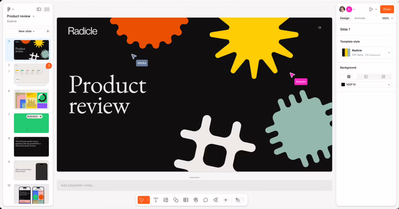
Google Slides + Nano Banana (collaboration + AI visuals)
Google Slides is still the most practical pitch deck software when multiple people need to touch the deck — writers, founders, advisors, and operators. It shines when the deck is a living document that evolves weekly, not a one-off artifact.
Pairing it with Nano Banana (or similar AI visual tools) solves Google Slides’ biggest weakness: visuals. The result is a workflow where structure and collaboration live in Slides, while diagrams, section visuals, and explanatory graphics are generated quickly without opening a design tool. This combination works especially well when you’re iterating on positioning and need to repeatedly adjust slides like the problem slide without breaking layout consistency.
Key features
- Real-time multi-user editing
- Inline comments and suggestions
- Version history and rollback
- Easy sharing for async review
- Fast insertion of AI-generated visuals
Pros
- Best-in-class collaboration
- Extremely fast iteration
- Ideal for distributed teams
- Low friction for feedback loops
Cons
- Visual ceiling without AI assistance
- Easy to lose narrative ownership
- Can drift into “committee-built” decks
Best fit
- Remote or multi-founder teams
- Accelerators and advisory-heavy environments
- Decks that change often before locking
PowerPoint (data-first credibility and universal compatibility)
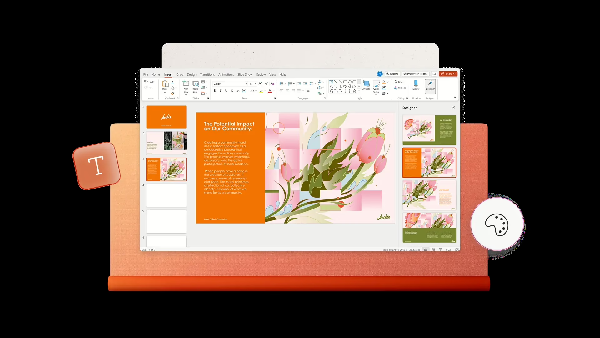
PowerPoint remains the safest choice when credibility, data clarity, and compatibility matter more than novelty. It’s still the most widely accepted pitch deck presentation format in institutional, corporate, and later-stage environments — largely because it survives forwarding, offline review, and scrutiny without breaking.
Where PowerPoint excels is structured reasoning. It’s particularly strong when the pitch relies on numbers, forecasts, and logic chains, and when slides like how to present financials in a pitch deck must be clear rather than decorative.
Key features
- Master slides and layout control
- Strong charting and Excel integration
- Presenter mode and speaker notes
- Reliable PDF and PPT export
- Familiarity across all investor types
Pros
- Maximum compatibility
- Strong for financial and analytical slides
- Predictable output across devices
- Trusted in formal environments
Cons
- Easy to overstuff slides
- Collaboration less fluid than cloud-native tools
- Visual polish requires discipline
Best fit
- Data-heavy pitches
- Enterprise and institutional audiences
- Decks expected to circulate widely
Visme (visual-first decks and hybrid storytelling)
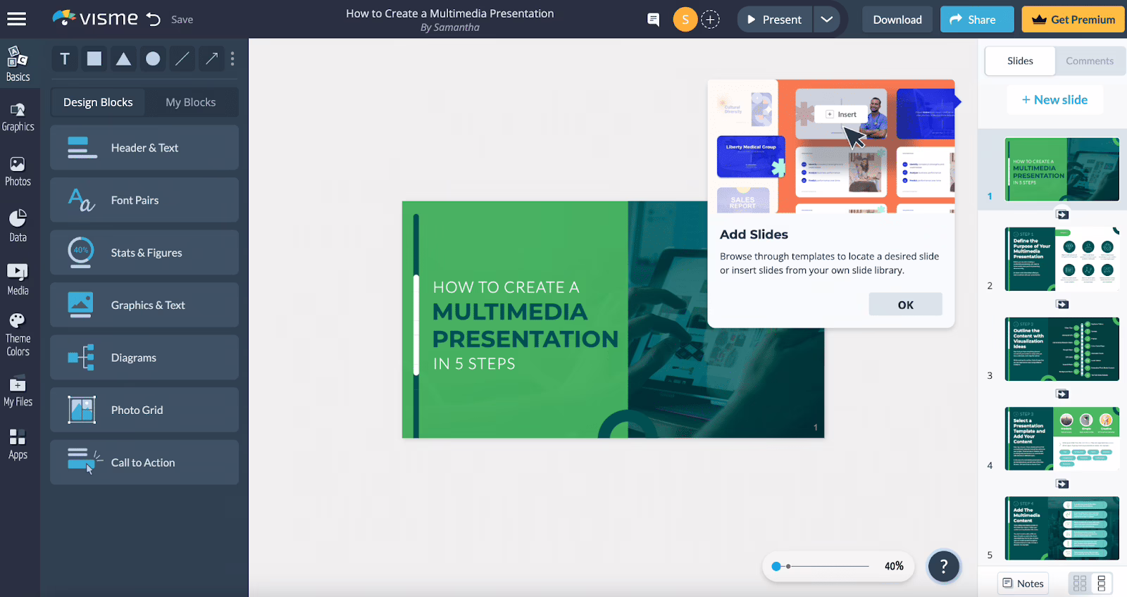
Visme sits between classic slide tools and visual communication platforms. It’s useful when your pitch deck needs to explain rather than just state — especially for complex products, abstract concepts, or narrative-heavy stories.
Its strength is turning ideas into visual blocks quickly, which makes it effective for decks where storytelling clarity matters more than numerical depth. Visme works best when anchored to a clean narrative flow, particularly around problem–solution slides, where visuals help comprehension rather than decorate.
Key features
- Visual templates and infographic modules
- Diagram and icon libraries
- Mixed-media slide elements
- Collaborative editing (plan-dependent)
- PDF and visual exports
Pros
- Strong visual communication without heavy design work
- Good for simplifying complex ideas
- Faster than full design tools
- More expressive than basic slide software
Cons
- Template gravity if not customized
- Less suited for finance-heavy decks
- Can encourage visuals over clarity
Best fit
- Concept-heavy or explanatory pitches
- Marketing-led narratives
- Decks where understanding beats precision
Canva (speed-first pitch decks for early-stage clarity)
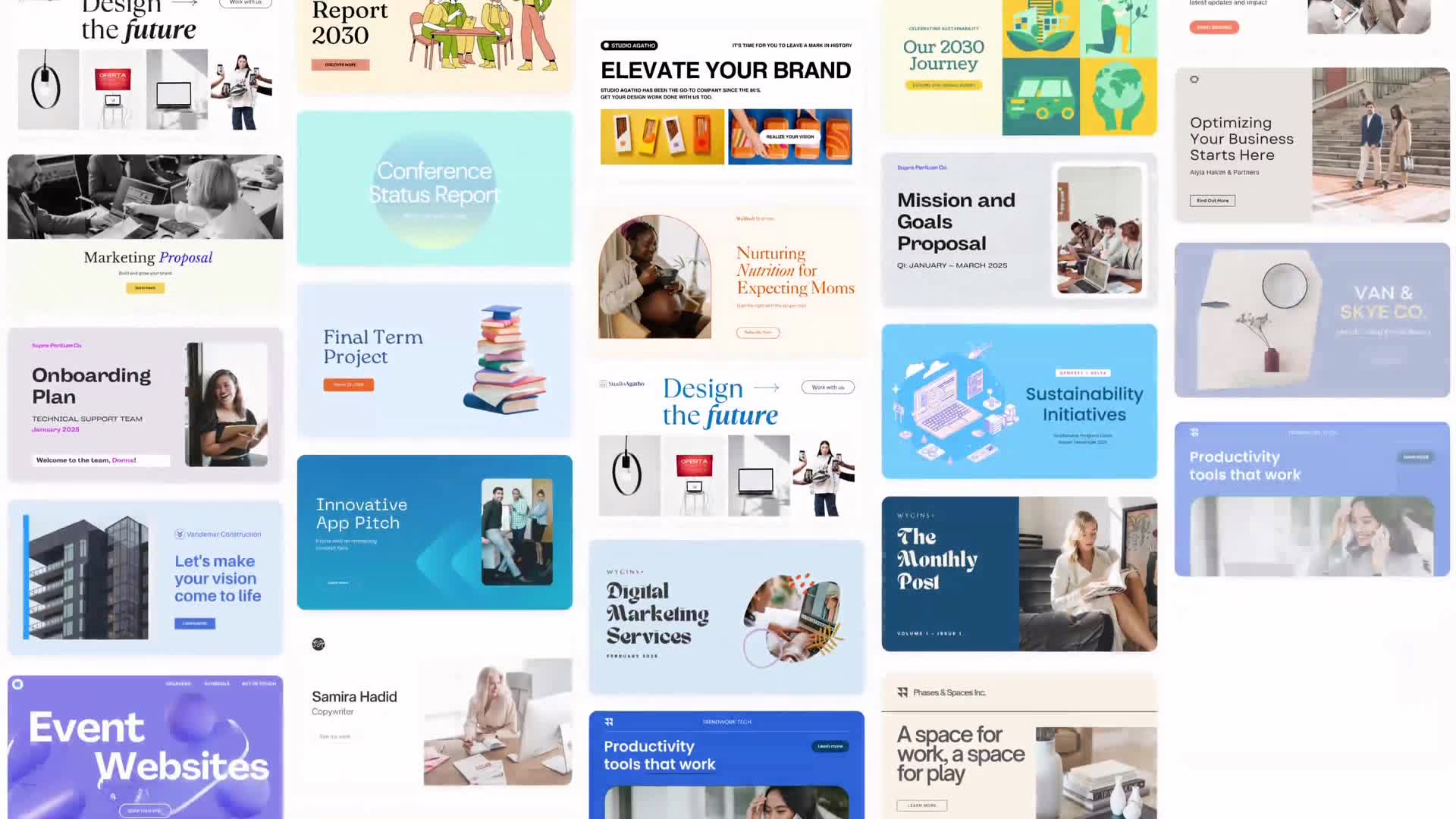
Canva reflects a preference for cognitive ease. When evaluators encounter familiar layouts, predictable spacing, and visually calm slides, resistance drops—not because the idea is stronger, but because the presentation demands less mental energy to parse.
This pattern typically shows up in early-stage or exploratory pitch decks, where visual coherence matters more than analytical depth. Canva’s templates align with how early evaluation environments tolerate ambiguity, a dynamic commonly discussed in basic pitch decks where simplicity reduces overload.
Best fit: early-stage founders, exploratory narratives, low-friction review contexts
Primary limitation: visual familiarity can mask weak structural logic
Pitch (modern decks that favor alignment over persuasion)
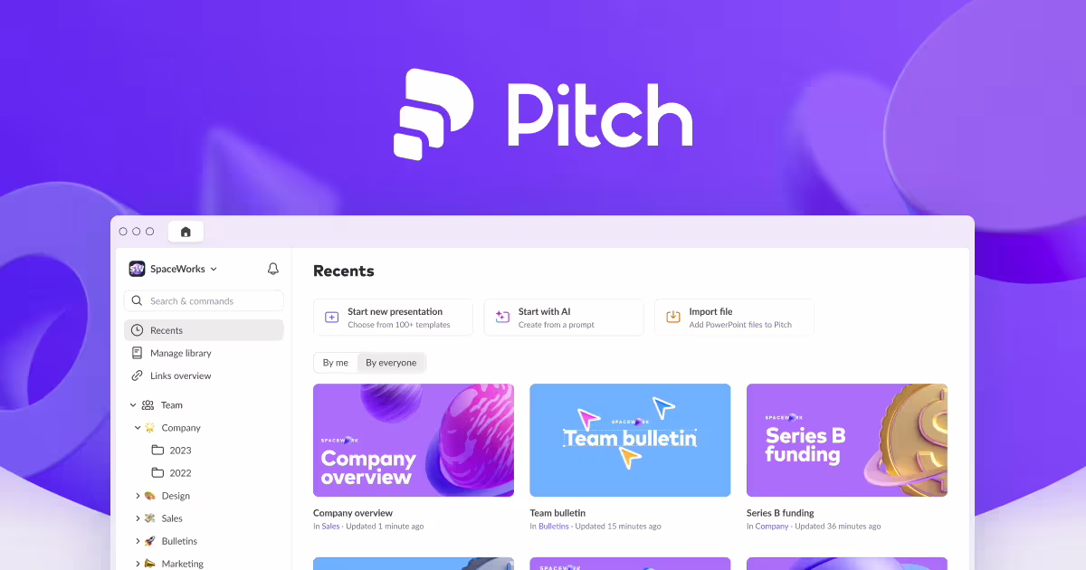
Pitch operates in environments where shared understanding matters more than theatrical delivery. Its restrained layouts and modular structure support internal alignment and repeated review, rather than one-off persuasion moments.
This aligns with how decks function when used as reference artifacts rather than performance tools—a pattern that shows up clearly in what is a marketing deck contexts, where consistency and clarity outweigh narrative drama.
Best fit: internal strategy decks, partnerships, repeat-use presentations
Primary limitation: limited expressive range for complex storytelling
Keynote (narrative pacing and live interpretation)
Keynote supports environments where temporal control influences interpretation. Transitions, rhythm, and pacing shape how information is received when a deck is presented live rather than read asynchronously.
This dynamic aligns with how narrative framing manifests in spoken delivery, especially when structure must support memory and flow, a pattern often discussed in storytelling frameworks rather than static documentation.
Best fit: live pitches, rehearsed presentations, design-led narratives
Primary limitation: weaker support for rapid iteration and collaboration
Storydoc (reading-mode evaluation and async cognition)
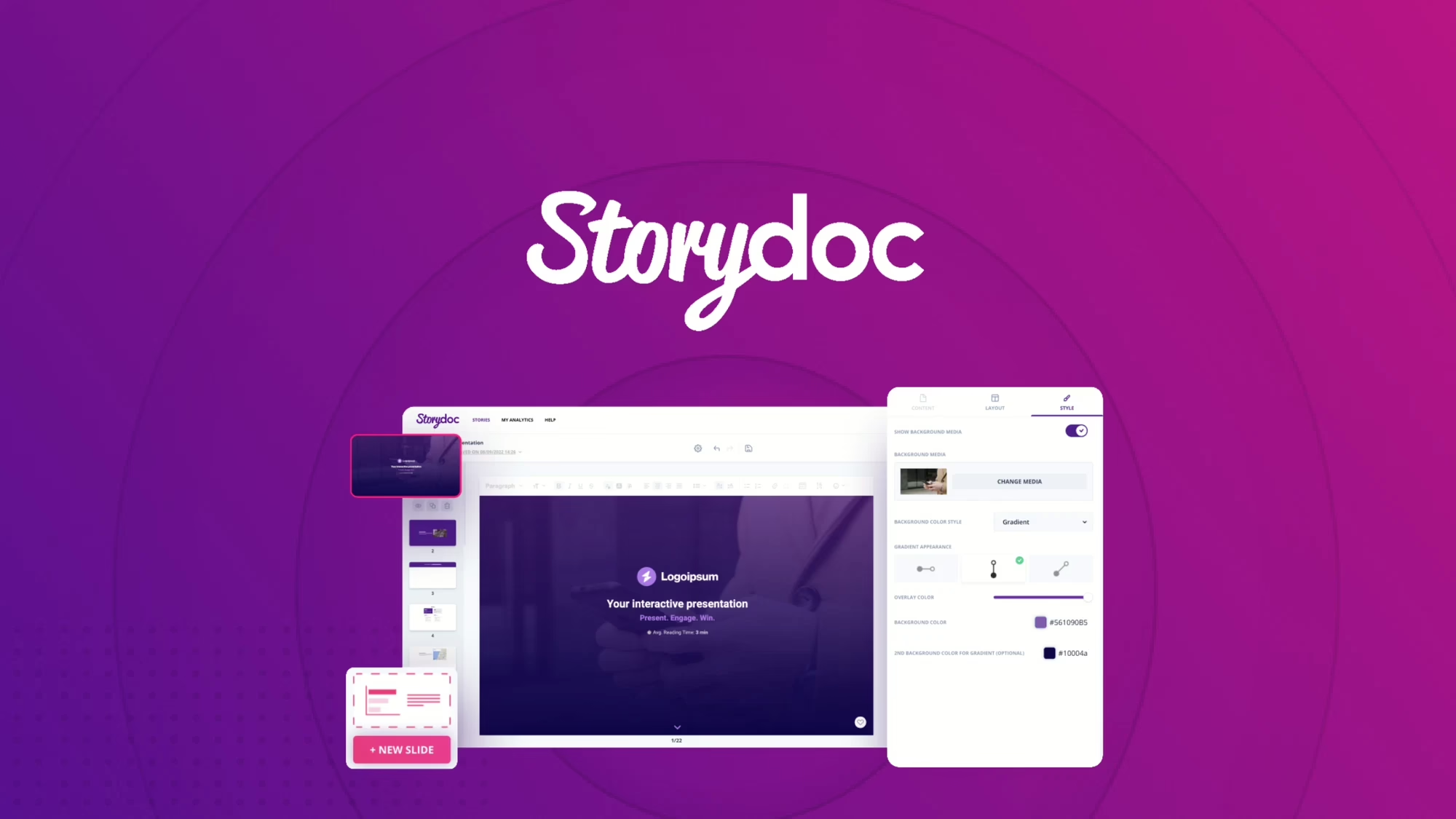
Storydoc reflects a shift from presentation to reading behavior. Scroll-based formats change how evaluators process information—favoring continuity, context, and self-paced review over moment-to-moment emphasis.
This aligns with how decks are interpreted when no presenter is present, a pattern that shows up clearly in how to create a short vs long pitch deck, where format length and consumption mode alter comprehension.
Best fit: async investor review, SaaS narratives, remote evaluation
Primary limitation: reduced effectiveness in live presentation settings
Beautiful.ai (constraint-driven visual coherence)
Beautiful.ai enforces structural discipline through constraint. By limiting layout freedom, it reduces visual noise and ensures predictable hierarchy—an approach that mirrors how evaluators prefer consistency when scanning unfamiliar information.
This reflects the same response pattern discussed in pitch deck design mistakes, where excessive freedom often leads to cognitive friction rather than clarity.
Best fit: standardized decks, teams needing guardrails
Primary limitation: limited expressiveness for differentiated narratives
Slidebean (automation as interpretive compression)
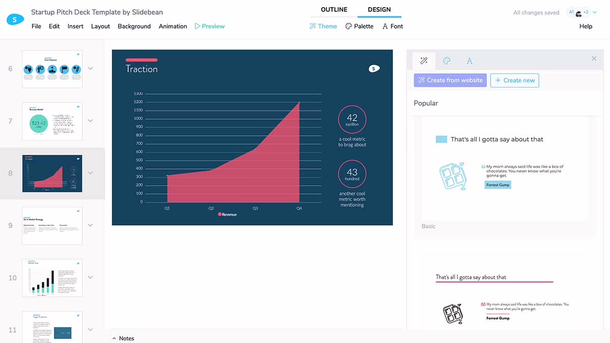
Slidebean functions as an interpretive compression layer. By automating layout decisions, it reduces the number of visual variables an evaluator must resolve, shifting attention toward content sequencing instead of design choices.
This aligns with how automation shows up in modern pitch environments, especially when contrasted with manual structuring discussed in chatgpt pitch deck contexts—where speed and consistency are prioritized over nuance.
Best fit: time-constrained fundraising, accelerator review cycles
Primary limitation: homogenization of visual expression