


A while back, I coached a medtech founder with great science, real traction… and a pitch deck that read like an FDA filing sprinkled with AI buzzwords. By slide four, the room was already lost.
Not because the idea was bad.
Because the deck was unreadable.
That’s the quiet killer in healthcare pitching. Not lack of innovation — lack of clarity.
In regulated industries, your deck is a review artifact. It needs to be easy to scan, easy to validate, and easy to understand by people who are time-poor and risk-aware. If your mechanism, outcomes, and pathway aren’t immediately legible, you’re creating friction before the conversation even starts.
This guide is built as a practical execution manual.
It focuses on how to structure, assemble, and present a medical pitch deck so it can actually be reviewed — not admired.
If you want the upstream context — how healthcare, biotech, medtech, and life sciences opportunities are evaluated and screened — that’s covered in our Healthcare & Life Sciences Capital Evaluation (Hub 2) guide. This page assumes that context and focuses purely on building the deck correctly.
What Is a Medical Pitch Deck?
A medical pitch deck is a structured presentation artifact used to communicate a healthcare, biotech, medtech, or digital health opportunity in a way that is:
- reviewable
- defensible
- and aligned with regulated-industry expectations
Unlike generic startup decks, a medical pitch deck is not just a story about growth. It is a combination of:
- clinical logic – what it does and why it works
- regulatory pathway – how it gets approved, by whom, and when
- commercial pathway – who pays, how, and why
- operational reality – how it fits into real clinical workflows
In practice, it’s used for:
- fundraising (VC, PE, angels, strategics)
- hospital partnerships and pilots
- licensing discussions
- corporate development conversations
- grant and public funding applications
Which means it has to satisfy multiple review lenses at once — clinical, regulatory, financial, and operational.
That’s why structure matters more here than in almost any other industry.
If the deck is confusing, the opportunity looks risky — even when it isn’t.
This guide shows you how to structure that complexity so it becomes readable instead of intimidating.
Step-by-Step Guide to Building a Medical Pitch Deck (That Actually Works)
This is the practical build process.
The mechanics of how to assemble a healthcare pitch deck so it’s readable, defensible, and reviewable in real medical, biotech, and healthtech contexts.
Step 1: Define the job of the deck (before you touch slides)
Before you write a single word, you need to know what this deck is supposed to do.
A medical pitch deck can be used to raise capital, secure a hospital pilot, pitch a strategic partnership, license technology, or support a grant or public funding application. Same format. Very different emphasis.
If you’re unsure whether you need a short version, a long version, or both, use this breakdown on how to create a short vs long pitch deck to decide upfront.
Lock this first. Everything else depends on it.
Step 2: Choose the right pitch deck length early
Deck length is not a creative choice. It’s an execution constraint.
If you don’t decide this upfront, you’ll end up with a 27-slide Frankenstein that no one enjoys reviewing.
Use this guide on ideal pitch deck length by use case to set boundaries before you start writing.
As a rule of thumb:
- 10–12 slides = first conversations
- 15–20 slides = serious diligence conversations
- 20+ slides = internal, technical, or clinical deep dives
Pick your lane early.
Step 3: Write your one-sentence elevator pitch
If you can’t explain what you do in one sentence, your slides will ramble. Guaranteed.
Use this structure:
We help [specific clinical or operational user] achieve [measurable outcome] by [mechanism], validated by [type of proof].
If you want examples and a tighter framework, use this guide on writing a strong one-sentence elevator pitch to sharpen it.
This sentence becomes the backbone of your deck.
Step 4: Build a proof inventory before you write slides
This is where most healthcare founders go wrong.
They write a beautiful story and then scramble to find evidence to support it.
Do the opposite.
Before opening PowerPoint, list what you actually have: clinical data, regulatory pathway notes, reimbursement logic, integration details, traction artifacts, and team credibility. If you’re early and don’t have hard metrics yet, this guide on showing traction without revenue will help you avoid sounding vague.
This list tells you what kind of deck you can realistically build.
Step 5: Outline the deck using a clean 12-slide structure
Don’t freestyle. Use a proven structure and adapt it to your case.
Slide 1 – Elevator Pitch
What it is, who it’s for, what changes. If you struggle here, use this breakdown on how to build a strong hook slide.
Slide 2 – Highlights
Traction, data, milestones, team. Four blocks max.
Slide 3 – The Problem
Clinical pain, workflow pain, cost of doing nothing. If you keep overcomplicating it, this guide on structuring problem–solution slides will keep you honest.
Slide 4 – The Opportunity
Market size, timing, why now. For market sizing, use this walkthrough on TAM, SAM, and SOM in a pitch deck, and avoid these common TAM slide mistakes that make numbers look made up.
Slide 5 – The Solution
What it is, how it works, what changes in practice.
Slide 6 – Validation
Clinical proof, study design, early data, what’s next.
Slide 7 – Product / Workflow
How it fits into real healthcare delivery. Integration matters here.
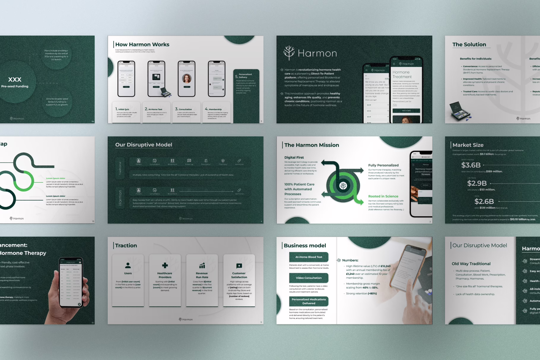
Slide 8 – Business Model
How revenue happens, pricing logic, unit economics direction. If this section always feels weak, this guide on how to present financials in a pitch deck will help.
Slide 9 – Go-to-Market
Who you sell to first and why they say yes.
Slide 10 – Competition
How alternatives solve it today and what you do differently.
Slide 11 – Roadmap / Milestones
Clinical, regulatory, and commercial milestones in sequence.
Slide 12 – Ask / Next Step
What you need and what it unlocks.
That’s it. No 18-slide hero journeys.
Step 6: Write slide headlines that carry the story
If someone only reads your slide titles, they should still understand the narrative.
This is non-negotiable.
Use this guide on writing pitch deck headlines that actually hook and stop wasting your best messaging inside body text.
Step 7: Decide the text vs visuals ratio intentionally
Healthcare decks usually fail in one of two ways: walls of clinical text or glossy visuals with zero substance.
You need balance.

This breakdown on text-heavy vs image-heavy pitch decks will help you avoid both extremes.
The goal is clarity with evidence, not decoration.
Step 8: Build your design system before designing slides
Don’t improvise design. It shows.
Lock your fonts, color rules, layout grid, and chart styles before you design anything. If you need guidance, these resources will save you hours:
- How to design a pitch deck
- Common pitch deck layout mistakes
- Font psychology in pitch decks
- Color psychology for pitch decks
This is how you avoid the “it looks okay but feels off” problem.
Step 9: Run a mistake sweep before sending
Before the deck leaves your laptop, check for visual errors, structural mistakes, and content bloat.
These three guides cover 90% of what founders get wrong:
- Visual design errors founders make in pitch decks
- The most common pitch deck mistakes
- Content mistakes in pitch decks (too much, too little, too vague)
This step alone removes most amateur signals.
Step 10: Prepare the delivery layer
Serious healthcare pitches usually need a short version, a long version, and a one-pager for forwarding.
This guide on creating a one-pager from your pitch deck shows you how to condense without losing meaning. And if you want to stay sharp in meetings, this breakdown on handling investor Q&A is worth reading.
The deck opens the door. Your delivery keeps it open.
Step 11: Tools (only if speed is your bottleneck)
If production speed is slowing you down:
Use tools to accelerate execution — not to replace thinking.
Here are some more specific slide guides for you.
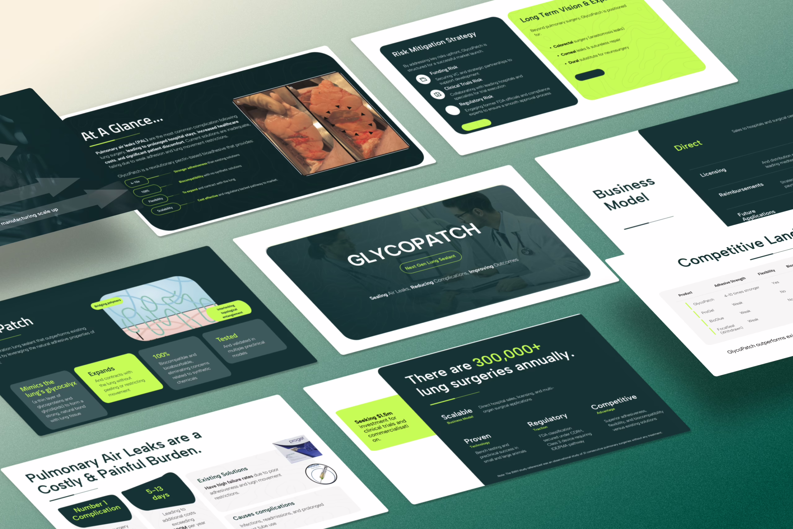
1. How to Build the Regulatory Pathway Slide (FDA, CE, UKCA)
This slide exists for one reason: to make your approval path legible in 10 seconds.
Not impressive. Not academic. Legible.
Your goal is to show:
- what class you fall into
- which pathway you’re taking
- where you are now
- what comes next
- and how long each step realistically takes
Nothing more.
What this slide should contain
At minimum:
- Regulatory body (FDA, EMA, MHRA, etc.)
- Device class or product category
- Pathway (510(k), De Novo, PMA, CE Mark, UKCA, etc.)
- Current status (pre-sub, in review, cleared, approved)
- Next milestone + timeline
How to lay it out
The cleanest format is a horizontal timeline:
Now → Pre-Sub → Submission → Review → Clearance/Approval
Each step gets:
- a label
- a duration
- and a one-line note if needed (e.g. “clinical data required”)
No paragraphs. No legal disclaimers. No regulatory essay.
If you’re unsure how much detail is appropriate on slides like this, the same clarity rules apply as in this breakdown on how to structure technical slides in a pitch deck.
Common mistakes to avoid
- Hiding the pathway in text
- Mixing FDA and CE logic on the same slide
- Pretending timelines are shorter than they are
- Using vague labels like “in progress” or “underway”
If you don’t know your pathway yet, say that. Ambiguity reads worse than honesty.
2. Clinical Validation Slides: What to Show at Each Stage
Clinical data slides should answer one simple question:
“Does this actually work, and how do you know?”
The structure of this slide changes depending on where you are.
Pre-clinical stage
Show:
- model used (in vitro, animal, simulation, etc.)
- outcome metric
- sample size
- result headline
One chart. One caption. No methods section.
Pilot stage
Show:
- number of patients
- setting (single site, multi-site, etc.)
- primary metric
- improvement vs baseline
If you have qualitative feedback, add one short quote. Not three.
If you’re struggling with how to present early traction cleanly, this guide on showing momentum without revenue applies here too.
Phase I / II / III
Show:
- phase name
- objective
- design (randomized, blinded, etc.)
- key outcome
- next step

This is where most decks collapse into unreadable tables. Don’t.
If the chart can’t be understood without explanation, it doesn’t belong on the slide.
3. Reimbursement & CPT Slide: Showing How You Get Paid
This is the slide almost everyone avoids — and almost everyone asks about.
Your job here is not to solve reimbursement.
Your job is to show you understand the pathway.
What to show
Depending on your case:
- existing CPT / DRG codes
- planned code strategy
- private payer route
- cash-pay logic
- cost offset model
Structure it as:
- Who pays
- For what
- Under which mechanism
One simple table works best.
| Who | Pays for | Via |
|---|---|---|
| Hospital | Procedure | DRG |
| Insurer | Service | CPT |
| Patient | Add-on | Cash |
Where this slide goes
After:
- solution
- validation
Before:
- go-to-market
If you put it at the end, it looks like an afterthought.
If your business model section feels vague, revisit this guide on how to present financials in a pitch deck and tighten the flow.
4. EHR & Workflow Integration Slides: Showing Adoption Reality
If you don’t show how this fits into real workflows, reviewers will assume it doesn’t.
Simple as that.
What this slide should answer
- Where does your product sit in the clinical flow?
- Who touches it?
- How long does it take?
- What system does it integrate with?
Best visual format
Use a before / after workflow diagram:
Before:
Patient → Nurse → System → Doctor → Delay
After:
Patient → Your Product → Doctor → Action
Add integration points:
- Epic
- Cerner
- Allscripts
- custom EHR
Logos are fine. Fantasy is not.
If you’re unsure how to structure workflow visuals cleanly, the same layout rules from pitch deck layout best practices apply here.
5. AI in Healthcare Slides: How to Show Explainability Without Buzzwords
If your slide says “AI-powered” and nothing else, you’ve said nothing.
This slide needs to show mechanism, not magic.
What to include
- Input data types (images, labs, notes, signals, etc.)
- Model type (classification, prediction, NLP, etc.)
- Output (alert, score, recommendation, automation)
- Human in the loop (where a clinician intervenes)
Visual structure that works
Pipeline diagram:
Data → Model → Output → Clinical Action
Add two small callouts:
- bias mitigation
- explainability method (e.g. SHAP, rule layer, audit log)
No math. No hype. No black box language.
If you want to tighten your overall slide language, the rules in how to write strong pitch deck headlines apply perfectly here.
6. Hospital Pilot Slides: How to Show Real-World Use Without Overclaiming
A pilot slide should show reality, not ambition.
What qualifies as a pilot
- named site
- timeframe
- use case
- outcome metric
That’s it.
If you don’t have a named site, call it a “trial” or “test”. Don’t fake gravity.
Structure that works
- Site name / type
- What was deployed
- Who used it
- What changed
- What you learned
One slide. Five bullets. No marketing language.
If you’re early and still building credibility, this connects well with how to structure problem–solution slides to show progression.
7. Common Failure Patterns in Medical Pitch Decks (and How to Fix Them)
Most medical decks don’t fail because the idea is bad.
They fail because the signal gets buried under noise.
Here are the patterns that kill credibility — and how to fix each one.
Pattern 1: Regulatory Vagueness
What it looks like:
“FDA approval in progress” with no class, pathway, or timeline.
Why it fails:
It reads like you haven’t done the homework.
Fix:
Add a dedicated regulatory pathway slide showing:
- class
- pathway (510(k), De Novo, PMA, CE, UKCA)
- current status
- next milestone
No text blocks. Just structure.
Pattern 2: Clinical Data Overload
What it looks like:
Six charts, tiny fonts, unreadable tables.
Why it fails:
Reviewers stop trying.
Fix:
One metric per slide.
One message per chart.
If it needs explanation, it doesn’t belong on the slide.
Pattern 3: Reimbursement Hand-Waving
What it looks like:
“We’ll work with payers” or “insurance will cover it.”
Why it fails:
It signals risk, not optimism.
Fix:
Add a simple reimbursement slide showing:
- who pays
- for what
- via which mechanism (CPT, DRG, private payer, cash)
Even “planned” is better than “unspecified.”
Pattern 4: Workflow Fantasy
What it looks like:
No mention of integration, training, or clinical reality.
Why it fails:
People assume it won’t be adopted.
Fix:
Add a workflow integration slide with:
- before / after flow
- EHR touchpoints
- who actually uses it
Reality beats aspiration.
Pattern 5: Buzzword AI Slides
What it looks like:
“AI-powered”, “machine learning”, “proprietary algorithms” — nothing else.
Why it fails:
It says nothing.
Fix:
Use a pipeline diagram:Input → Model → Output → Clinical Action
Add explainability + human-in-the-loop.
Pattern 6: Team Slides with No Domain Signal
What it looks like:
Generic bios, no healthcare relevance.
Why it fails:
Execution risk spikes.
Fix:
Show relevant experience:
- regulatory
- clinical
- healthcare ops
- prior exits in the space
Not job titles. Proof of execution.
8. Deck Versions: First Meeting vs Diligence vs Board Review
One deck cannot serve all stages.
Trying to do that is how you end up with bloated, unfocused slides.
Here’s how to structure each version.
First Meeting Deck (10–12 slides)
Purpose: clarity + interest
Focus on:
- problem
- solution
- validation headline
- regulatory path (high level)
- use case
Leave out:
- deep financials
- detailed clinical tables
- long roadmaps
This deck should be readable in 5 minutes.
Diligence Deck (15–20 slides)
Purpose: proof + structure
Expand:
- clinical data
- regulatory detail
- reimbursement logic
- integration reality
- milestones
This is where:
- CPT codes
- pilot metrics
- timelines
- dependencies
belong.
Board / Internal Review Deck (20–30+ slides)
Purpose: execution control
Add:
- risks
- mitigation plans
- hiring plan
- operational dependencies
- budget logic
This deck is not for selling.
It’s for running the business.
9. Structuring a Medical Pitch Deck for Grants and Public Funding
Grant reviewers are not investors.
Your deck structure needs to reflect that.
What changes structurally
- Impact moves up
- Clinical relevance expands
- Market dominance shrinks
- Access + equity become visible
- Methodology gets more space
What to add
- population impact slide
- public health relevance
- alignment with funding body goals
- implementation plan
What to downplay
- aggressive revenue projections
- exit scenarios
- competitive chest-thumping
This is about outcomes, not ownership.
10. What Reviewers Actually Scan First (and How to Design for That)
People don’t read decks.
They scan them.
Design accordingly.
The scan pattern
- Headline
- Visual
- Key number
- Axis labels
- Caption
If your key message isn’t visible in the headline or the first visual, it’s invisible.
Practical design rules
- One message per slide
- One visual per message
- Numbers large enough to read on a laptop
- No text below 10pt
- No charts without labeled axes
Whitespace is not wasted space.
It’s comprehension space.
11. Medical vs Biotech vs Digital Health Decks (Structural Differences)
These are not the same story.
Don’t pretend they are.
MedTech Decks
Expand:
- regulatory pathway
- manufacturing
- validation
Compress:
- product vision
- future roadmap fantasy
Biotech Decks
Expand:
- mechanism of action
- trial design
- pipeline
Compress:
- UI
- workflow
- UX fluff
Digital Health Decks
Expand:
- workflow integration
- adoption
- ROI logic
Compress:
- molecular detail
- scientific exposition
Same format. Different weight.
12. How to Prepare Backup Slides for Clinical & Regulatory Questions
If you need to answer a question with “we’ll follow up”, you’re behind.
Backup slides let you:
- stay in control
- answer confidently
- avoid derailing flow
What belongs in backup
- detailed clinical tables
- regulatory correspondence
- expanded timelines
- additional charts
- study design detail
How to structure them
- clear titles
- numbered appendix
- referenced from main deck
Never interrupt the main flow.
Let backup slides support it.
13. Pre-Flight Checklist: What to Review Before You Send a Medical Pitch Deck
By the time you reach this point, your deck should already be structurally sound.
The slides exist. The story flows. The sections are in place.
This final step is not about adding more.
It’s about removing friction.
Before you send a medical pitch deck to anyone — investor, hospital, partner, grant committee, internal review — it should pass a basic sanity check. Not a branding review. Not a design critique. A can this be reviewed without confusion test.
Use this as a last pass.
Clinical & Product Clarity
Start with the most basic question:
- Is it immediately clear what the product does?
- Is the clinical use case specific (not “improves care”, but how, where, and for whom)?
- Are outcomes described in concrete terms, not generalities?
If someone has to ask “so… what exactly is this?”, the deck is not ready.
Regulatory Pathway Visibility
In healthcare, ambiguity reads as risk.

Check:
- Is the regulatory body named (FDA, EMA, MHRA, etc.)?
- Is the pathway explicit (510(k), De Novo, PMA, CE, UKCA, etc.)?
- Is current status visible, not buried in text?
- Is the next milestone obvious?
A reviewer should not need to search for this. It should be immediately legible.
Validation & Evidence
This is where credibility is either established or quietly lost.
- Is there at least one slide that shows real data?
- Is the study design understandable (pilot, retrospective, pre-clinical, etc.)?
- Is the primary outcome clearly stated?
- Is the sample size visible?
If the validation slide reads like marketing copy, it doesn’t function as validation.
Reimbursement & Business Logic
You do not need a perfect reimbursement strategy.
You do need a visible one.
Check:
- Is it clear who pays?
- Is it clear what they are paying for?
- Is the mechanism named (CPT, DRG, private payer, enterprise license, cash, etc.)?
- Does the pricing logic make sense in a healthcare environment?
If revenue feels like an afterthought, the whole opportunity will feel fragile.
Workflow & Adoption Reality
This is where many decks quietly fail.
- Is it clear where this fits in real clinical workflow?
- Is the actual user visible (nurse, physician, admin, patient, technician)?
- Are integration points acknowledged (EHR, device, system)?
- Is training or behavior change at least mentioned?
If adoption looks effortless because reality was ignored, it will be read as naïve.
Technology & AI Clarity (if applicable)
If your product uses AI or advanced analytics:
- Is the data source visible?
- Is the model function understandable at a high level?
- Is the output clear (alert, score, automation, recommendation)?
- Is there a human in the loop?
If the slide could be copy-pasted into any AI startup deck, it’s too generic.
Design & Readability
This is not about aesthetics. It’s about comprehension.
- One message per slide?
- Can headlines be understood without context?
- Are numbers readable without zooming?
- Are all charts labeled properly?
If someone has to work to understand the slide, they won’t.
Narrative Flow
Finally, zoom out.
- Does the story move logically from problem → solution → proof → reality → next step?
- Does anything feel out of sequence?
- Does any slide feel like it was added “because decks usually have one”?
If the flow feels disjointed, the opportunity will feel disjointed.
The Simple Test
Ask yourself:
“If this deck landed in my inbox from someone I don’t know, would I trust them to execute in a regulated environment?”
You’re not testing whether it’s exciting.
You’re testing whether it feels competent, grounded, and credible.
That’s the bar in healthcare.
Final Thought
In medical, biotech, and healthtech, a pitch deck is not a performance.
It’s a working document.
It’s read by people who are trained to look for risk, gaps, and weak assumptions.
It’s reviewed by people who see hundreds of similar claims every year.
It’s evaluated by people who don’t have time to decode unclear thinking.
Which means clarity is not a nice-to-have.
It is the product.
If the deck is easy to understand, easy to validate, and easy to follow, you’ve done your job.
If it isn’t, no amount of enthusiasm will save it.
Build it to be reviewed.
Not admired.