


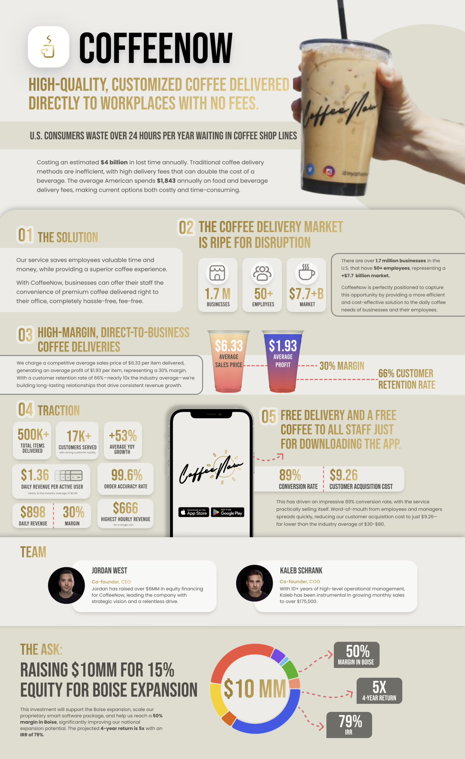
In evaluation environments, value propositions aren’t read the way founders expect. They’re scanned, compressed, and tested against time pressure, prior experience, and perceived risk. What sounds clear internally can show up as vague when processed externally.
This dynamic reflects how decision-makers evaluate unfamiliar claims: not by depth, but by legibility. A value proposition that can’t be interpreted quickly increases uncertainty, regardless of how strong the underlying product is. This is why value propositions function as cognitive filters rather than marketing statements.
This pattern is typically expressed through how early slides stabilize interpretation across an entire deck, which aligns with how a pitch deck is typically assembled.
What is a value proposition?
A value proposition is your main promise, said in a way that’s easy to understand.
It’s not a feature list. It’s not your tech. It’s not “we’re innovative.”
It’s what changes for the audience if they use what you offer.
People use your value proposition to quickly figure out:
- Who this is for
- What problem it removes
- What result it creates
That’s why this message usually lives on the value proposition slide: it gives the audience a clear “handle” before the details start.
What makes a great value proposition?
A great value proposition is easy to understand and easy to believe.
It works because it’s:
- clear (simple words)
- specific (real outcome, not vague claims)
- about results (what the audience gets)
If the message feels messy, people assume the business is messy too. If it feels clear, people feel safer moving forward.
This is the same idea behind the art of simplification: remove the noise, and the point becomes obvious.
How to create a killer value proposition
Step 1: Write the simplest version first (even if it’s ugly).
Start with one sentence that says what you do and what changes for the audience. Don’t worry about sounding “smart.” Worry about being understood.
Step 2: Replace product language with audience language.
Swap “our platform / our solution / AI-powered” with the audience’s reality: the pain, delay, cost, risk, or mess they live with. If the sentence still sounds like it was written by the company, it won’t land.
Step 3: Make the outcome obvious.
Add a clear result that someone can picture quickly. Avoid vague words like “better,” “streamlined,” or “optimized.” Say what improves: time, money, quality, speed, risk, or effort.
Step 4: Add a “because” that explains the difference.
In one short phrase, explain why you can deliver that outcome. Not your whole feature list — just the reason you’re not “same as everyone.”
Step 5: Cut anything that needs extra explaining.
If a word needs a follow-up sentence, it’s usually too complex. Keep only what the audience can understand on the first pass.
Step 6: Test it with a misread check.
Show it to someone outside the project and ask them to repeat it back in their own words. If they misunderstand it, tighten the wording. If they understand it but don’t care, you’re not connected to a real pain yet.
Step 7: Lock the final version to one sentence + one support line.
The one sentence is the promise. The support line is the proof-style outcome (what improves, by how much, or how fast). This keeps the message stable when it gets repeated across the deck.
This step-by-step fits the role early slides play in setting meaning across the deck, as explained in what is an investor pitch deck.
How to design a killer value proposition
People don’t read slides like articles. They look for the big message first, then they decide whether it’s worth reading anything else. So design isn’t decoration here — it’s what makes the promise visible.
So design changes how the value proposition feels:
If the main promise is small or buried, it feels weak
Even if the words are good, a buried headline communicates hesitation. It shows up as: too many bullets, the headline competing with other elements, or the promise sitting in the same visual “weight class” as everything else. When everything looks equally important, nothing feels important.
If it’s clear and easy to spot, it feels confident
Confidence, on a slide, is mostly hierarchy. A strong value proposition slide makes the promise the obvious “first stop” for the eyes. The reader should instantly know: this is the claim — and everything else is support, not competition.
If the slide is crowded, people stop trying
Crowding tells the reader they’ll have to work. And in evaluation mode, if they have to work, they often don’t. A crowded slide also makes the promise feel less certain, because it looks like you’re trying to compensate with volume. The brain reads clutter as risk.
A “killer” design doesn’t mean fancy. It means the audience can scan the slide and instantly see what matters: the promise first, then the support, then the detail (if needed). Clean hierarchy, breathing room, and no visual distractions.
This shows up in the most common layout failures covered in pitch deck design mistakes.
Additional value proposition examples
Here are a few simple, clear examples that people understand fast. They work because the promise is concrete, the audience is obvious, and the outcome is easy to picture.
Example 1 — B2B SaaS (sales team)
“Sales reps spend hours updating the CRM. We automate the busywork so your team spends more time selling — and less time typing.”
Why it lands: it names the pain (busywork), the fix (automation), and the outcome (more selling time).
Example 2 — Healthtech (patients)
“Get ongoing support for chronic care without weeks of waiting. Daily check-ins, simple plans, and faster help when symptoms flare.”
Why it lands: it removes friction (waiting) and makes the “after” feel real.
Example 3 — Fintech (banks / partners)
“Launch new digital banking features faster, without rebuilding your core systems.”
Why it lands: speed + reduced risk. No fluff.
Example 4 — Real estate (developers / investors)
“Cut construction delays by spotting issues early — before they become expensive surprises.”
Why it lands: it’s about avoided pain, not fancy features.
Example 5 — Consumer product (simple outcome)
“Cleaner skin in 30 days, without harsh ingredients.”
Why it lands: one outcome, one constraint removed.
Example 6 — Service business (clear promise)
“We turn your messy process into a simple system your team can actually follow.”
Why it lands: it speaks to the real pain (mess) and the real desire (clarity).
These examples are best used as patterns, not templates. You’ll see the same shapes across different industries in pitch deck examples.