


Got an event idea that could rival Coachella but can’t seem to get anyone to listen? Maybe the problem isn’t the idea — it’s the deck. Event proposals live or die on structure, clarity, and timing — not hype.
This guide is a mechanics-level execution resource. It shows you how to build an events pitch deck that meets professional expectations — from layout, slides, and storytelling, to financial clarity and client presentation order.
It operates under the consumer-brand evaluator logic defined upstream in Consumer Brand Capital Evaluation framework (Hub 2), which sets the standards this execution page follows.
Decision rules live there; this guide only shows how to meet them in practice.
Definition
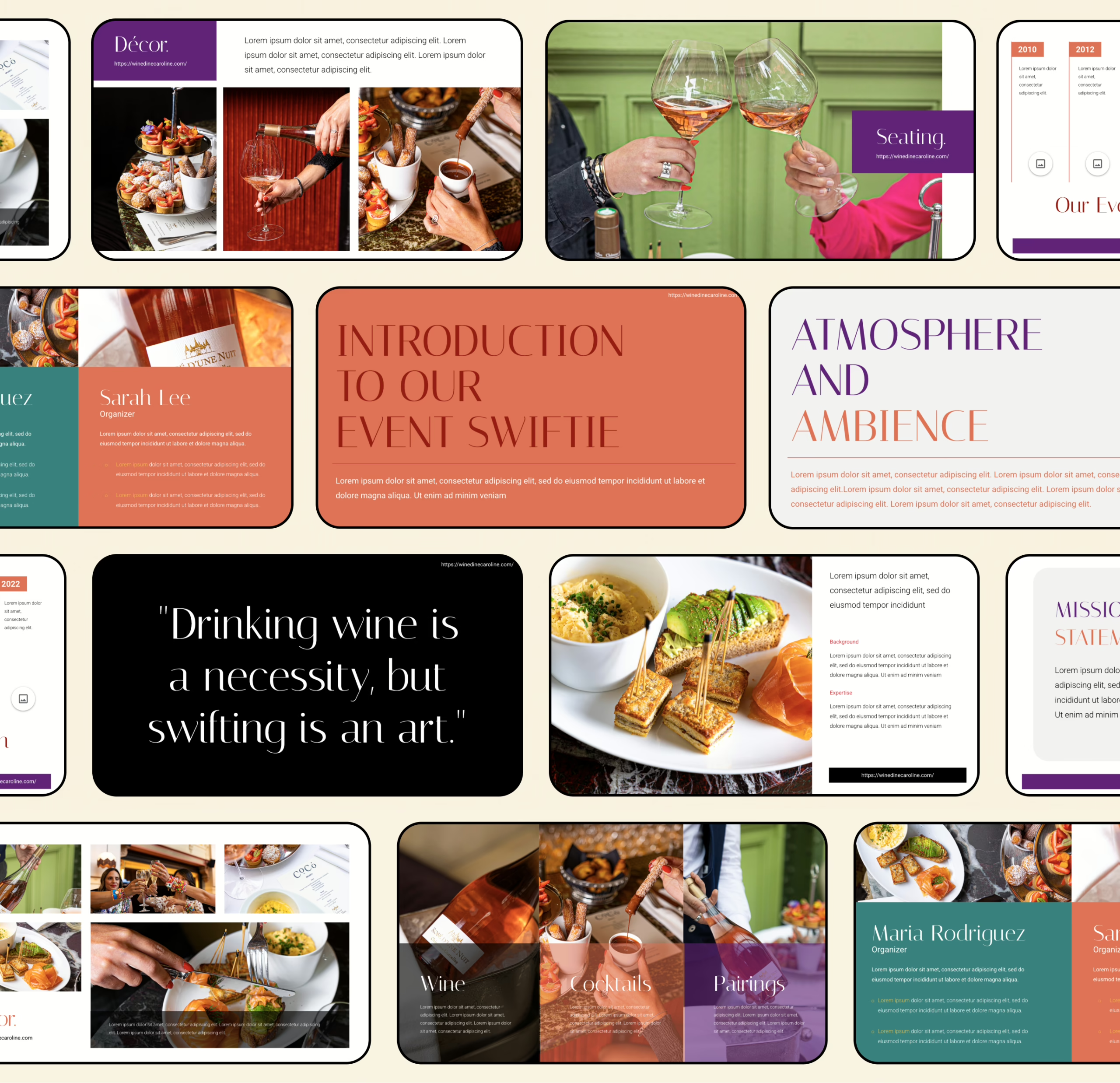
An events planning pitch deck is a structured presentation that outlines how your company plans, executes, and markets events — from concept to delivery. It communicates capabilities, creativity, and operational precision in a concise visual form.
Unlike a generic business deck, this one translates brand experience into event execution: what the client will see, how logistics work, and why your planning process inspires confidence.
This guide breaks down the mechanics — slide structure, hierarchy, formatting, and flow — required to make your event deck functional, clear, and review-ready.
Step-by-step: How to build an Event Planning Pitch Deck
1) Lock the job-to-be-done (what this deck must do)
Before you touch PowerPoint/Keynote, write one sentence:
- “This event proposal must get ____ to approve ____ by ____.”
Examples: client sign-off, sponsor commitment, venue partnership, internal budget approval.
If you want a fast way to sanity-check the opening, use the first-15-seconds test to make sure your top slide actually says something: first 15 seconds test.
2) Choose the format: short deck vs long deck
Don’t build a 25-slide “comprehensive event deck” if the audience needs a 10-slide decision brief.
Use these as your guardrails:
- Short deck (8–12 slides): decision overview, fast review
- Standard (12–18 slides): client-facing proposal + execution proof
- Long (18–25 slides): complex event management plan, multiple stakeholders, heavier logistics
Helpful references:
3) Write the “one line” that everything else supports
This becomes your internal compass for every slide you add:
- Event + audience + outcome + why you
If you want a clean format (and not a word salad), use: one-sentence pitch formula.
4) Build the narrative frame (so the deck doesn’t feel like random slides)
Your story is not “we are amazing.” It’s:
- Context → Stakes → Plan → Proof → Terms → Next steps
A practical way to keep the flow tight is to set the frame early and keep it consistent: deck framing mechanics.
5) Draft the slide outline (titles first, visuals later)
Write slide titles as complete statements, not labels.
Bad: “Marketing”
Good: “We’ll fill the room using 3 channels with predictable conversion points.”
If your outline is messy, it becomes a “deck found” situation (aka: looks like a template someone downloaded and never finished).
6) Create the opener trio (Hook → What it is → Why now)
This is where most event decks die: too vague, too pretty, too slow.
- Hook slide: one sharp visual + one clear claim
Reference: building a hook slide - Definition slide: what the event is, for whom, what success looks like
- Why now slide: timing, demand, cultural/market trigger, or internal urgency (without drama)
7) Problem + solution (yes, even for events)
Events still solve a business problem: attention, community, pipeline, brand heat, retention, launch momentum.
Keep it crisp:
- Problem: what’s not working today
- Solution: how this event fixes it specifically
For structure: problem/solution slide patterns.
8) Value proposition (translate “cool event” into business value)
This is where you connect creative to outcomes:
- What attendees get
- What the brand/client gets
- What sponsors/partners get
Use a clean structure so it doesn’t turn into fluffy promises: value proposition slide layout.
9) Show the event plan like an operator, not a poet
This is your event planning process slide set:
- Format (festival, activation, conference, brand event, etc.)
- Agenda / run-of-show
- Experience zones / stages (if relevant)
- Venue logic (why this place fits)
- Vendor map (AV, staging, catering, security, etc.)
If you need a reliable “visual story” approach (instead of wall-of-text):
10) Budget + cost management (make it reviewable in 20 seconds)
Most decks either:
- hide the budget (suspicious), or
- dump a spreadsheet (unreadable)
Do it in layers:
- Top-line budget summary (categories + totals)
- Cost drivers (what moves the number)
- Options (good/better/best)
- Contingency (simple, not paranoid)
For financial formatting mechanics:
11) Event marketing plan (distribution, not vibes)
Your event marketing plan should show:
- Channels (paid/organic/partners)
- Timeline (pre-launch → launch → last call)
- Conversion points (RSVP, ticketing, waitlist, lead capture)
- Content examples (what you’ll actually publish)
If you include “marketing” but can’t show execution, reviewers will treat it as filler.
12) Proof (portfolio, case studies, or credible substitutes)
Best: past events, photos, results, testimonials.
If you don’t have that yet, use:
- a pilot plan
- a partner/venue letter
- a realistic rollout
- a tight operational plan that reduces perceived risk
Also: avoid layout mistakes that scream “template.”
13) Risk, legal, and operations (short, calm, competent)
This is not where you write a legal essay.
It’s where you show you’ve covered:
- permits / insurance
- safety plan
- accessibility basics
- vendor backups
- weather contingencies (if relevant)
One slide. Maybe two. No panic tone.
14) Close with “the ask” + next step (clear terms, clear action)
Don’t end with “Thank you” as the most actionable thing on screen.
Close with:
- what you need (budget approval / signature / sponsor amount / partnership)
- what happens next (call, site visit, timeline)
- who owns what
15) Design pass (only after the logic is stable)
Polish last. Always.
If you need fast, practical guidance:
- how to design the deck without overdesigning
- color psychology used responsibly
- font choices that don’t sabotage clarity
16) Build and ship (tools + export settings)
Pick tools based on workflow, not trends:
- Keynote for speed
- PowerPoint for compatibility
- Canva only if you control typography and spacing
Tooling references:
Now that you’ve seen the steps, let’s go deeper into execution.
Quick-start blueprint
Use this if you’re building an event proposal deck fast and want it to read “review-ready,” not “template-y.”
- Start with outcome, not origin story: what the event delivers (attendance, leads, brand moment, partner value) in 1–2 lines.
- Lock a clean slide spine (10–14 slides): concept → audience → experience → plan → timeline → budget → promotion plan → risk → proof → next step.
- Write slide titles as statements: each headline should complete a thought (tight formats help—see headline writing patterns).
- Keep content density controlled: one message per slide; cut anything that feels like filler (use a simplification playbook when you get stuck).
- Make it look bespoke: consistent spacing, consistent typography, and no “Canva-default energy” (quick audit via how decks end up looking templated).
- Budget must scan in 15 seconds: top-line totals first, detail second.
- Proof beats adjectives: even lightweight evidence is better than “we’re passionate.”
- End with a clear next step: decision required + date + owner + what happens next.
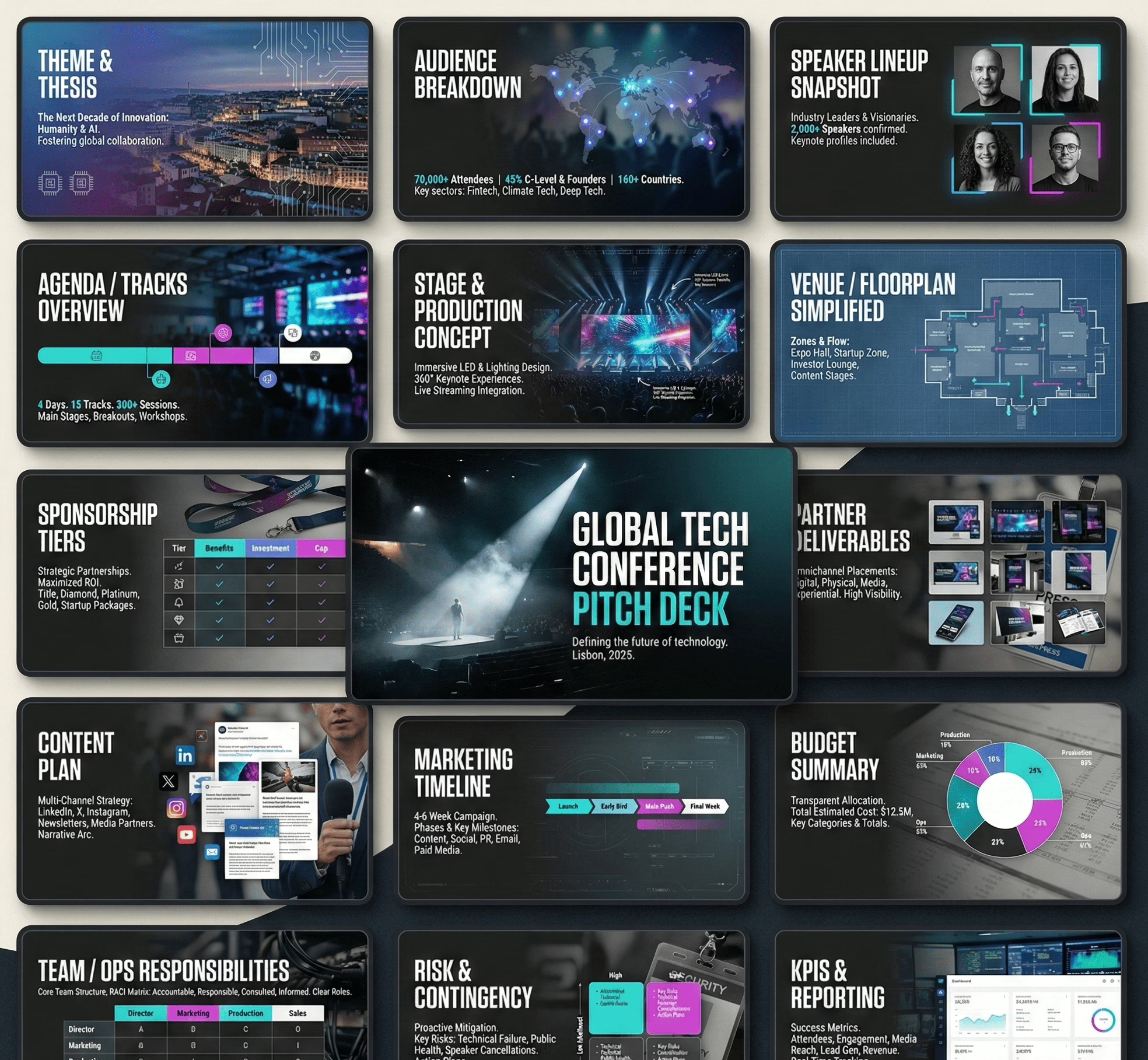
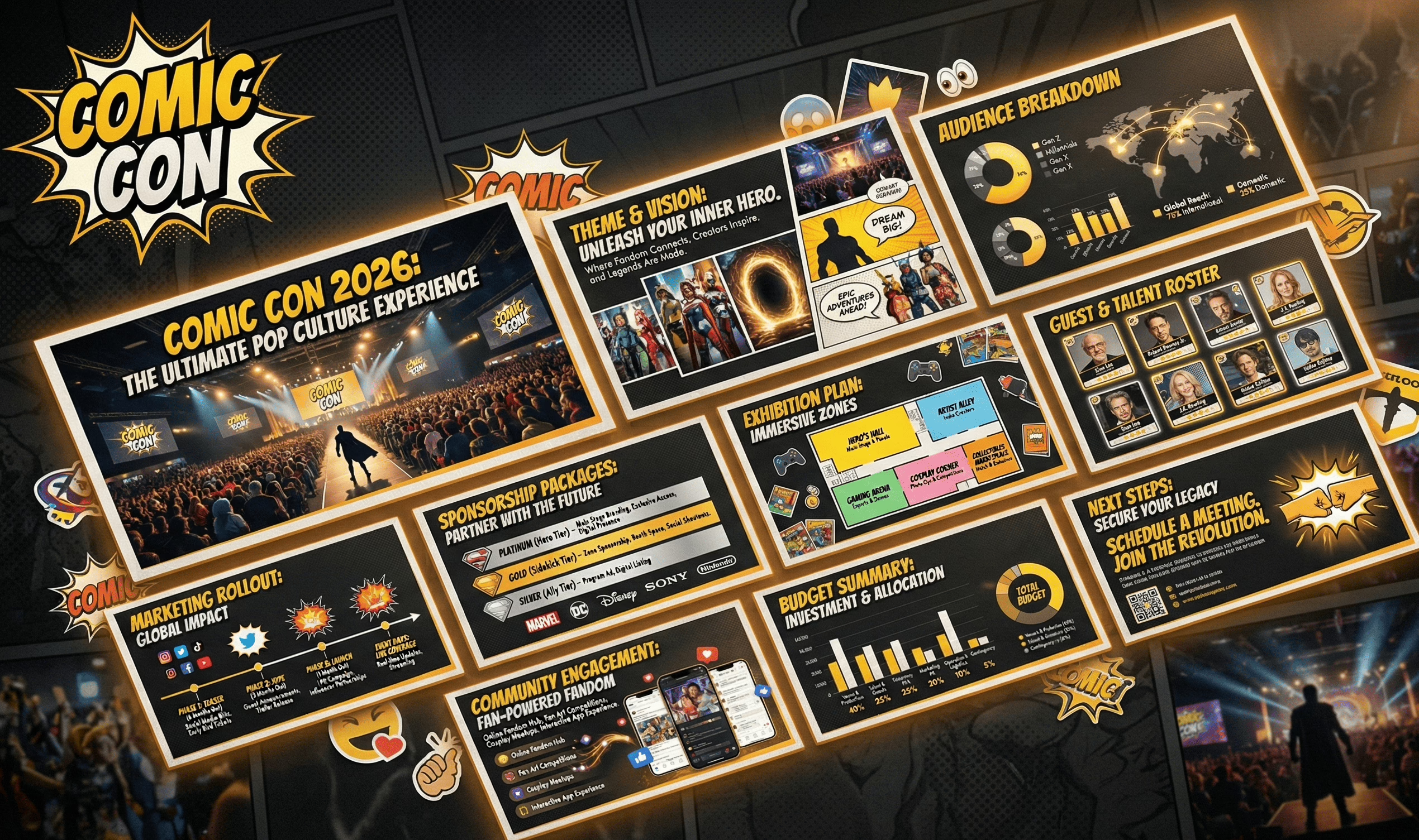
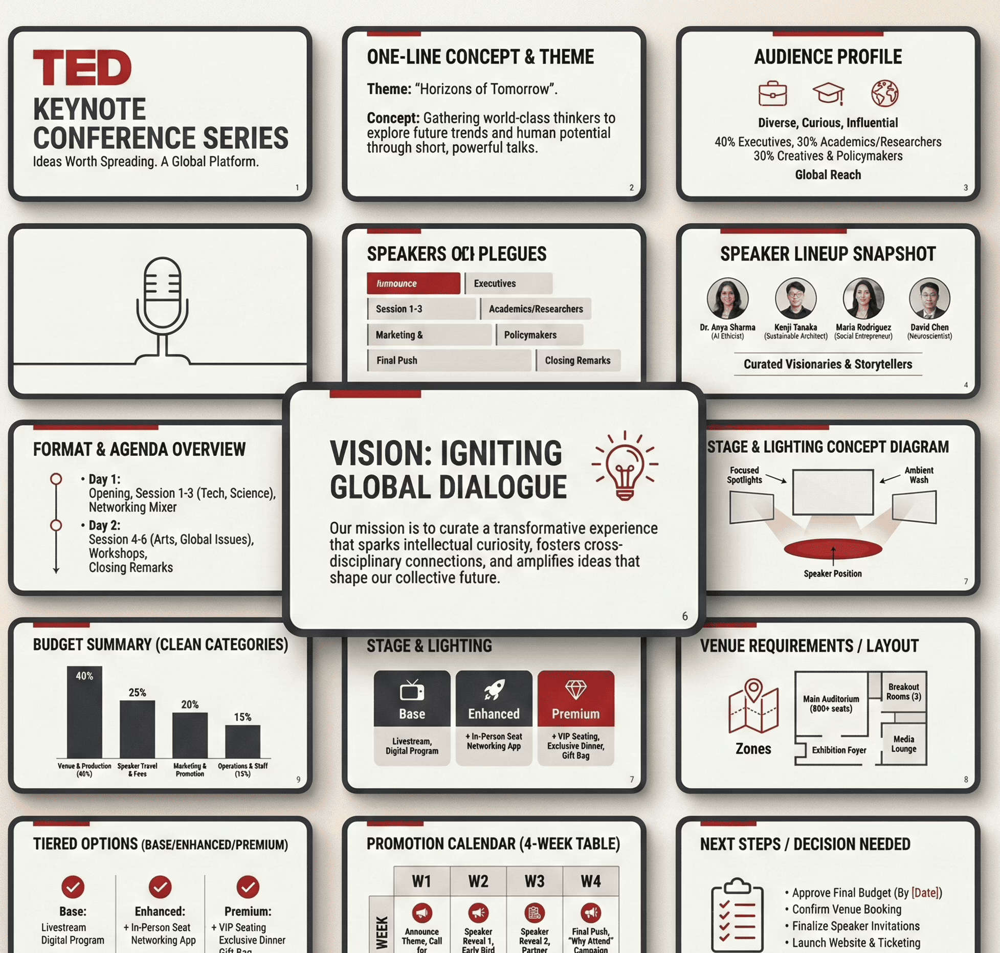
Slide-by-slide checklist
Use this as your build checklist. Keep it boring. Boring closes deals. 😄
| Slide | Purpose | Must include | Common fail |
|---|---|---|---|
| 1. Cover | Identify the proposal instantly | Event name, date window, location, brand/client | Over-designed title, missing basics |
| 2. One-slide overview | “What is this?” in one breath | Format, audience, success definition | Too many paragraphs |
| 3. Audience | Show who it’s for | Persona snapshot, estimated attendance, why they show up | Vague demographics (“everyone”) |
| 4. Experience map | Show what attendees do | Zones/moments, key highlights, flow | Listing activities without structure |
| 5. Concept & theme | Provide creative coherence | Theme rules, look/feel references, do/don’t | Moodboard dump with no rules |
| 6. Program / run-of-show | Show operational flow | Timeline blocks, transitions, staffing notes | Over-granular schedule nobody reads |
| 7. Venue logic | Justify the location choice | Capacity, access, layout fit, constraints | Pretty photos, no practical notes |
| 8. Ops plan | Show it’s executable | Roles, vendors, setup/teardown, dependencies | “We’ll handle it” with no specifics |
| 9. Budget summary | Make cost readable | Category totals + assumptions | Spreadsheet screenshot chaos |
| 10. Budget options | Give choices | Tiered versions or add-ons | Random upgrades with no logic |
| 11. Promotion plan | Explain how the room gets filled | Channel plan + calendar + conversion points | “We’ll use social media” (cool story) |
| 12. Partner/sponsor value (if relevant) | Show what partners get | Deliverables, placements, reporting | Inflated promises, no deliverables |
| 13. Risk & compliance | Show preparedness | Permits/insurance, safety, backups | Doom-scrolling a risk list |
| 14. Proof & credibility | Reduce uncertainty | Evidence stack (even light) | Generic testimonials / stock photos |
| 15. Next step | Make decision easy | What’s needed, by when, who confirms | Ending with “Thanks” only |
If you want a sanity check on whether the story is getting muddy, skim the usual narrative traps in common storytelling mistakes.
Deck QA before you send it
Do this once. Save yourself five rounds of “tiny edits” that somehow take two weeks.
Structure
- Every slide answers one question. If it answers two, split it.
- Slide order reads cleanly without you narrating it out loud.
- Slide titles are statements (not labels). If titles feel weak, tighten using slide headline mechanics.
Content
- No “about us” paragraphs early. Identity can wait.
- No repeating the same point in three different sections.
- Remove vague claims (“world-class”, “innovative”) unless you show evidence.
- If you suspect bloat, run a quick pass using too much / too little / too vague fixes.
Visuals
- One layout grid across the deck (alignment is credibility).
- Every image has a job (context, proof, mood rule, or instruction).
- Avoid “template patterns” (same stock photos, same icon sets, generic section dividers). Quick check: why decks look copy-pasted.
Numbers
- Budget totals consistent across slides.
- Assumptions are stated (attendance, pricing, vendor ranges).
- Options add up correctly (you’d be shocked how often they don’t).
Delivery
- Export PDF + keep an editable version.
- File name includes project + version + date.
- First page includes contact + date window (not just vibes).
Proof without a portfolio
No past events? Fine. You can still show execution credibility—just don’t cosplay as a “proven track record.”
Use an “evidence stack” (pick 5–8):
- Venue confirmation signals: email excerpt, availability note, layout screenshot, capacity constraints summary.
- Vendor realism: 2–3 indicative quotes/ranges (AV, security, staging, catering) + lead times.
- Run-of-show draft: timeline blocks + staffing roles (shows operator thinking).
- Promotion assets preview: sample posts, email invite draft, landing page wireframe, content calendar.
- Pilot plan: a smaller “v1 event” with budget + timeline + measurable outcomes.
- Partner indicators: partner list + what each contributes (distribution, space, talent, logistics).
- Team execution map: who owns what (not bios—responsibilities).
- Risk readiness: a short “if X happens, we do Y” table.
- Comparable reference set: 3 similar events with what you’re matching (format, crowd, footprint)—kept neutral.
If your proof slide starts turning into a novel, apply a hard trim using simplification principles and keep only what reduces uncertainty fastest.
Sponsor deck vs client deck vs internal deck
Same event. Three audiences. If you reuse the same deck, you’ll either overwhelm the sponsor, under-inform the internal team, or bore the client. Here’s how to package it without reinventing the wheel.
| Deck type | Primary goal | What to emphasize | What to downplay/remove | Typical length |
|---|---|---|---|---|
| Client proposal deck | Win approval + align on scope | Experience design, delivery plan, timeline, budget options, responsibilities | Deep internal resourcing, operational minutiae, vendor sourcing steps | 12–18 slides |
| Sponsor partnership deck | Secure commitment + define deliverables | Audience fit, brand alignment, placements, activation options, reporting, sponsorship tiers | Internal processes, granular costs, “how we plan events” explanations | 8–12 slides |
| Internal delivery deck | Execute cleanly + keep everyone aligned | Run-of-show, roles, dependencies, vendor contacts, risks, checklists, comms plan | Brand narrative, sales language | 15–30 slides |
Packaging rules (quick and practical):
- Same spine, different weight: keep the same section order, but change what gets detail.
- Sponsors buy deliverables, not your feelings: show placements, audience fit, and what they get (clearly).
- Internal decks should read like an ops document: if it doesn’t help execution, it’s dead weight.
If you need a clean way to adapt messaging for different audiences without re-writing the entire thing, use the mechanics from tailoring a deck by audience type (apply it as packaging, not “decision logic”).
FAQ
1) How many slides should an event proposal deck be?
Most client proposals land best at 12–18 slides. Sponsor decks usually 8–12. Internal delivery decks can go longer because they’re operational.
2) What’s the cleanest slide order for an event deck?
Concept → audience → experience → plan → timeline → budget → promotion plan → proof → risk → next steps. Keep it linear so it scans without narration.
3) How do I show the schedule without dumping a spreadsheet?
Use a block timeline (phases + timestamps) and only expand detail for high-risk transitions (doors open, talent changeover, teardown).
4) What should the budget slide look like?
Top-line categories + totals first, then assumptions. Avoid screenshots. If your budget is hard to present clearly, your structure is probably the problem.
5) How do I present “options” without confusing people?
Use 3 tiers (base / enhanced / premium) where each tier changes only 2–4 variables. If every tier changes everything, it’s noise.
6) What if I don’t have photos or past events to show?
Use credible substitutes: vendor ranges, venue constraints, pilot plan, run-of-show, team responsibility map, sample promo assets.
7) How do I avoid the deck looking like a template?
Consistency. Grid. Clean typography. Fewer design gimmicks. If it still feels generic, audit against pitch deck design mistakes.
8) How much text is “too much” on a slide?
If the slide needs more than 15 seconds to read, it’s too dense. Convert paragraphs into structure (headers, bullets, mini tables).
9) What’s the simplest way to show the marketing plan?
A single table: channel → content type → cadence → conversion point. “We’ll use Instagram” is not a plan.
10) What file format should I send?
Send PDF for review + keep the editable file for changes. Version your filenames like an adult (Project_Name_v03_2026-01-07).
Copy/paste prompt pack for AI tools
Use these prompts to generate components (titles, tables, slide copy) without letting the AI “invent strategy.” Keep it factual, structured, and easy to review.
A) Slide titles as clear statements
Prompt:
“Write 12 slide titles for a client-facing event proposal deck. Each title must be a complete statement (not a label). Tone: clear, operational, confident. Event details: [paste].”
B) Turn an event concept into a clean one-slide overview
Prompt:
“Summarize this event concept into a one-slide overview with 5 bullets: format, audience, key experience moments, success measures, constraints. Keep it execution-focused. Details: [paste].”
C) Build a run-of-show slide from notes
Prompt:
“Convert these notes into a run-of-show timeline in table form: time block, activity, owner, dependencies, risks. Notes: [paste].”
D) Budget categories that scan fast
Prompt:
“Create a budget summary table with 8–12 categories for this event. Include a short note for what each category covers and a placeholder range column. Event scope: [paste].”
E) Tiered options (base / enhanced / premium)
Prompt:
“Create 3 tiered event packages (Base / Enhanced / Premium). Each tier should change only 3–5 variables. Output as a table: tier, what’s included, what changes, what stays constant.”
F) Promotion plan table
Prompt:
“Create a promotional calendar table for 4 weeks pre-event. Columns: week, channel, content asset, CTA/conversion point, owner. Event + audience details: [paste].”
G) Proof substitutes list (when no portfolio exists)
Prompt:
“List 10 credible proof substitutes for an event planning deck when there’s no past event portfolio. Categorize into operational proof, commercial proof, and distribution proof.”
H) QA checklist generation
Prompt:
“Create a QA checklist for an event proposal deck. Categories: structure, copy, visuals, numbers, deliverables. Each item should be binary (pass/fail) and written as a short command.”
If you’re using AI heavily for deck production, keep it scoped to mechanics—this overview helps: using ChatGPT for deck building.
Key terms glossary
- Event proposal deck: A structured presentation used to communicate an event concept, plan, budget, and next steps for approval.
- Sponsor partnership deck: A short deck focused on deliverables, placements, and tiered packages for partners/sponsors.
- Internal delivery deck: An ops-first deck used to coordinate execution, roles, dependencies, and timelines.
- Run-of-show: The time-based operational schedule of what happens, when, and who owns each moment.
- Activation: A brand interaction area or experience inside the event (booth, sampling, installation, demo, etc.).
- Cost drivers: The few variables that move the budget the most (venue, talent, production, staffing, catering).
- Tiered packages: Base/enhanced/premium options that change a small set of variables without rewriting the whole plan.
- Conversion point: The moment a viewer becomes an attendee/lead (RSVP, ticket purchase, waitlist, QR scan, form fill).
- Contingency buffer: A reserved slice of budget/time for surprises that inevitably arrive uninvited.
- Evidence stack: A compact set of proofs that reduce uncertainty (quotes, constraints, pilots, drafts, partners, assets).