


The competition slide is one of the most misunderstood slides in a pitch deck.
Founders often treat it like a boxing match. Investors treat it like a risk scan. That mismatch is why this slide quietly becomes a credibility leak in an otherwise strong pitch deck presentation. If you want the broader structure this slide must fit into, anchor it against the core deck logic in What Is an Investor Pitch Deck?.
A strong competition slide doesn’t exist to “prove you’re better.” It exists to clarify the competitive landscape, show positioning discipline, and reduce uncertainty.
What Is a Competition Slide?
A competition slide is a single pitch deck slide that visually explains how your startup fits into its real market environment — direct competitors, indirect alternatives, and the status quo buyers stick with.
Investors read this slide as a market-awareness test. That’s why it aligns closely with the thinking in Competitive Analysis for Startups: not listing logos, but mapping the decision space.
This slide should make it easy to see:
- who competes for the same budget,
- what the customer uses instead,
- where you’re positioned,
- and what differentiation is actually structural (not adjectives).
What Do Investors Look for on the Competition Slide?
Investors aren’t looking for swagger. They’re looking for clarity that supports diligence.
They typically evaluate:
Market awareness (direct + indirect)
If you skip substitutes, spreadsheets, agencies, in-house teams, or “we’ll just keep doing nothing,” you’re not showing the full landscape. That gap tends to surface later as friction during due diligence-style evaluation.
Positioning that matches your narrative
Your competition slide should not contradict the promise in your Value Proposition Slide. When those two disagree, investors assume the story is being assembled from parts.
Differentiation that’s not feature cosplay
“AI-powered” is not differentiation. It’s a tax you pay to exist in 2026. Differentiation has to show up as a real advantage: distribution, business model, workflow control, compliance posture, switching costs, or data edge.
Strategic realism
If the slide implies “we beat everyone,” it usually reads as immature. Investors don’t need you to be humble; they need you to be accurate.
What Questions Should a Competition Slide Answer?
A good competition slide quietly answers the questions investors will ask out loud later:
- Who are the main competitors?
Direct + indirect + substitutes + status quo. - Where are you positioned relative to them?
A simple, readable diagram (often a 2×2 quadrant) is fine if the axes reflect buyer decision criteria (not founder ego). - What does your differentiation actually mean in practice?
This is where the slide should align with your Solution Slide so the positioning isn’t floating in space. - Why does that position hold?
What makes it durable: business model, distribution, partnerships, regulation, operating model, workflow lock-in, or switching costs. - How does this affect go-to-market?
If your positioning implies one approach but your motion implies another, it doesn’t survive scrutiny. This mismatch usually becomes visible next to a Go-To-Market Slide.
Common Mistakes to Avoid
“We have no competitors”
That’s not confidence — it’s an own-goal. It signals weak market research or a category that doesn’t exist.
Feature-comparison tables
Markets don’t buy feature grids. They buy outcomes, risk reduction, and workflow fit.
The overloaded quadrant
If it takes more than five seconds to decode, it’s not a slide — it’s a spreadsheet wearing a suit.
Vague differentiation language
“Fast, easy, modern, AI-driven, next-gen” — these are not differentiators. They’re wallpaper.
Ignoring the status quo
Often your biggest competitor isn’t another startup. It’s “we’ll keep doing it the old way.” If you want a broader check for credibility leaks across the deck, compare against Pitch Deck Design Mistakes and 10 Pitch Deck Mistakes.
How to Create a Competition Slide That Investors Will Love
A strong competition slide is built from market structure, not founder emotion.
It starts with:
- what buyers compare,
- what they fear,
- and what they default to.
Then it expresses that reality with clean structure. If you want the overarching structure that keeps this slide consistent with the rest of the deck, ground it in How to Create a Pitch Deck — not as “steps,” but as a structural reference point so the competition slide doesn’t become a random one-off.
Competition Slide Best Practices
- Be specific, not exhaustive. Show the few competitors that actually matter to the buyer’s decision.
- Use meaningful axes. Your axes should reflect real buyer tradeoffs.
- Include indirect competition. Status quo and substitutes belong on the slide.
- Show tradeoffs. A believable position implies strengths and constraints.
- Keep it readable. If the slide can’t be understood instantly, it fails at its job.
- Stay consistent with the rest of the deck. Especially the positioning implied by Problem–Solution framing.
Competition Slide Content
Minimum content that typically holds up:
- 3–7 competitors (mix of direct + indirect)
- One clear positioning model (quadrant, map, or segmentation)
- A short headline that states your position
- 1–2 proof points that support differentiation (not adjectives)
If your slide claims differentiation but your deck doesn’t support it elsewhere (traction, GTM, or outcomes), investors will treat it as marketing. That mismatch often shows up when compared with a Traction and Growth Slide.
Competition Slide Design
Design exists to compress complexity into clarity.
- One dominant visual (quadrant / map / diagram)
- Minimal labels, big type, strong hierarchy
- Clean spacing
- No tiny logos army marching across the slide
If you want a related lens on how perception changes based on visual choices, this is one of the slides where Pitch Deck Color Psychology can matter — not as “persuasion,” but as readability and emphasis under pressure.
Competition Slide Examples
Here are common formats that work (when matched to the market):
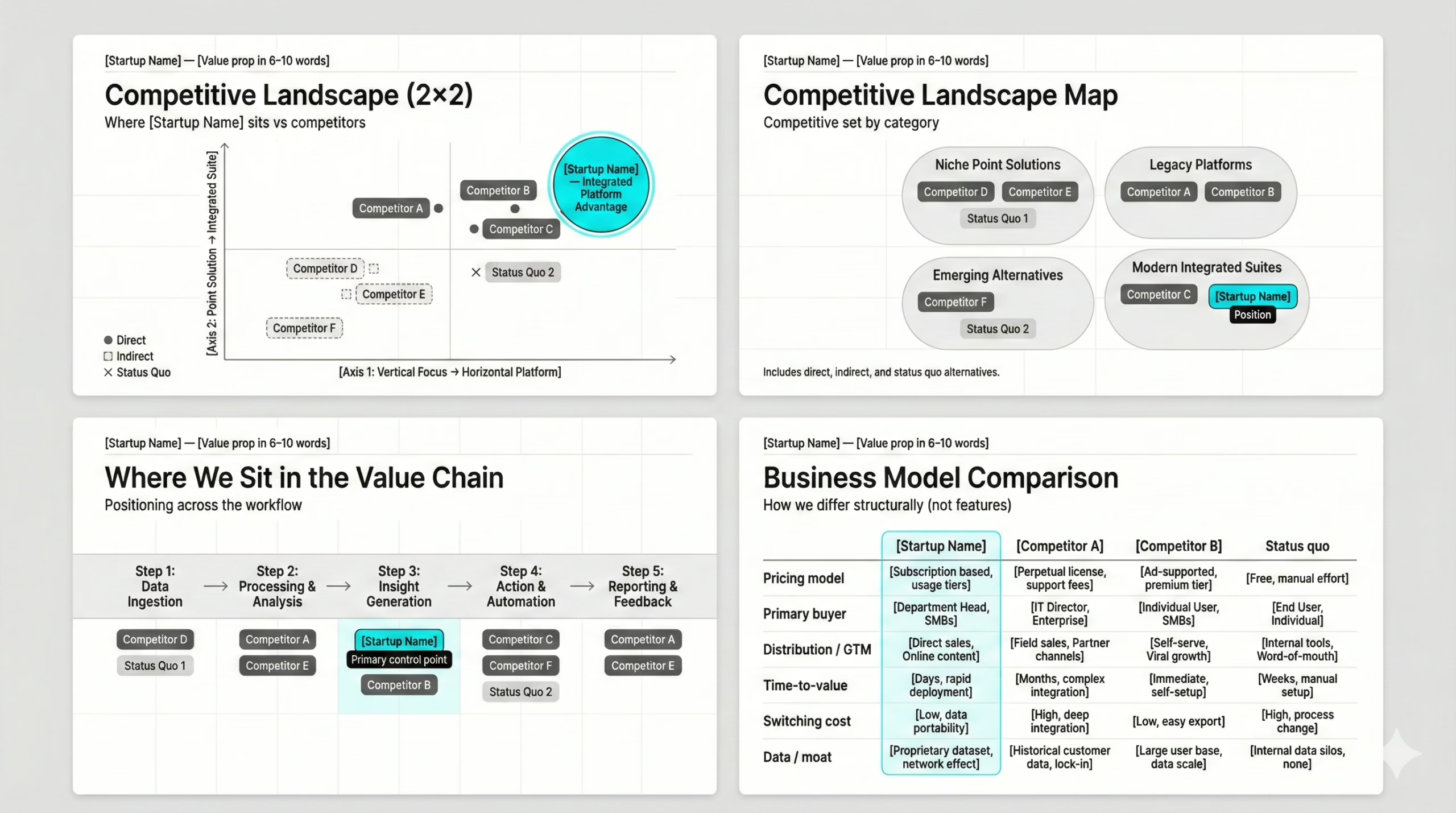
1) 2×2 Quadrant (classic)
Use when the market can be described by two real tradeoffs. Keep it clean. Don’t turn it into modern art.
2) Competitive Landscape Map
Use when alternatives aren’t direct peers (e.g., spreadsheets, agencies, internal teams). Great for showing indirect competition.
3) Segmentation Grid
Use when the market splits by customer type, use case, or delivery model.
4) Value Chain Positioning
Use when the category is defined by workflow ownership (upstream/downstream control).
If you’re looking for execution patterns by category, sector-specific deck guides often reveal what competition slides typically look like in that domain (example: SaaS Pitch Deck Guide or Fintech Pitch Deck Guide).
FAQ
What is a competition slide in a pitch deck?
A competition slide is a single slide in a pitch deck presentation that maps how a startup or venture fits within the real competitive landscape. It shows investors who the competitors are, how the company is positioned, and what strategic tradeoffs exist — all succinctly and in a digestible format.
Why is the competition slide important for investors?
The competition slide pitch deck section helps potential investors understand market dynamics, differentiation, and risk exposure. It allows them to assess whether the position makes sense relative to market size, target market, and go-to-market strategy, which directly impacts due diligence and fundraising decisions.
What do investors want to see on a competition slide?
Investors want a clear picture of:
- the real competitive landscape,
- meaningful competitor analysis,
- visible competitive advantage,
- and logical positioning that helps investors understand where the company fits.
A strong slide should show investors the tradeoffs, not just claim superiority.
How many competitors should be shown on a competition slide?
Most VCs and VCS expect to see 3–7 meaningful competitors on a single slide, including direct, indirect, and status-quo alternatives. Overcrowding the slide weakens clarity and makes the information less easily understandable.
Should startups include indirect competitors?
Yes. Ignoring substitutes, in-house solutions, spreadsheets, consultants, or the status quo is a red flag. These alternatives often capture more market share than direct competitors, especially in SMB and early-stage markets.
What is the best format for a competition slide?
The most common formats include:
- the magic quadrant (2×2 positioning),
- a competitive map,
- or a workflow-based comparison grid.
Some teams also use a power grid when comparing multiple strategic dimensions, but only when the logic remains digestible and visually clear.
Is the competition slide really investors’ least favorite slide?
Ironically, yes — the competition slide is often considered the least favorite slide because it’s frequently done poorly. When built correctly, however, it becomes one of the most trusted slides in the startup pitch deck.
Should I use a competition slide template?
A template or presentation template can help with structure, but it should never dictate strategy. A pitch deck template is useful for layout — not for thinking. Positioning logic must always come before design.
How does the competition slide connect to TAM and market size?
The competition slide should align with your TAM, market size, and target market logic. If your market claims don’t match the visible competitive density, investors will immediately question credibility.
How detailed should a competition slide be?
The slide should explain positioning succinctly while remaining easily understandable. Its job is to frame logic — not deliver exhaustive research. Deep dives belong in appendices, not the main pitch deck slide.
How does the competition slide support go-to-market strategy?
Your positioning determines your go-to-market strategy. A mismatch between how you claim to compete and how you plan to sell usually signals execution risk — something CEOs, investors, and analysts notice instantly.
How do competition slides help with fundraising?
A strong competition slide reduces perceived risk, supports due diligence, and creates strategic clarity — all of which accelerate fundraising and increase confidence in the best pitch and great pitch narratives.
Should I build my competition slide in PowerPoint?
Yes — PowerPoint remains the industry standard for investor decks. However, clarity of logic matters far more than tool choice. The slide must be easily understandable, not just visually polished.
What mistake most founders make on competition slides?
Most founders assume the goal is to “look dominant.” In reality, the goal is to show realism. Overconfidence, missing competitors, and exaggerated claims are the fastest way to trigger skepticism — and become a red flag.
How does the competition slide relate to value proposition and pain points?
Your value prop and pain points must align with your positioning. If your competition slide shows one market reality while your narrative claims another, investors immediately sense inconsistency.
Can a strong competition slide help startups expand into new markets?
Yes. A clear competitive map helps startups evaluate new markets, identify structural openings, and assess whether expansion aligns with existing differentiation and operational strengths.