


Building a restaurant pitch deck isn’t about dazzling investors with design flair — it’s about clarity, structure, and alignment with how institutional reviewers interpret consumer-brand ventures. This page walks you through the mechanical process of building and formatting a restaurant pitch deck that reflects expectations already established in consumer brand evaluation criteria.
As part of Viktori.co’s Hub 4 (Mechanics & Execution), this guide translates evaluator expectations into actionable steps — slide by slide. It does not redefine investor logic, funding criteria, or sector evaluation frameworks defined upstream. What you’ll find here are the exact mechanical steps to structure, format, and visually execute a restaurant pitch deck that meets professional presentation standards.
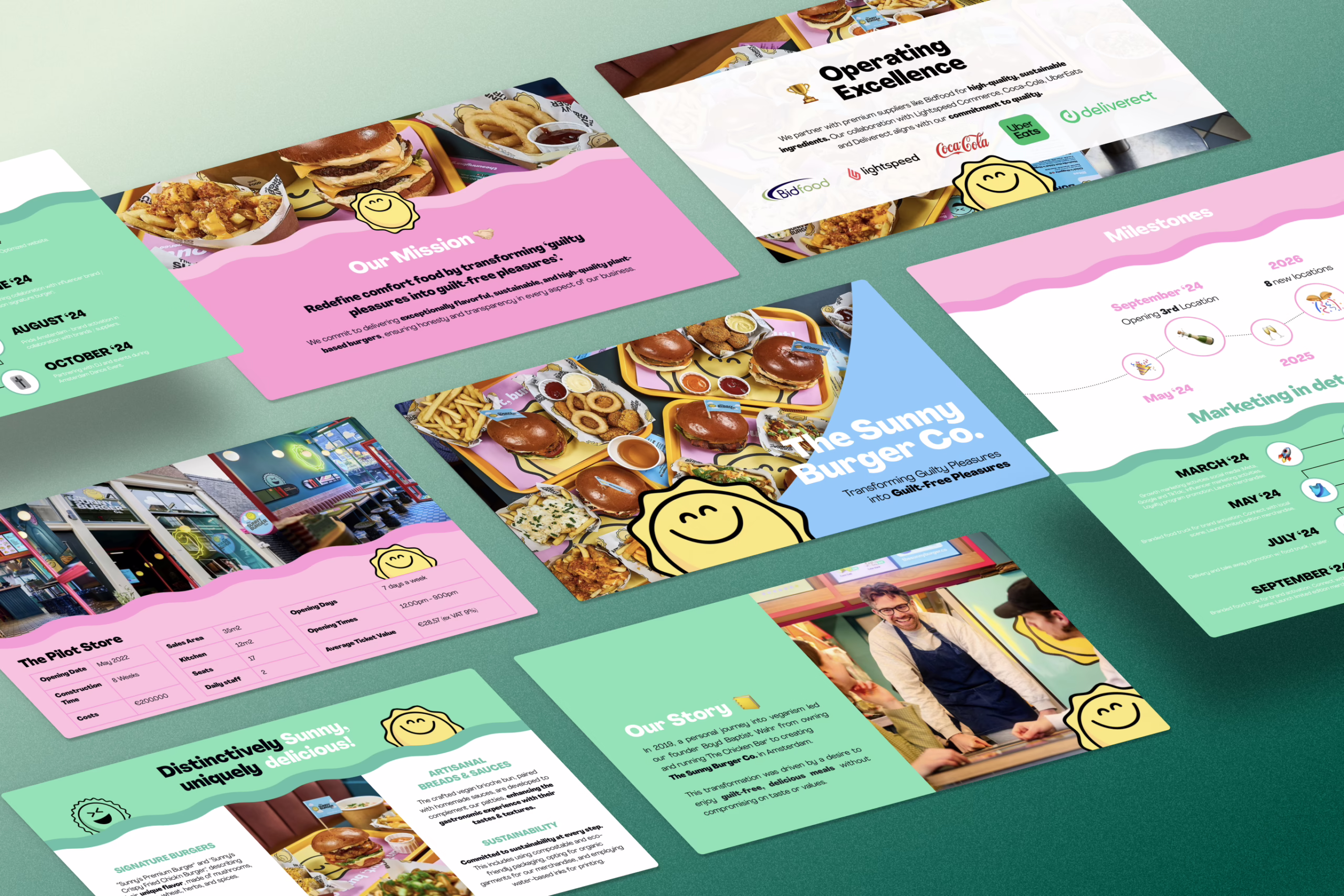
What Is a Restaurant Pitch Deck?
A restaurant pitch deck is a structured visual presentation used to communicate your restaurant concept, operations, and market opportunity to stakeholders. It distills your business plan into concise slides — covering the concept, target market, menu vision, financial outlook, and operational strategy — formatted for clarity and fast comprehension.
In Hub 4 terms, this isn’t about persuasion theory or capital logic; it’s about mechanics: slide order, layout, data visualization, and copy brevity. Every element serves the goal of making your presentation easier for upstream evaluators to process within the frameworks set out in Hub 2.
Step-by-step: how to build a restaurant pitch deck
1) Define the deck’s job (one sentence, no poetry)
Before you touch slides, write one sentence that defines what this pitch deck must achieve.
Examples (pick one):
- “Get a second meeting with a serious restaurant investor.”
- “Secure a partner conversation (location, supplier, operator).”
- “Provide a clean pre-read before a pitch meeting.”
Mechanical rule: if the deck’s job isn’t singular, your deck becomes a “maybe” deck — and “maybe” decks don’t get forwarded.
Output you produce here:
- One sentence deck goal
- One primary CTA for the last slide (e.g., “Schedule a site visit,” “Review our proposed unit economics,” “Intro to a real estate partner”)
Quick sanity check: if you don’t know how long the deck should be for that use, use slide count guardrails.
2) Pick the format: short vs long (and commit)
Restaurants are visual, but funding conversations are not a food Instagram reel. Decide early whether this is:
A) Short deck (first-touch / outreach / discovery)
- 10–12 slides
- “Enough to understand + enough to believe”
- Light proof, no deep tables, no appendix
B) Long deck (follow-up / diligence / serious evaluation)
- 15–20 slides
- Deeper proof (ops, comps, cost structure, assumptions)
- Better for sending after the first call
Mechanical rule: don’t mix them. A “medium” deck is usually a long deck pretending to be short.
Use this to choose cleanly: short deck vs deep-dive version.
3) Build the slide list before you write anything
Open a doc and create a one-line purpose for each slide (not the title—its job).
A practical restaurant flow:
- Concept + why now (what it is, for whom, why it matters)
- Audience + market sizing (who pays, where money comes from)
- Problem (what the market currently fails at)
- Solution (your restaurant model)
- Experience & differentiation (menu pillars + vibe + service model)
- How it works (ops flow: sourcing → service → reorder/loyalty)
- Business model (revenue streams + cost anchors)
- Competition / positioning
- Validation / traction
- Financial snapshot
- Team
- Ask + use of funds + next step
Mechanical rule: every slide should be answerable as: “Why does this slide exist?”
If your deck opener feels “meh,” use a clean one-liner structure: one-line opener formula.
4) Draft Slide 1 like a billboard, not like a homepage
Slide 1 should be readable in 3 seconds.
Layout template:
- Big headline (8–12 words)
- One-liner subhead (clarifies concept + customer)
- One proof/credibility line (optional)
- Small footer: location / status (optional)
Copy constraints:
- No paragraph blocks
- No “we are passionate”
- No generic claims (“redefining dining”)
Good patterns:
- “Fast-casual Balkan grill for downtown office workers.”
- “Premium salad + protein bowls designed for high-repeat lunch traffic.”
- “Late-night dessert bar built for delivery + in-store impulse.”
If you need to tighten how you frame the whole story upfront: how to frame the deck’s opening.
5) Market slide: do TAM/SAM/SOM without making numbers up
This slide exists so the reader can quickly answer:
“Is this a real market, in a real place, with real spend?”
Build it with 3 layers:
- TAM: total dining spend in your broader geo/category
- SAM: spend in your reachable segment (format + area + price band)
- SOM: what you can plausibly capture in 12–24 months
Restaurant-specific mechanics that help:
- Use geo-first sizing (city/zone) before “national dining market”
- Include one line on unit economics constraints (capacity, turnover, hours)
- Add a small assumptions box (2–4 bullets)
Visual options (choose one):
- Funnel graphic (TAM→SAM→SOM)
- Stacked bars by geography
- Simple table with 3 rows + assumptions
Market sizing execution reference: market sizing slide mechanics.
6) Problem + Solution: build them as a matched pair
These two slides are where people either lean in… or start checking Slack.
Problem slide (Slide 3)
Structure:
- 1 headline that states the pain
- 3 bullets max:
- what’s happening now
- why it’s bad
- who it hurts / how often
Restaurant examples (pick the right category):
- Lunch options are slow + inconsistent for office workers → churn
- “Healthy” is expensive + boring → low repeat
- Delivery menus don’t travel well → refunds + bad reviews
- Late-night category is junk food only → unmet demand
Solution slide (Slide 4)
Structure:
- 1 headline that states the answer
- 3 bullets max:
- your model (format + concept)
- your edge (why you win)
- how you deliver consistently (ops/system)
Mechanical rule: if your solution slide needs 10 bullets, you don’t have a deck problem—you have a business clarity problem.
If your problem/solution slides keep turning into mush, use: problem/solution slide cleanup tactics.
7) Experience slide: show the restaurant without turning it into a menu PDF
Your goal here is not “show everything.”
Your goal is: make the concept feel real, consistent, and repeatable.
Build the slide in 3 blocks:
A) Menu pillars (3–5 items)
Not a full menu. Pick signature items that represent the model.
- 1 hero dish (most photogenic + most “you”)
- 1 high-margin repeat item
- 1 “talkable” item (brand hook)
- 1 dietary-friendly anchor (if relevant)
- 1 beverage/dessert upsell (optional)
B) Experience pillars (3 pillars)
Short labels + one-line explanation each.
Examples:
- Speed: “12-minute lunch promise”
- Quality: “daily prep, limited SKU discipline”
- Atmosphere: “warm, tight, high-turnover design”
- Convenience: “walk-in + pre-order + delivery optimized”
C) Proof of repeatability (1 proof point)
Pick one:
- supplier/prep system
- portion standardization
- throughput plan (seating + turnover)
- early feedback / pop-up data
- operations playbook or chef experience
Visual rule: one strong image + 2–3 small supporting images max.
If you can’t keep it clean, rebalance using: text vs visuals balance rules.
8) “How it works” slide: build a simple operational flow (no spaghetti)
This slide exists so someone can quickly understand how the restaurant actually runs—not the vibes, the mechanics.
Best format: a 4–6 step horizontal flow with icons.
Use one of these flows (pick what matches your model):
A) Dine-in led
- Sourcing partners →
- Prep system (daily/weekly) →
- Service model (counter/table) →
- Throughput (avg order time + table turn) →
- Upsell & loyalty loop
B) Delivery / hybrid
- Menu engineered for travel →
- Prep standardization →
- Order channels (app/aggregators) →
- Packaging quality control →
- Repeat order drivers (bundles/subscriptions)
C) Experience / themed
- Booking / reservations →
- Arrival + experience design →
- Signature moments (menu/ritual) →
- Add-ons (merch/events) →
- Social sharing loop
Mechanical rules:
- Labels must be short (2–4 words)
- Add one small “metrics strip” if you have it (prep hours, target ticket size, service time)
If the flow looks messy, it’s usually layout discipline—not content. Fix with: pitch deck layout fixes.
9) Business model slide: show how money moves in 10 seconds
Restaurant decks fail here because they either:
- oversimplify (“we sell food”), or
- dump a spreadsheet screenshot (criminal behavior).
Build the slide in 3 blocks:
A) Revenue streams (primary + secondary)
- Primary: dine-in / takeaway
- Secondary: delivery, catering, events, merch, subscriptions, classes
B) Unit economics anchors (just the big levers)
- Average ticket
- Covers per day / orders per day
- Gross margin range (or food cost %)
- Labor model (lean vs premium service)
C) Cost structure strip (top 4–5 only)
COGS, labor, rent, marketing, utilities/other.
Visual options:
- Simple “money wheel” diagram (streams around the center)
- 2-column table (revenue vs cost drivers)
- Waterfall (if you want to show margin logic cleanly)
10) Competitive slide: position cleanly, don’t posture
This slide exists to show you know what exists and where you sit.
Two formats that work:
A) Comparison table (most practical)
Competitors across the top, attributes down the side (3–5 attributes max):
- Price band
- Speed / service model
- Menu focus
- Experience/ambience
- Channel mix (dine-in vs delivery)
B) 2×2 positioning map (if you can keep it honest)
Examples:
- “Price” vs “Quality”
- “Speed” vs “Experience”
- “Traditional” vs “Modern”
Rules:
- 3–6 competitors max
- Keep attribute labels neutral (don’t rig the game)
- One sentence under the visual: “Where we win + why it matters”
If you want a clean structure for this slide: competitive slide mechanics.
11) Validation / traction slide: pick the proof that matches your stage
This slide exists so reviewers can answer: “Is this real, or is this just a nice menu idea?”
Pick the version that matches your reality:
A) Pre-launch proof
- Waitlist size + conversion rate
- Pop-up performance (orders, repeat interest)
- LOIs (suppliers, locations, partners)
- Pre-orders / deposits
- Survey results (only if done properly)
B) Early operations
- Covers/night, revenue/week
- Repeat rate
- Reviews & sentiment summary
- Reservation utilization
- Delivery performance (AOV, reorder)
C) Scaling
- Unit economics by location
- Margin stability across weeks
- Retention / loyalty performance
- CAC vs LTV (if you track it)
If you’re early and need a credible “momentum” format: traction without vanity metrics.
12) Financial snapshot: present clean numbers + assumptions (not a fantasy spreadsheet)
This slide is not a full model. It’s a legible summary.
Best structure (one slide):
- 3-year (or 5-year) mini-table: Revenue, GM%, Operating profit (or EBITDA)
- Breakeven point (month or revenue level)
- Funding use categories (high level)
- Assumptions box (small, 3–6 bullets)
Assumptions that matter for restaurants:
- Seating capacity
- Table turn targets
- Operating days/hours
- Ticket size
- Food cost %
- Labor model
- Rent as % of revenue
Rule: if you can’t explain a number in one sentence, remove it.
Execution reference: financial slide formatting rules.
13) Design system pass: make it look like one deck, not 12 different moods
Once content is set, do a dedicated design sweep.
System checklist:
- One font pair (max)
- 3 text styles: headline, body, small notes
- Consistent spacing grid (same margins every slide)
- One icon style set (line or filled, not both)
- Charts styled consistently (same label placement, same decimals rules)
- Image treatment consistent (same corner radius, same shadows or none)
Two “don’t do this” rules:
- Don’t mix templates
- Don’t use five accent colors because you got excited
Practical guide: how to design the deck cleanly.
If typography or color is the weak link, use: type choices that don’t sabotage credibility and color usage in pitch visuals.
14) QA + export: test it like a serious document, not a school project
This is where you remove the silent killers.
Content QA
- Every slide has one job
- No slide has more than ~3–5 bullets
- Numbers have units + timeframe
- Acronyms are explained once
- Claims have at least one proof point somewhere
Delivery QA
- Can someone understand it without you talking?
- Does the story still work if they read it out of order?
Export QA
- Export to PDF
- Review on mobile
- Review in grayscale once (design hierarchy test)
- Check alignment (nothing “almost” aligned)
And since real meetings come with questions: Q&A prep tactics.
Slide-by-slide Copy Prompts (fill-in-the-blank)
Use these as copy scaffolds. Keep each slide to one message and avoid paragraph blocks.
Slide 1 — Concept (Cover)
Headline: [Restaurant name] is a [format] serving [audience] in [location] with [edge].
Subhead: We win because [reason #1] + [reason #2] + [proof signal].
Tiny proof line (optional): Status: [pre-launch/pop-up/open] • Target: [ticket size] • Launch: [date]
If your first slide needs sharper tension/curiosity, borrow patterns from opening hook structures.
Slide 2 — Target Customer
Headline: We serve [primary customer segment] who currently [behavior/pain].
3 bullets:
They value: [value #1], [value #2], [value #3].They buy when: [context/situation].They choose us over alternatives because: [reason].
Slide 3 — Problem
Headline: [Audience] can’t reliably get [desired outcome] because [cause].
3 bullets max:
Current options fail due to: [constraint].The impact shows up as: [time/money/friction].This happens: [frequency] in [context].
If this slide becomes “wordy but vague,” use the cleanup pattern in problem/solution slide tuning.
Slide 4 — Solution (Your Restaurant Model)
Headline: We deliver [desired outcome] through [restaurant model].
3 bullets:
Format: [fast-casual / full-service / delivery-first / hybrid].Differentiator: [menu + experience + ops edge].Repeatability: [standardization/process] enables [consistency].
Slide 5 — Experience / Menu Pillars
Headline: The experience is built around 3–5 repeatable pillars.
Menu pillars (fill in):
[Signature item #1] — why it matters: [taste/margin/brand hook].[Signature item #2] — why it matters: [speed/consistency].[Signature item #3] — why it matters: [dietary/accessibility].
Experience pillars (3):
Pillar 1: [speed/quality/vibe/convenience] → [what customer gets].Pillar 2: […]Pillar 3: […]
If your slide starts looking like a brochure, rebalance using visual vs text density rules.
Slide 6 — How It Works (Ops Flow)
Headline: A simple operating flow that keeps quality consistent.
Flow steps: [Sourcing] → [Prep] → [Service model] → [Channels] → [Repeat loop]
Ops proof line: We control [x] through [process], which improves [metric].
For cleaner diagram composition, fix spacing and alignment using layout cleanup patterns.
Slide 7 — Business Model
Headline: Revenue comes from [primary stream] + [secondary stream(s)].
Revenue bullets: Dine-in: [x%] • Delivery: [x%] • Catering/events: [x%]
Cost anchors: Food cost target: [x%] • Labor model: [lean/premium] • Rent target: [x% of sales]
Slide 8 — Positioning / Competition
Headline: We sit at the intersection of [attribute] and [attribute].
One-liner: We’re different because [clear differentiator].
Comparison rows (3–5): Price band • Speed • Menu focus • Experience • Channel mix
Slide 9 — Proof / Validation
Headline: Evidence that this isn’t just a nice idea.
Pick 3 (pre-launch): waitlist • pop-ups • LOIs • deposits • partnerships
Pick 3 (open): covers/night • repeat rate • reviews • AOV • reservation utilization
If you’re early-stage and need a credible proof format, use momentum slide patterns.
Slide 10 — Financial Snapshot
Headline: A simple path to breakeven and profitability.
Mini-table labels: Revenue • Gross margin • Operating profit • Breakeven month
Assumptions (3–5): capacity • turns • ticket size • food cost • labor
Slide 11 — Team
Headline: The team that can execute this model.
Bullets:
[Role] — [relevant proof][Role] — [relevant proof]Gaps we’ll fill: [hire #1], [advisor #1]
Slide 12 — Ask / Next Step
Headline: We’re raising / seeking: [amount] to achieve [milestone].
Use of funds (3 buckets): [capex] • [working capital] • [launch marketing]
Next step: Proposed follow-up: [site visit / tasting / diligence call]
Restaurant Pitch Deck Mistakes (execution errors only)
1) The cover slide reads like a press release
Fix: reduce to one headline + one clarifier. If you need tension, use hook slide patterns instead of adding more text.
2) You show the full menu (aka: you brought a phonebook)
Fix: 3–5 signature items, grouped as pillars. Anything else goes in appendix or not at all.
3) Your “How it works” diagram looks like an airport map
Fix: 4–6 steps max, horizontal. Clean spacing matters. Use layout cleanup patterns.
4) Text density is inconsistent (some slides are novels, some are empty)
Fix: set a rule: max 3–5 bullets per slide. Use visual vs text density rules.
5) You use screenshots of spreadsheets
Fix: convert to one mini-table + assumptions strip. If the deck needs more, move details to an appendix doc.
6) Competition slide is either too thin or too aggressive
Fix: 3–6 competitors max, 3–5 attributes, neutral labels. Don’t rig the table.
7) Everything looks templated
Fix: one typography system, consistent spacing, consistent image treatment. If you want a mechanical checklist, use practical deck design mechanics.
8) Your numbers have no units or timeframe
Fix: every number gets: [unit] + [time period]. Example: “$28 AOV (last 30 days)” not “$28”.
9) Slides don’t have headlines (so the reader has to interpret)
Fix: headline = conclusion. Your slide title should answer “so what?”
10) You reuse the same phrase 12 times
Fix: vary labels and headlines. Repetition makes decks feel generic, not consistent
Restaurant Pitch Deck Templates: How to Customize Without Breaking Consistency
Templates are fine. What breaks decks isn’t “using a template.” It’s mixing systems.
A) Start by choosing a single slide system
Pick one template and commit to:
- typography hierarchy
- grid + margins
- chart style
- icon style
- image treatment
If you need a step-by-step for turning a template into a clean system, use practical deck design mechanics.
B) Swap modules, not style rules
Safe swaps (restaurant-specific):
- Replace “Product” → “Experience pillars”
- Replace “Users” → “Target diners”
- Replace “Distribution” → “Channel mix (walk-in/reservations/delivery)”
- Replace “Traction” → “Validation (pop-ups/LOIs/reviews)”
Unsafe swaps:
- Switching fonts halfway
- Bringing in random icon packs
- Dropping in screenshots with different color profiles
C) Keep headlines consistent, vary phrasing (avoid template echo)
Use one headline pattern per section:
- Problem: “What’s broken”
- Solution: “What we built”
- Ops: “How it runs”
- Financials: “How it works financially”
But vary the actual wording so it doesn’t read like a cloned template.
D) When using AI to draft slides, control structure first
AI is best used for:
- headline alternatives
- bullet compression
- rewriting for brevity
AI is worst at:
- maintaining consistent slide hierarchy
- keeping assumptions consistent across slides
If you’re using AI heavily, use a controlled workflow from AI-assisted deck building workflows.
E) Don’t let “template slides” dictate your restaurant model
Restaurant decks need restaurant mechanics:
- capacity, turns, ticket size
- service model
- menu pillars
- channel mix
If your template doesn’t support those, rebuild those slides rather than forcing your business into generic SaaS boxes
FAQ
How many slides should a restaurant pitch deck be?
Most restaurant pitch decks work best as 10–12 slides for a first meeting and 15–20 slides for follow-up when more operational and financial detail is needed. Use deck length guardrails by use-case to pick the right format.
What should I include on the menu slide?
Don’t include the whole menu. Show 3–5 signature items as “menu pillars,” and explain why each one matters (margin, speed, brand hook, repeatability).
How do I show traction if I’m pre-launch?
Use validation proof: pop-ups, waitlist conversion, LOIs, supplier partnerships, deposits, or repeat intent. Keep it to 3 clear proof points. A clean approach is outlined in momentum slide patterns.
Should I include a business plan in the deck?
No. The deck is a high-signal summary, not the full plan. If someone needs the full plan, send it as a separate doc after the meeting.
What numbers must be on the financial slide?
At minimum: ticket size, capacity, turns, food cost %, labor model, rent target, and breakeven point. Keep the slide readable and put assumptions in a small strip.
Should I make the deck more visual or more detailed?
A restaurant deck should be visual but controlled: one strong image, minimal text, and only the numbers required to support the model. Use visual vs text density rules to balance clarity.
What’s the best way to present “how it works” operationally?
Use a 4–6 step flow diagram (sourcing → prep → service model → channels → repeat loop). Keep labels short and spacing consistent. If it looks messy, fix structure with layout cleanup patterns.
What file format should I send?
Send a PDF for sharing and keep the editable source (PowerPoint/Slides) for iteration. Always review the PDF on mobile before sending.