


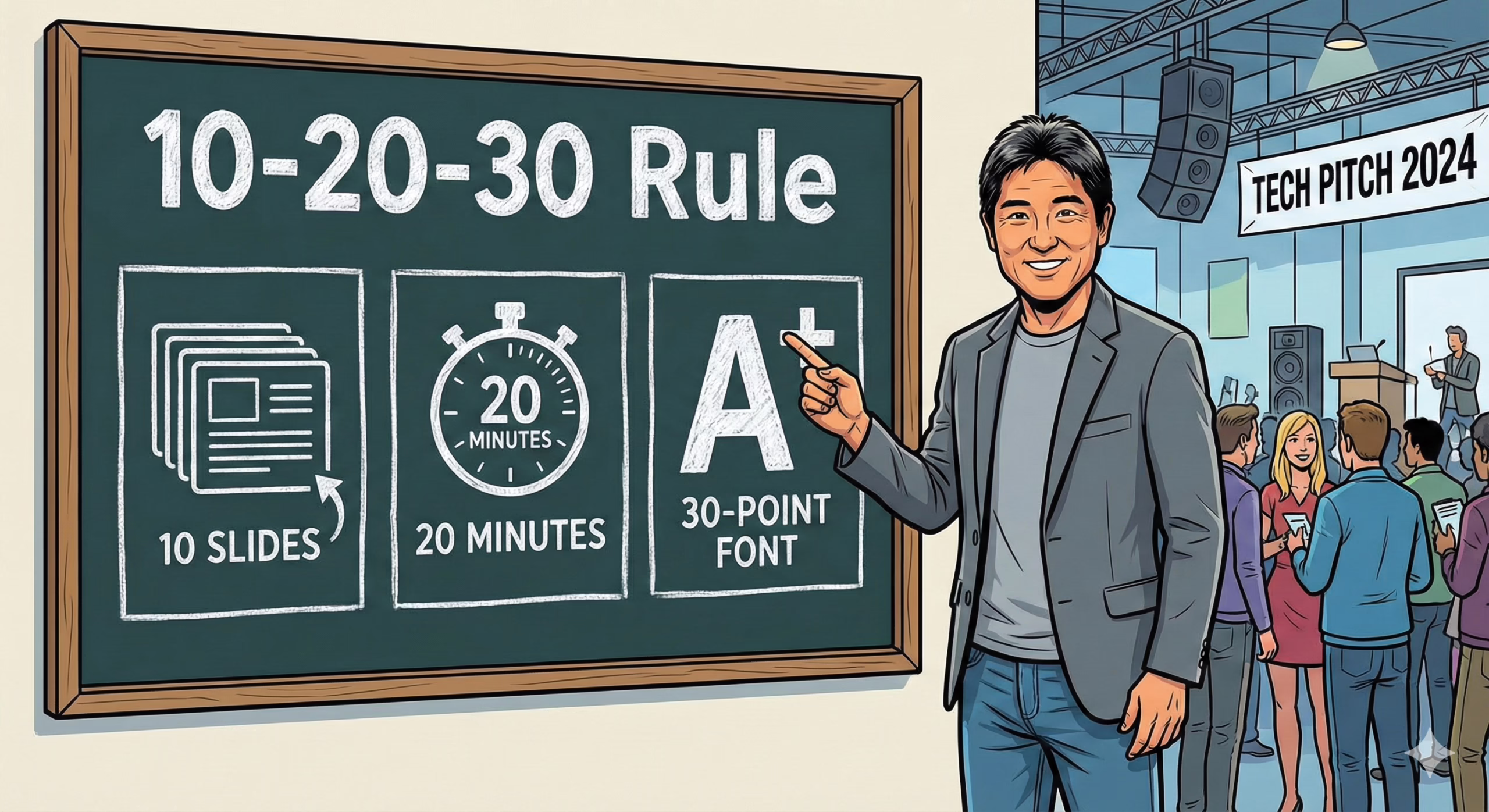
The 10-20-30 Rule — popularized by Guy Kawasaki — offers a framing shortcut for pitch presentations under pressure. It proposes a format of 10 slides, delivered in 20 minutes, using 30-point font. Originally crafted for venture pitch contexts, it has since become a design philosophy for any scenario where cognitive load and time constraints matter.
What makes this rule effective isn’t simplicity for its own sake — it’s the compression of information into a format that supports pattern recognition, not data overload. The rule prioritizes investor cognition over founder output, reflecting the need to balance clarity with control in time-limited, high-stakes evaluation settings.
This logic reflects principles outlined in The Art of Simplification, where reduced input increases interpretability under pressure.
Origin and Rationale: Guy Kawasaki
Guy Kawasaki introduced the rule during his time as a venture capitalist after sitting through countless bloated, self-serving slide decks. His logic was simple: most founders overestimate attention spans and underestimate cognitive friction.
The 10-20-30 framework isn’t just about slide count — it reflects deeper evaluation psychology:
- 10 slides reflect the average limit of high-level concepts investors can evaluate in one sitting.
- 20 minutes aligns with known attention decay timelines in meeting environments.
- 30-point font isn’t a design suggestion — it’s a constraint mechanism to force clarity and eliminate bloat.
This dynamic is structurally expressed in the Elevator Pitch Slide which compresses positioning into one constrained visual layer.
The Pitch Deck Rule Explained
Each part of the 10-20-30 rule aligns with how humans process, reject, or anchor ideas during evaluation:
- 10 Slides: Forces prioritization. Presenters must select only the most contextually relevant information.
- 20 Minutes: Matches the natural “decision window” where first impressions, confirmation bias, and pattern recognition are most active.
- 30-Point Font: Prevents over-explanation. Encourages slides to be signals, not scripts.
This isn’t about presentation minimalism — it’s about limiting cognitive friction while guiding perception.
This pattern shows up structurally in Pitch Deck Design Mistakes, where font size, density, and slide load sabotage clarity.
Recommended 10 Slides Structure
The structure Guy Kawasaki recommends aligns surprisingly well with today’s capital evaluation priorities:
- Title Slide – Name, tagline, point of contact
- Problem – What urgent pain do you solve?
- Solution – What is your product and why does it matter?
- Market Opportunity – How big is the opportunity (TAM/SAM/SOM)?
- Business Model – How do you make money?
- Go-To-Market – How will you grow?
- Competitive Landscape – Who else exists, and why are you different?
- Team – Who are you and why can you execute?
- Financials – Forecasts, milestones, and metrics
- Ask & Closing – What do you want? What happens next?
This sequence reduces narrative load, allowing the audience to follow a linear evaluation arc without backtracking.
This format is structurally aligned with the Investment Fund Pitch Deck, which applies this pattern to fund-level presentations.
Slide-Level Guidance
Each slide in the 10-20-30 structure functions as a cognitive anchor — not a delivery script. That’s why the 30-point font rule matters: it restricts verbosity and forces hierarchy clarity. Use only:
- One headline per slide
- One visual concept or chart
- One takeaway per viewer’s scan
This is not an aesthetic rule — it’s about directing evaluative attention to the right cues, at the right time, in the right sequence.
This dynamic is reinforced by Pitch Deck Headlines That Hook, which explores how visual priority drives message retention.
Timing & Presentation Tips (20 Minutes)
The 20-minute rule isn’t about slide pacing — it’s about attention decay and decision friction. Most investors form their first opinion within the first 5 minutes. After 20 minutes, cognitive drop-off accelerates.
Recommended structure:
- 90–120 seconds per slide (not uniform — some take 30 seconds, others 3 minutes)
- Rehearse your flow, not your script. Investors respond to confidence through coherence, not memorization
- Always leave room for pauses, clarifications, and redirections. The best decks feel like a “conversation anchored by visuals”
This time-based framing aligns with the Investor Pitch Timing & Pacing Framework, which unpacks how deck length and energy management affect perception.
Design & Readability (30-Point Font)
The 30-point font rule isn’t arbitrary — it reflects distance cognition and scan behavior. When investors glance at a deck (especially on Zoom), they’re scanning for relevance signals — not reading for insight.
Good slide readability shows up as:
- Clear visual hierarchy (headline, focal point, whitespace)
- Fonts like Inter, Helvetica, or Roboto, with strong baseline contrast
- No full sentences unless they’re taglines or quotes — keep it skimmable
Avoid the temptation to “fit more in” — this leads to density blindness, where everything looks important, and nothing gets retained.
These design constraints reflect the functional structure described in Font Psychology in Pitch Decks.
Common Mistakes and How to Fix Them
Violating the 10-20-30 rule almost always results in one of these structural breakdowns:
- Overcrowded Slides → Makes comprehension slower and forces evaluators to work harder
- Overtime Presentations → Erodes credibility and reduces space for discussion or objections
- Low-Contrast Visuals → Reduces scannability and retention
These aren’t aesthetic issues — they’re about evaluation friction. A cluttered slide suggests a cluttered mind. A 40-minute deck feels like a founder who can’t prioritize. Every slide choice signals how your brain works.
These patterns are broken down clearly in 11 Content Mistakes in Pitch Decks, which shows how overload leads to drop-off.
Variations and When to Adapt the Rule
The 10-20-30 rule isn’t rigid. It’s a default for first-contact environments, like demo days, first pitches, or Zoom intros. But in deeper conversations or sector-specific contexts, adaptations emerge:
- Biotech, Pharma, and DeepTech: Often need an appendix for evidence, protocols, or validation
- Fundraising Updates: Might shorten to 5 slides with optional deep-dives
- Media or Vision-led Startups: May incorporate video, motion, or narrative visuals in place of financial detail
Think of 10-20-30 as a constraint for initial clarity, not a ceiling on context.
These variations manifest in guides like the Pharma Pitch Deck Guide and TV Show Pitch Deck Guide, where structure flexes by sector.
Practical Examples and Templates
A great way to internalize the 10-20-30 rule is through comparative framing:
- Take a bloated 25-slide deck and compress it to 10: what’s lost? What’s actually gained?
- Replace dense text with iconography, charts, or metaphors
- Strip down to 30-point font and redesign — clarity often increases, even when detail drops
The best decks don’t feel like slides — they feel like visual conversation anchors.
🔗 This transformation process is explored through Using Diverse Visuals to Improve Your Pitch Decks, which highlights how reframing content through visuals changes evaluation response.