


A pitch deck is judged visually before it’s judged logically. In the first seconds, an investor isn’t “reading”—they’re scanning for order, signal, and coherence. Visuals are what determine whether your information is processed immediately or postponed into the mental bin labeled “I’ll deal with this later” (spoiler: they won’t).
In this article, “visuals” means every element that shapes perception: charts, diagrams, screenshots, icons, photos, layout systems, spacing, and typography. These aren’t decorative add-ons. They’re the interface layer that controls cognitive load, directs attention, and makes meaning legible at speed. That dynamic is easiest to notice when you study how decks change comprehension outcomes through using diverse visuals to improve your pitch decks.
Why Visual Storytelling Matters in Pitch Decks
Pitch decks are rarely consumed linearly. Investors jump ahead, skim back, and form impressions through pattern recognition: trend direction, contrast, grouping, and hierarchy. Visual structure becomes a proxy for clarity, and clarity becomes a proxy for competence.
This response isn’t random—it reflects how judgment forms under time pressure. Visuals reduce interpretive friction when they compress complexity into recognizable shapes and relationships. Visuals increase perceived risk when they create ambiguity, clutter, or conflicting emphasis. This is consistent with how evaluation shortcuts show up in cognitive biases in pitching.
Core Principles for Effective Visuals
Clarity over density
The primary job of a visual is to make one meaning obvious. When a slide tries to communicate multiple messages at once, the viewer doesn’t “work harder”—they disengage. The brain defaults to simplification, and it simplifies by discarding nuance. In pitch terms, that reads as “unclear” rather than “thoughtful.”
Consistency as a credibility cue
Consistency in color, typography, and layout reduces cognitive tax. When those rules shift across slides, the viewer has to re-learn the interface repeatedly. That friction often registers as complexity or instability, even when the underlying narrative is solid.
Hierarchy and emphasis
Hierarchy is how you tell the eye where to land first. If everything is equally loud, nothing is important. Effective hierarchy relies on contrast, scale, spacing, and positioning—not adding more labels.
Data integrity
Visuals carry trust. Misleading scales, distorted comparisons, and exaggerated chart choices don’t read as “smart presentation.” They read as “interpretation risk.” A lot of decks fail here by accident, which is why these patterns show up repeatedly in pitch deck design mistakes.
Types of Visuals to Use
Different visuals answer different cognitive questions. The right choice is less about aesthetics and more about what kind of interpretation you need the viewer to make.
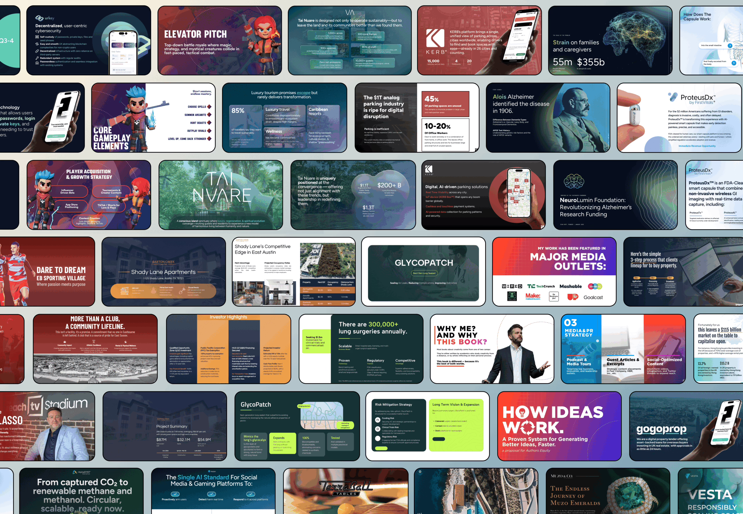
- Charts and graphs express magnitude and direction (trend, comparison, distribution).
- Diagrams and flows express causality and sequence (process, system logic, handoffs).
- Icons increase scan speed when categories repeat across slides.
- Screenshots and mockups establish concreteness and reduce “abstract product” doubt.
- Photos establish real-world context when environment matters.
- Timelines and roadmaps express progression without turning the deck into narration.
- Maps clarify geographic constraints, adoption, or distribution dynamics.
Where decks tend to break is not using “the wrong visual,” but choosing visuals that don’t match what the slide is structurally responsible for expressing. That mismatch is often connected to the broader narrative and sequencing issues described in 11 content mistakes in pitch decks: too much, too little, too vague.
Choosing the Right Visual for Each Slide
Each slide type carries a different burden of interpretation, so the visual should match the question the slide is implicitly answering.
- Problem slide: needs recognition. A scenario image or a simple “current state” diagram is often enough.
- Market slide: needs scale and segmentation without hand-waving. Visuals should show relative size, not just big numbers.
- Solution slide: needs concreteness. UI, mockups, or a simple flow show what changes and how.
- Business model slide: needs legible mechanics. A clean flow of value exchange tends to outperform dense tables.
- Traction slide: needs pattern first, explanation second. Trend visuals work because direction registers instantly.
- Competition slide: needs category clarity. Matrices and positioning maps prevent “we’re everything to everyone” ambiguity.
- Financials slide: needs interpretability and integrity. Charts should support the story the numbers already tell.
You can see how this “slide responsibility → visual form” logic maps onto deck structure when you compare against how to create a pitch deck.
Designing Visuals: Practical Tips
Visual effectiveness is mostly about interpretability under compression: small screens, quick scans, imperfect attention.
- Color should act as a signal system. One highlight color is often more powerful than a rainbow.
- Typography is hierarchy. Weight, size, and spacing are how the slide tells the viewer what matters.
- Whitespace is control. It isolates meaning and reduces perceived clutter.
- Charts should reduce friction. Simplified axes, readable labels, and minimal noise improve extraction speed.
- Screenshots should be cropped to relevance. Anything visible becomes “evaluated,” including irrelevant UI details.
This is also where emotional perception shows up: clean visuals create calm; messy visuals create tension. If you want the psychological layer behind that response, it aligns closely with how narrative structure and attention behave in storytelling frameworks.
Tools and Resources
Tools don’t create clarity; they reveal whether your visual system exists. If a pitch deck feels inconsistent across slides, it’s rarely because you chose the “wrong” software—it’s because the deck has no fixed rules for hierarchy, spacing, typography, and chart styling.
Most teams end up blending tools: a presentation tool for assembly, a design tool for precision assets, and a spreadsheet tool for charts. The risk isn’t the mix—it’s the loss of a shared visual language. That’s why ecosystems matter more than apps, and why it helps to compare how tool stacks show up in discussions of best AI pitch deck tools versus more controlled workflows like chatgpt pitch deck, where the constraint is usually consistency, not capability. If you need an external “reference spine” for what roles and standards a deck specialist typically enforces, what is a pitch deck expert frames that expectation cleanly.
Step-by-Step Workflow for Creating Visuals
Visual workflows fail when they start with aesthetics. They work when they start with intent. The most reliable order is: meaning → form → hierarchy → refinement. Not because it’s “best practice,” but because the brain interprets visuals as claims, and claims need a single dominant signal.
A useful filter is whether your slide already has a clear message before the visual exists. When it doesn’t, visuals become filler—icons, shapes, and graphs that decorate uncertainty. That failure mode shows up frequently in fundraising sequences where deck versions multiply but clarity doesn’t, which is why the bigger context in fundraising process matters. It also shows up in deck length decisions: when a team can’t compress meaning, the deck inflates—something you can see reflected in how to create a short vs long pitch deck.
Common Mistakes and How to Avoid Them
Most “visual mistakes” are interpretation mistakes. The slide may look polished, but it causes the viewer to ask the wrong questions. Typical patterns include charts that contain too much data to extract a pattern, inconsistent visual language that resets comprehension every slide, and visuals that exaggerate scale or momentum in ways that quietly damage trust.
Overload is usually not accidental—it’s the symptom of unresolved prioritization. When the founder can’t decide what matters most, the slide tries to show everything. That’s why these breakdowns overlap heavily with structural pitch errors cataloged in 10 pitch deck mistakes and why technical teams often get hit harder: complexity is real, but the deck isn’t the place for raw complexity, which is unpacked in pitch deck mistakes technical founders make.
Examples and Mini Case Studies
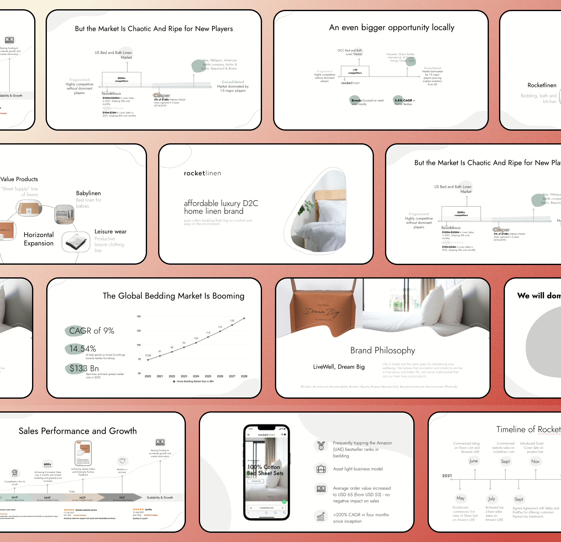
Examples matter because they reveal what “clarity” looks like in practice: the same information, expressed differently, produces different interpretations. A traction slide can be a story of momentum or a story of volatility depending on scale choice, annotation, and hierarchy. A competition slide can create category confusion or resolve it in seconds depending on framing.
One of the cleanest before/after shifts usually happens on traction visuals: removing dashboard-style clutter, expressing one dominant trend, and annotating the few events that explain inflection points. That pattern is captured well in creating an impactful traction slide for your investor pitch deck, and it pairs naturally with the broader logic of how traction is interpreted in traction and growth in your pitch deck.
Checklist: Visual-Ready Pitch Deck
A deck is visually ready when each slide communicates one dominant idea without needing narration to decode it. “Readable” isn’t about font size alone—it’s about whether the viewer can extract the intended meaning under scanning behavior.
A quick readiness checklist tends to correlate with five signals:
- consistent typographic hierarchy (the eye knows what’s primary),
- consistent chart styling (the brain stops re-learning the visual language),
- restrained color logic (highlight means highlight),
- whitespace used to separate meaning (not fill emptiness),
- visuals are relevant evidence, not mood.
If you want a structured sense of what slide elements are expected to carry meaning, not just aesthetics, the standards described in pitch deck headlines that hook map nicely onto visual hierarchy—because headlines and visuals serve the same role: they tell the viewer what to pay attention to first. This also aligns with how value is typically expressed on core slides like value proposition slide, where the “visual proof” often matters more than the phrasing.
The Importance Of Visuals
Visuals don’t exist to beautify a pitch deck. They exist to make interpretation stable. Under investor attention constraints, the deck’s job is to reduce cognitive load and express the business as legible, bounded, and coherent.

When visuals are consistent and honest, they support comprehension and trust. When visuals are cluttered or visually manipulative, they introduce interpretive risk. That’s why visual discipline shows up as a core competence across deck types and investor audiences, including the way decks are structured for pitch deck for non technical investors, where the penalty for ambiguity is even higher.
FAQs
How many visuals should a pitch deck have to be effective?
An effective pitch deck is usually visual-led, not text-led. That doesn’t mean every slide needs a chart or animation, but most slides should use visuals for your pitch deck to reduce cognitive load in the first 30 seconds. A successful pitch deck prioritizes strong visuals that help potential investors extract key points quickly, especially on the first slide. Text-heavy slides slow down interpretation and often fail to hold investor attention.
How do visuals help investors understand a pitch more quickly?
Visuals help investors understand by turning complex information into recognizable patterns. Charts and graphs, clean layout, and clear labels allow investors to process market size, target market, and traction without reading raw data from a spreadsheet. When visuals are used effectively, investors can quickly grasp the message you want, even when scanning a slide deck under time pressure.
When should I use charts, graphs, or dashboards instead of text?
Charts, graphs, and dashboards are useful when the slide must communicate a data point, comparison, or trend. If the slide explains numbers verbally, it’s often a sign the visual design isn’t doing enough work. Clear labels, honest scales, and restrained use of animation help charts support the narrative instead of creating clutter. The goal is not decoration, but to make data easy to understand and actionable.
Are photos, illustrations, or UI screenshots better for visual storytelling?
Each serves a different role in visual storytelling. Photos help create an emotional connection when realism matters. Illustrations simplify systems and workflows. UI screenshots help investors understand how the product actually works. Choosing the right visuals depends on what the slide must express—context, abstraction, or functionality. Mixing styles without intent weakens the pitch deck look and reduces credibility.
How important is typography and layout in a pitch deck?
Typography and layout play a crucial role in whether a slide deck is easy to understand. Typography establishes hierarchy; layout directs the eye. When spacing, alignment, and font choices are inconsistent, investors spend mental energy decoding structure instead of evaluating substance. Clean typography and disciplined layout help build trust and make the pitch deck feel coherent rather than improvised.
Can tools like Canva, Keynote, PowerPoint, or Prezi create professional visuals?
Design tools like Canva, Keynote, PowerPoint, or Prezi don’t determine quality—structure does. These tools can all produce impactful visuals if the underlying workflow is sound. Problems usually arise when tools are used without rules, leading to inconsistent visuals to create, mismatched styles, and decks that feel assembled rather than designed. A design tool amplifies intent; it doesn’t replace it.
How do visuals make a pitch more persuasive without feeling salesy?
Visuals become persuasive when they align with how information is evaluated, not when they exaggerate claims. An effective pitch uses visuals to simplify complex ideas, highlight relationships, and support the argument already present in the narrative. When visuals help investors understand rather than push them toward a conclusion, persuasion emerges naturally and credibility increases.
What are the most common visual mistakes in pitch decks?
The most common mistakes include visual clutter, inconsistent layout, misuse of charts, decorative animation, and visuals that don’t support the message you want to communicate. Other frequent issues are trying to include everything on one slide, presenting raw data instead of patterns, and relying on text-heavy slides that should be visual. These mistakes often make decks harder to follow rather than more informative.
Should every pitch deck follow the same visual best practices?
There are shared best practices—clarity, hierarchy, consistency—but visual choices should reflect the brand’s context, audience, and pitch stage. A deck pitching to early-stage investors differs visually from one aimed at later-stage evaluation. What stays constant is the importance of visuals in helping information register quickly and accurately.
Where should detailed visuals or extra data go?
Highly detailed visuals, raw tables, or supporting charts usually belong in the appendix. The main slide deck should focus on signal, not exhaustiveness. The appendix exists so that deeper questions can be answered without overwhelming the core narrative. This separation helps decks stay readable while still being defensible.