


Food is emotional. Funding is not. If you’re building a food & beverage startup, your pitch deck has one job: make your idea easy to evaluate fast—without turning into a 42-slide memoir about your “passion for flavor.”
This guide is Hub 4 (execution). That means we’re staying practical: slide order, what to include, what to cut, and how to present your market, model, traction, and financials without triggering eye-rolls or due diligence headaches. If you want the broader context on how consumer brands are typically screened at the sector level, use this upstream reference: consumer brand capital evaluation.
Inside, you’ll get a clean slide-by-slide structure you can steal, plus examples and patterns that show up in decks that read “decision-ready” instead of “nice idea, good luck.”
What is a food & beverage pitch deck?
A food & beverage pitch deck is a structured, visual presentation that summarizes your business in a way that helps stakeholders quickly assess what you’re building, who it’s for, how it wins, and how it becomes a real business (not just a great product).
In practice, a strong F&B pitch deck typically includes:
- Concept + positioning: what you sell, to whom, and why it’s different
- Market + competition: where you fit and how you avoid being “just another brand”
- Business model + go-to-market: how revenue is created and how customers are acquired
- Traction + financials: proof, momentum, and a credible path to profitability
It’s not a business plan. It’s the tight, decision-friendly version—designed to be understood in minutes, then defended in Q&A.
How to Build a Food & Beverage Pitch Deck (Step-by-Step)
Building a food & beverage pitch deck isn’t about decorating slides—it’s about translating your idea into a format that matches how capital reviewers process information. Below is the exact structure professional decks follow, adapted to the expectations explained in consumer brand capital evaluation.
Step 1 — Define the Core Narrative
Start by defining the spine of your story: the problem, solution, and traction thread. Investors don’t just buy your concept—they buy clarity. Before touching visuals, refine your through-line using the storytelling frameworks post, which breaks down emotional sequencing and cognitive flow.
Keep the focus on how your product improves daily habits rather than long personal backstories. Remember—clarity eats charisma.
Step 2 — Structure the Deck Logically
Your layout should mirror how evaluators read under time pressure. Use this proven order:
- Title & tagline
- Problem → Solution
- Market size & trends
- Product & differentiation
- Business model
- Go-to-market strategy
- Traction & milestones
- Financials & projections
- Team & funding ask
For a deep dive on layout logic, see framing your pitch deck—it explains the reader’s eye-path and why hierarchy matters more than decoration.
Step 3 — Keep the Deck Lean
Anything over 15 slides invites fatigue. The balance between brevity and substance is covered in pitch deck length. Focus on decision-critical data, not everything you’ve ever researched. Each slide should advance the story or prove competence. If it doesn’t, delete it.
Step 4 — Craft Visual Hierarchy and Readability
Typography and layout control comprehension speed. Avoid mixed fonts and inconsistent grids. Read how to design a pitch deck for grid discipline, spacing rules, and text-to-visual ratio.
Pair that with pitch deck color psychology to maintain consistent emotional cues across slides—especially important in F&B, where color drives appetite and recall.
Step 5 — Quantify Market Opportunity
Replace enthusiasm with data. Quantify your TAM / SAM / SOM using credible sources and reference the TAM SAM SOM guide for examples.
Visualize your segment in one clean graphic—overly complex charts scream uncertainty.
Step 6 — Prove Traction and Momentum
If you have revenue, growth rate, or pilot feedback, show it. Use traction and growth in your pitch deck for how to present progress without vanity metrics. Even pre-revenue startups can showcase validated demand, letters of intent, or distribution partnerships.
Step 7 — Build Financial Credibility
Numbers without narrative fail. Use how to present financials in a pitch deck to translate projections into believable stories: assumptions first, formulas second.
Include revenue drivers, margin logic, and break-even timing. Avoid inflated hockey sticks—smart reviewers notice.
Step 8 — Introduce the Team
Brief bios, clear roles, and relevance. Use the visual storytelling techniques for pitching guide to balance portraits, text, and brand tone. Each team member slide should answer: why this person can execute this business model.
Step 9 — Tailor and Simplify
Your F&B deck isn’t static. Adjust slide depth depending on the recipient—retail partners, seed-stage funds, or corporate VCs all scan differently. The the art of simplification explains how to trim noise without losing authority. Always save a long-form appendix separately.
Step 10 — Rehearse Delivery and Q&A
Execution isn’t finished when the slides are done. Rehearse with tough feedback, anticipate challenges, and practice composure. Use handle investor Q&A for examples of framing answers under scrutiny.
Your calm response is part of the pitch—reviewers notice operational discipline long before due diligence.
Optional — Validate Through Feedback Loops
Once your draft deck is complete, circulate it among mentors or advisors. External critique helps you catch blind spots early. For the storytelling side, cross-check against emotional storytelling for pitch decks to ensure tone consistency.
Now that we did the basic step by step, let’s get into the execution details.
Pick Your F&B Deck Type Decision Tree
Use this to choose what your deck should emphasize before you touch design. Same category, different proof.
Quick selector
- Are you selling a packaged product? → Go CPG / Packaged Food
- Are you selling a drink brand (cans/bottles) specifically? → Go Beverage Brand
- Are you operating a physical location? → Go Restaurant / Café
- Are you delivering meals at scale? → Go Food Delivery / Ghost Kitchen
- Are you building tech that serves F&B? → Go Food Tech
- Are you a marketplace connecting buyers/sellers? → Go Marketplace / Platform
What to emphasize (by deck type)
| Deck type | What to prove fast | Slides that deserve more space | Metrics that “count” early | Typical credibility breakpoints |
|---|---|---|---|---|
| CPG / Packaged Food | Unit economics + distribution path | Product, margins, channel strategy, supply chain | Gross margin, reorder rate, velocity, retailer traction | Unrealistic margins, unclear shelf strategy, vague COGS |
| Beverage Brand | Repeat behavior + brand-driven demand | Positioning, GTM, distribution, traction | Repeat purchase, sampling conversion, retail velocity | “Brand” with no proof loop, missing route-to-market |
| Restaurant / Café | Operations + throughput + unit model | Operations, financials, location logic, team | Covers/day, ticket size, labor %, rent %, payback period | Pretty visuals, weak ops math, no capacity logic |
| Food Delivery / Ghost Kitchen | Acquisition cost + retention + unit model | GTM, unit economics, ops, partnerships | CAC, repeat rate, contribution margin/order | Subsidized economics, logistics hand-waving |
| Food Tech | Adoption + defensibility + enterprise pathway | Problem clarity, product workflow, traction, roadmap | Pilots, conversions, expansion, churn | “Platform” claims with no workflow proof |
| Marketplace / Platform | Liquidity path | Supply, demand, take rate, GTM | Activation, retention, take-rate, time-to-match | Chicken/egg ignored, no wedge strategy |
Execution tip: Don’t start with “slides.” Start with the dominant proof type your category needs. If you’re still struggling to compress the concept into a single line before branching into slide types, use a tighter one-sentence pitch line as your pre-work anchor.
Slide-by-Slide “Done / Not Done” Checklist
This is the build spec. If a slide fails the “Done” criteria, it’s not finished—no matter how nice the template looks.
| Slide | DONE if… | NOT DONE if… | Micro-fix |
|---|---|---|---|
| Cover | Name + clear descriptor + one visual cue | Tagline is vague (“redefining food”) | Add category + outcome (“Sparkling protein soda for…”). |
| Problem | One customer pain + one proof point | It reads like a manifesto | Show a concrete behavior or cost, not philosophy. |
| Solution | What it is + why it’s different in one screen | Five features, no “why now” | Lead with the differentiator, not the ingredient list. |
| Product | Visual + what’s included + price anchor | Only beauty shots | Add format, SKUs, pack sizes, or menu structure. |
| Market | Numbers + segment logic + your wedge | TAM is a giant circle | Keep sizing tight; don’t “inherit” the whole category. |
| Competition | Clear positioning, not a hate list | You compare to brands in a different lane | Use one consistent axis and show trade-offs. |
| Business model | How money moves + margin logic | “We sell online and retail” | Show pricing, unit margin, and channel mix. |
| Go-to-market | 2–3 channels with sequencing | 9 channels with no order | Pick a wedge channel and explain why first. |
| Traction | Evidence + trend + next milestone | Logos and vibes | Add conversion, repeat behavior, pipeline, or pilots. |
| Operations | How you produce/fulfill at scale | “We will outsource manufacturing” | Name the model, constraints, and bottleneck plan. |
| Financials | Assumptions + outputs + break-even | Spreadsheet screenshot | Show the few drivers that actually move the outcome. |
| Team | Roles tied to execution | CV dump | Tie each person to the risk they reduce. |
| Ask / Use of funds | Amount + 3–5 buckets + timing | “Marketing + growth” | Budget buckets need nouns, not moods. |
| Close | Recap + next step milestone | Repeats intro | Close with the next proof you’ll unlock post-funding. |
If your slides keep bloating, it’s usually a layout discipline problem, not a “more content” problem—run a quick pass against pitch deck layout mistakes and you’ll find the real culprit fast.
Red Flag Audit — Execution Errors That Break Credibility
These aren’t “investor opinions.” They’re execution patterns that make reviewers stop trusting the material.
Narrative & clarity red flags
- The deck can’t be summarized in one sentence. If you can’t compress it, a reviewer definitely won’t.
- Problem and solution don’t mirror each other. Your solution slide answers a different problem than the one you stated.
- You lead with features, not differentiation. “We use X ingredient” is not a moat.
Market & category red flags
- TAM is inflated or structurally wrong. The market slide “inherits” an entire industry instead of showing a reachable segment. If your TAM slide feels suspiciously huge, it usually contains classic TAM slide errors.
- Competitors are miscategorized. You compare a premium niche product to mass-market incumbents without explaining the lane.
Business model & revenue red flags
- Revenue logic is implied, not shown. “We sell in retail and online” without unit margin logic.
- Channel economics are ignored. Retail margin, distributor cuts, promo allowances, returns—missing or magically favorable.
- Take rate / pricing is floating. Pricing is “TBD,” which reads like “we haven’t stress-tested reality.” A lot of this shows up in predictable revenue model pitfalls.
Operations & scalability red flags
- Supply chain is a sentence, not a system. No lead times, no constraints, no bottlenecks.
- Manufacturing is hand-waved. “We’ll use a co-packer” without showing selection criteria, MOQ logic, or quality controls.
Financial red flags
- Forecasts without assumptions. Outputs exist, inputs don’t.
- Margins improve with no mechanism. “Gross margin goes from 35% to 70%” because… optimism.
- Cash needs are missing. Working capital and inventory cycles aren’t acknowledged.
Design & communication red flags
- Text walls. If it reads like an essay, it will be treated like one: skipped. Use a stricter balance from text vs. visuals in pitch decks.
- Inconsistent units and labels. Charts without definitions; metrics without time windows.
F&B Unit Economics Mini-Template (Inputs → Outputs)
Use this as a compact “math block” you can convert into one slide. The goal is not a giant spreadsheet—it’s credible drivers.
A) Core inputs (you fill these)
Pricing & volume
- Selling price (by channel): DTC price / wholesale price / menu price
- Units per order / average ticket
- Monthly volume (units or orders)
Costs
- COGS per unit (ingredients + packaging + manufacturing)
- Fulfillment per order (pick/pack/shipping or delivery)
- Fees (platform, payment, distributor)
- Marketing spend (monthly) + expected conversion
Operating
- Fixed costs (rent, payroll, software, overhead)
- Variable labor (if restaurant/delivery)
B) Outputs (you calculate)
Gross profit per unit
= Price − COGS
Contribution margin per order
= (Revenue per order) − (COGS + fulfillment + variable fees + variable labor)
Contribution margin %
= Contribution margin ÷ Revenue
Break-even volume
= Fixed costs ÷ Contribution margin per unit (or per order)
Cash cycle note (CPG / retail)
Inventory paid upfront + delayed receivables = working capital pressure (state it plainly).
C) Channel-specific variations (keep it honest)
Retail / wholesale beverage or packaged food
- Wholesale price is usually not your DTC price. Use the real channel price.
- Add: distributor margin / retailer margin / promos / returns assumptions (even if ranges).
Restaurant
- Include: labor %, rent %, food cost % (simple line items, not a dissertation).
- Tie capacity to reality: seats × turns × hours.
Subscription / meal plan
- Focus on: churn, repeat cycles, and contribution margin per delivery window.
If you need a deeper driver-first model structure (without turning the guide into a finance course), map your assumptions using this financial projections framework—it’s built for showing inputs clearly instead of dumping spreadsheets.
Proof Stack for Traction — What Counts as Evidence
Traction is not one thing. It’s a stack of signals that shows demand is real and execution is moving.
Level 0 — “Pre-proof” (acceptable only if framed correctly)
- Customer interviews with structured findings
- Waitlist with conversion (not just “10k signups”)
- LOIs or retailer interest emails (cleanly summarized)
Level 1 — Behavioral proof
- Paid orders (even small)
- Repeat purchase rate (even early cohorts)
- Sampling → purchase conversion
Level 2 — Channel proof
- Retail test with velocity (units/store/week)
- Foodservice placements with reorder behavior
- Distributor conversations that progressed to terms discussion
Level 3 — Expansion proof
- Reorders increasing over time
- New locations / accounts added per month
- CAC stabilizing or improving with learning loops
Level 4 — System proof (reviewers relax here)
- Predictable unit economics by channel
- Supply chain reliability shown through lead times + fulfillment performance
- Team execution cadence: milestones hit repeatedly
How to present it (so it reads “decision-ready”)
- Use one chart with trend (month-by-month) and one evidence table (top 3 signals).
- Label everything: time window, cohort size, channel, geography.
- Avoid “press logos” unless they correlate to pipeline, conversion, or distribution.
If your traction slide is turning into a collage, run it against the “looks impressive, says nothing” trap explained in deck mistakes that look templated.
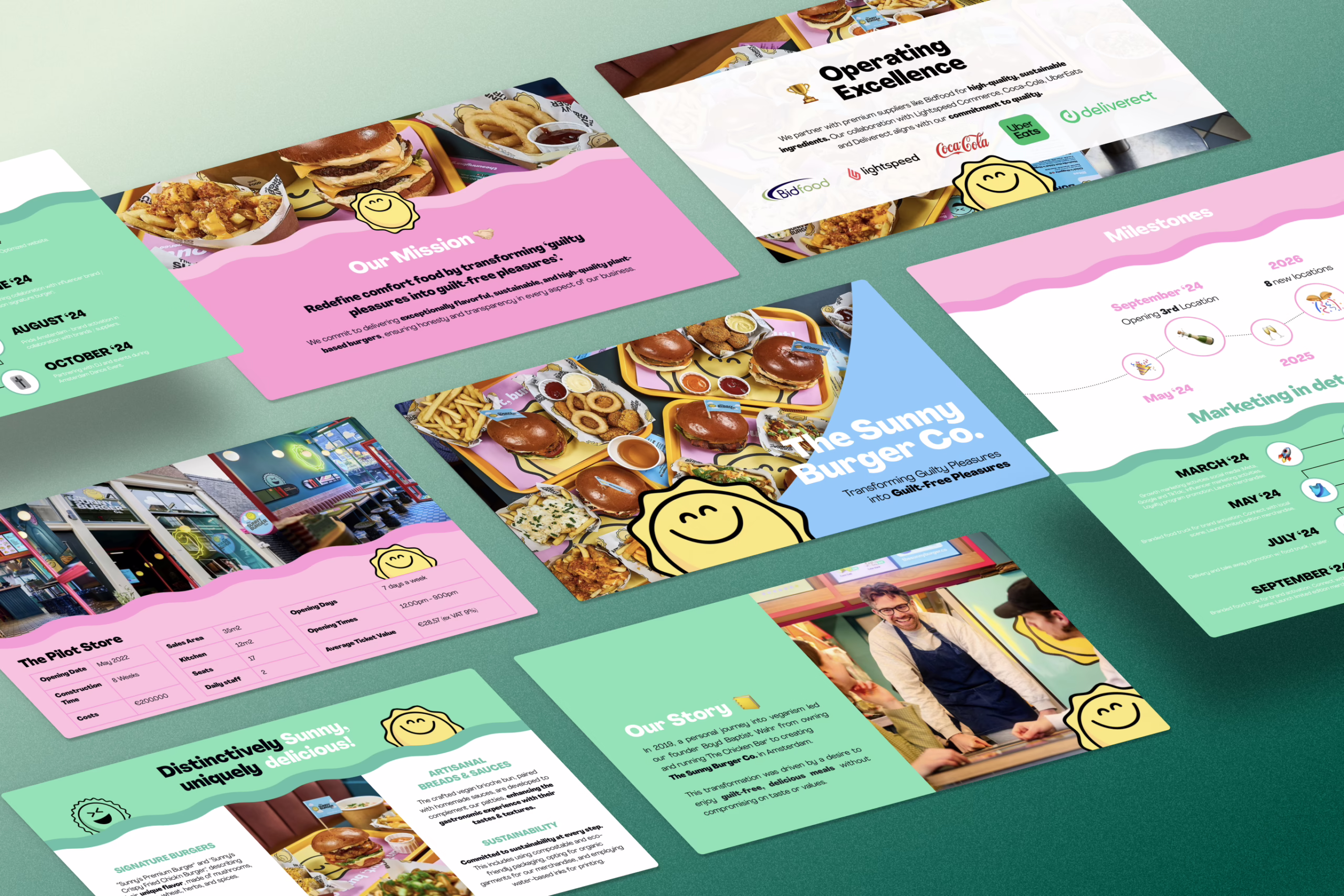
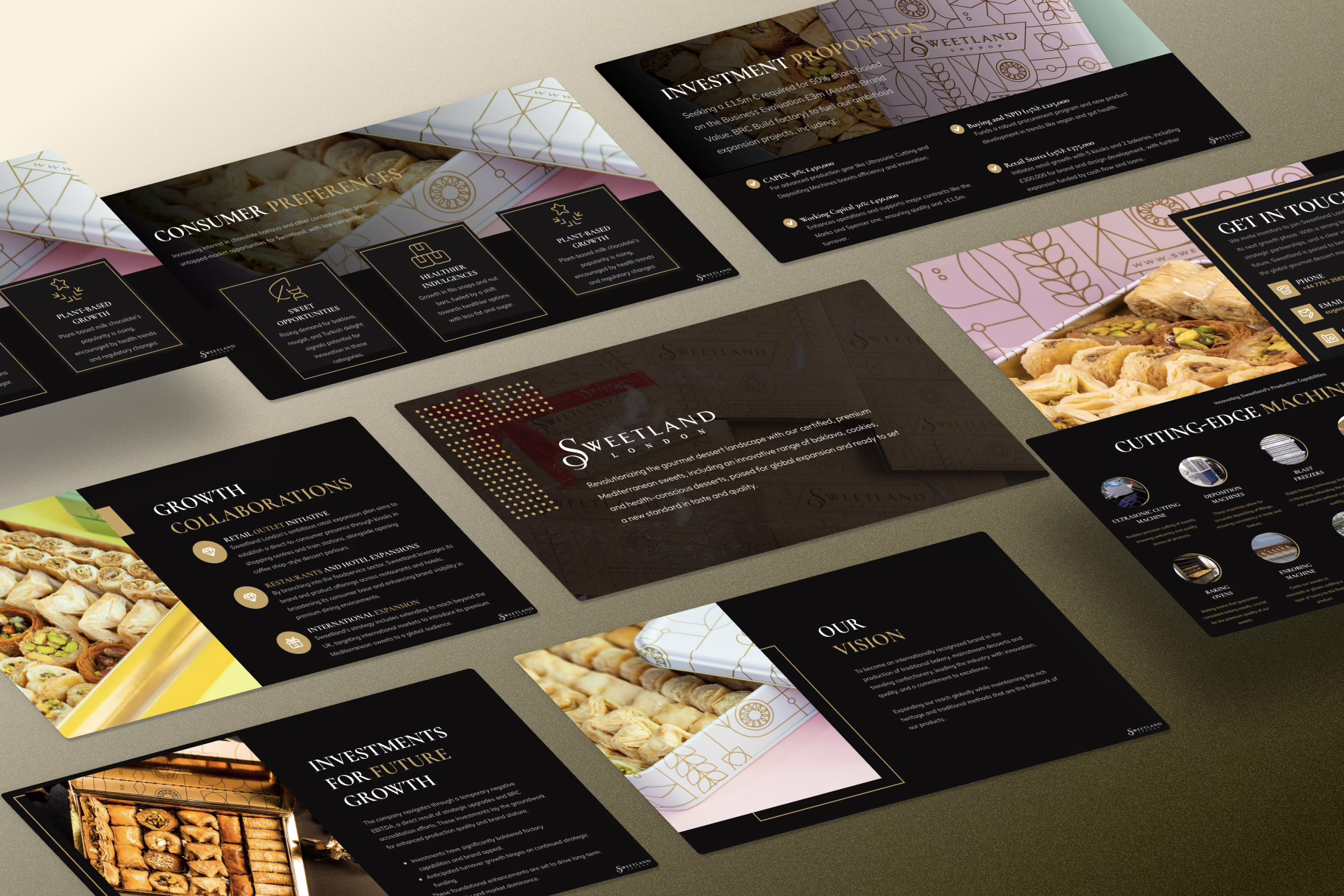
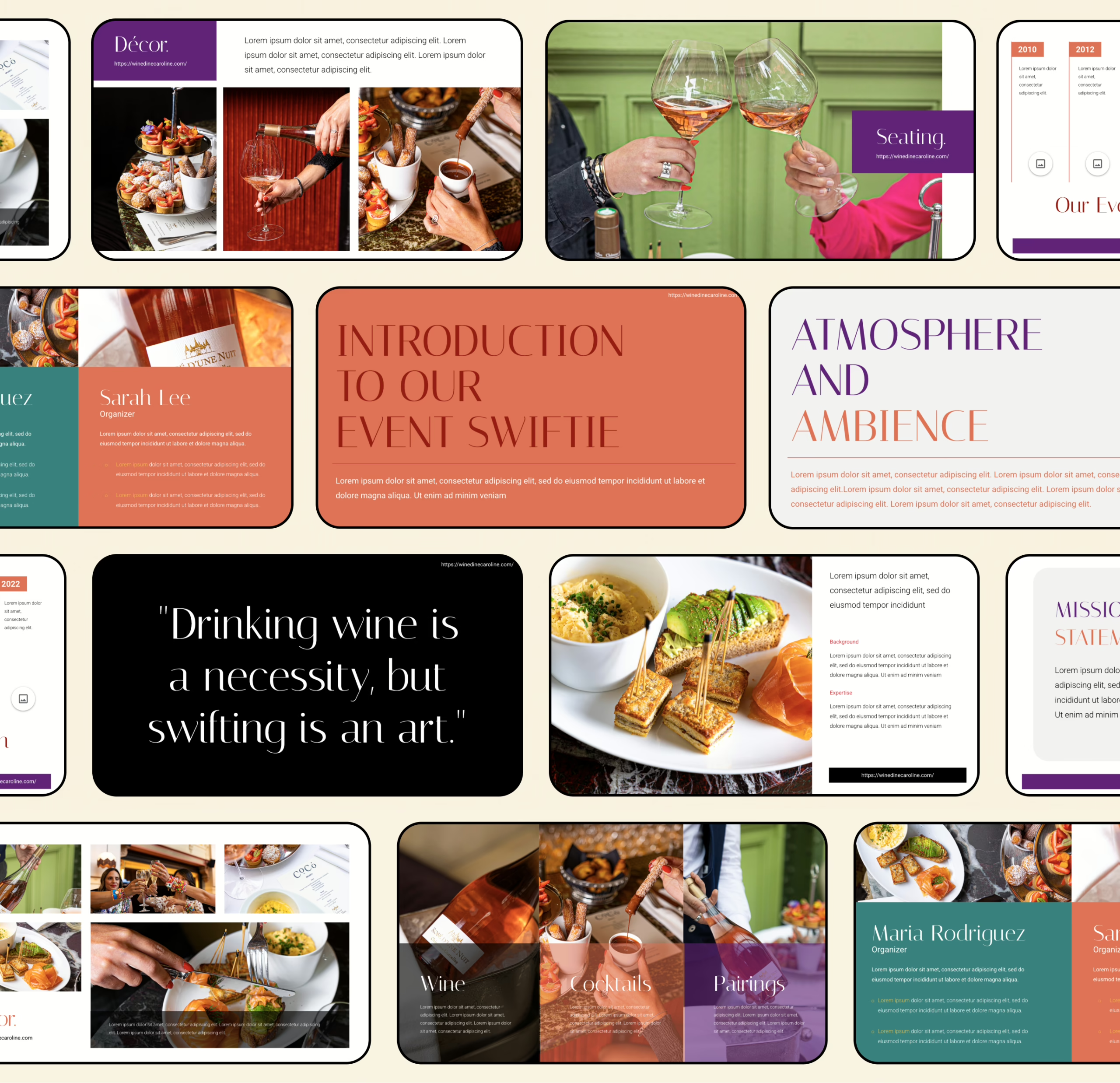
Packaging / Product Visual Standards
If your deck is F&B and the product visuals are sloppy, the whole story starts feeling imaginary. This section is the visual spec for any product slide, packaging slide, and “what we sell” section—so reviewers can understand the offer in seconds.
The 5-image set that should exist (even if you only show 2–3 on the slide)
- Hero packaging shot (front-facing, clean, readable)
- Serving context (the product in real-life use: poured, plated, held, chilled, etc.)
- Ingredient / texture close-up (what makes it “this,” not “generic”)
- Variant grid (SKUs/flavors/sizes—simple and organized)
- Label callouts (2–4 zoomed highlights: claims, nutrition, key differentiators)
Hero shot rules (packaging that reads instantly)
- Use a neutral or controlled background (no busy lifestyle scene as the hero).
- Packaging should be straight, not tilted, with the label readable at thumbnail size.
- Show one dominant SKU first. Variants come later as a grid.
- Keep reflections controlled. Avoid glossy glare hiding typography.
If your hero shot keeps looking “template-y,” it’s usually because composition and hierarchy are off—compare your slide against common pitch deck design mistakes and fix the layout before you “fix the image.”
Ingredient / proof close-up rules (the credibility shot)
Use macro shots only when they explain differentiation:
- Functional benefit ingredient (protein source, adaptogen, fermentation culture, etc.)
- Texture that’s part of the sell (crispness, foam, melt, pour)
- Process indicator (cold-pressed, aged, brewed, roasted)
Don’t use random ingredient montages. “We have lemons” is not a differentiator.
Label / compliance callout rules (keep it factual, not dramatic)
You’re not writing legal copy in a deck, but you are showing you’re not careless.
- Pick 2–4 callouts max: e.g., sugar level, protein grams, allergen statement, certification icon, shelf-life note.
- Use “zoom bubble” callouts, not paragraphs.
- If a claim is still pending validation, label it clearly as “target claim” or “in progress.”
Packaging variants grid (stop making chaos)
- Use a 2×2 or 1×4 row depending on SKU count.
- Keep all variants the same scale and aligned to a baseline.
- One label line under each: flavor + size + format.
Serving context (make it real)
Serving visuals should answer:
- When is it consumed? (morning, post-gym, night snack, dinner)
- How is it used? (pour, mix, heat, snack, sip)
- Where does it fit? (home, café, on-the-go, office)
Mini checklist (paste into your deck QA)
Product slide is DONE if:
- Packaging is readable
- Offer is obvious (format, size, price anchor)
- Differentiation is visible (not just claimed)
- Variants are structured, not scattered
- Callouts are minimal and factual
Need mockups fast without the “Photoshop Olympics”? Use a lightweight stack from tools for creating pitch decks (mockups, image cleanup, slide assembly) so the visuals don’t become the bottleneck.
Deck Build System
This is the production pipeline that prevents decks from turning into a chaotic mix of half-written slides and last-minute design panic.
Phase 1 — Outline (2–4 hours)
Goal: Lock the slide order + message per slide.
Deliverables:
- Slide list (10–14 slides)
- One sentence per slide: what this slide proves
- Asset list: what images, charts, and numbers you need
Definition of done: You can explain the deck without showing it.
Phase 2 — Draft (4–8 hours)
Goal: Write slide copy in “slide language,” not essay language.
Deliverables:
- Headlines + 3–6 bullets per slide
- Placeholder numbers + assumptions list (clearly marked)
- Notes for charts (what the chart should show, not the chart itself)
If drafting is slow, use controlled AI assistance for rough copy—but keep it disciplined. The point is speed, not hallucinations. A practical workflow is outlined in ChatGPT for pitch decks.
Phase 3 — Design (6–12 hours)
Goal: Turn content into visual hierarchy and consistent structure.
Deliverables:
- Grid + typography rules applied across the deck
- Visual system: colors, icon style, chart style
- Image standards (see section above)
Definition of done: Every slide has one dominant message and reads in 5–7 seconds.
If you’re debating whether to build a “short deck” vs. a “full deck + appendix,” settle it early—your production flow changes based on versioning. Use short vs. long deck workflow as the decision rule.
Phase 4 — QA (1–2 hours)
Goal: Remove friction and inconsistency.
Run a final sweep:
- Are units consistent (%, $, time windows, cohorts)?
- Are charts labeled with time ranges and definitions?
- Any slide trying to do two jobs? Split it.
- Any numbers missing assumptions? Add them.
Phase 5 — Versioning (30–60 minutes)
Goal: Create export-ready formats and “who is this for” variants.
- PDF (standard)
- Light version (for quick sharing)
- Appendix pack (for follow-up questions)
Design Guardrails
Design isn’t decoration—it’s comprehension speed. These are hard rules that prevent “template soup.”
Typography rules
- Max 2 fonts (1 for headings, 1 for body).
- Minimum body size: 18pt on standard 16:9 slides (yes, really).
- Headlines should be a claim, not a label (avoid “Market” → write the takeaway).
If your deck feels “off” even with good content, it’s often because typography is signaling the wrong mood. Use font psychology for pitch decks to choose type that matches category tone (premium beverage vs. mass snack vs. functional food).
Density rules (what goes on one slide)
- One message per slide. If you’re saying “and also…” you need another slide.
- Max 35–45 words per slide (excluding footnotes).
- Max 3 visual elements competing for attention (image, chart, diagram).
- Avoid micro-text disclaimers scattered everywhere—consolidate assumptions.
Spacing and grid rules
- Use a consistent 8pt / 16pt spacing rhythm (or similar).
- Align everything. If you “eyeball it,” it will look like you did.
- Keep margins generous; crowded decks read as uncertain.
Chart rules (non-negotiable)
- Every chart must include: metric, unit, timeframe, source/notes (tiny is fine).
- No unlabeled axes. No “mystery growth curves.”
- If the chart can’t be read in 3 seconds, it’s not helping.
For the most common visual traps founders fall into, cross-check against visual design errors in pitch decks before you export.
Financial Slides: Required Assumptions List
A financial slide isn’t “numbers.” It’s assumptions → outputs. If assumptions are missing, the model reads like fiction.
Assumptions you must state (even briefly)
Pricing & revenue
- Price by channel (DTC vs. wholesale vs. foodservice)
- Expected sales mix (% by channel over time)
- Volume driver (orders/month, units/store/week, covers/day)
Margins & costs
- COGS components (ingredients, packaging, manufacturing)
- Gross margin target + mechanism (what improves it and when)
- Fulfillment / delivery / platform fees
- Promo allowances / returns (if retail)
Growth mechanics
- Customer acquisition lever (paid, organic, partnerships)
- If DTC/subscription: retention/repeat purchase assumption
- Ramp timeline (when distribution or scale actually happens)
Operating model
- Headcount plan (roles, when hired)
- Fixed cost baseline (rent, warehouse, co-packer overhead, software)
- Capex vs. opex split if relevant
Cash reality
- Working capital notes (inventory paid upfront, receivables lag)
- Break-even point definition (what metric, what month)
Stage changes what “enough detail” looks like. If you’re preparing multiple versions, align assumptions to the round context using pre-seed vs. Series A expectations—not for decision logic, but so the level of detail matches the moment.
Q&A Prep: Objection Bank (By Category)
This isn’t about “winning arguments.” It’s about being ready when someone pokes the obvious weak points.
Market & category questions
- What specific segment are you starting with, and why that wedge first?
- What substitute behavior are you replacing (not just competitors)?
- Which trend matters, and which is noise?
Unit economics questions
- What are margins by channel today vs. after scale?
- What’s the biggest cost lever, and how will you actually improve it?
- What breaks first when volume doubles?
Operations & supply chain questions
- Who produces it, what are MOQs, and what’s lead time?
- What happens if ingredient pricing spikes or a supplier fails?
- Where is quality control enforced?
Distribution & go-to-market questions
- What is your first acquisition channel and why is it realistic?
- How do you get shelf space / menu placement / repeat orders?
- What’s the sales cycle and who runs it?
Differentiation / “moat” questions
- What stays true when a bigger brand copies the packaging?
- Is your advantage product, process, brand, or distribution? Pick one.
Team & execution questions
- What role is missing today that you must hire next?
- What experience on the team reduces the biggest risk?
When you’re preparing answers, don’t just list facts—structure responses to avoid predictable mental traps (anchoring, loss aversion, etc.). cognitive biases in pitching helps you package answers so they land cleanly.
One-Sentence + Three-Sentence Templates
These are designed to stop you from writing vague positioning and to keep your cover + intro slides tight.
One-sentence version (category + buyer + outcome + differentiator)
We help [specific buyer] achieve [measurable outcome] by delivering [product format] that’s different because [one proofable reason].
Example structure (not filled):
“We help ___ achieve ___ by delivering ___, differentiated by ___.”
If your opening line still feels like a slogan, build it the way you’d build a strong opening slide: claim first, then proof. The mechanics are outlined in the Hook Slide method.
Three-sentence version (problem → solution → traction proof)
- Context/problem: “Today, [buyer] struggles with [specific friction].”
- Solution: “We solve it with [product], delivered through [channel], designed around [differentiator].”
- Proof: “So far, we’ve validated this through [evidence: repeats, pilots, velocity, partnerships].”
Keep sentence three factual. No adjectives. Numbers beat vibes.
FAQ + Micro-Definitions
Gross margin vs. contribution margin
- Gross margin: revenue minus COGS (product costs).
- Contribution margin: gross margin minus variable costs tied to selling (shipping, fees, variable labor, promos).
If you’re DTC or delivery-heavy, contribution margin matters more day-to-day.
TAM vs. category size
- Category size is the big market headline.
- TAM (as used in decks) is only useful when it’s tied to a reachable segment and a realistic entry point. Otherwise it becomes decoration.
DTC vs. retail (why your pricing math changes)
- DTC: higher price, higher fulfillment and marketing costs, more control.
- Retail: lower unit revenue, more volume potential, but margins get squeezed by channel cuts and promos.
Velocity (retail)
Units sold per store per week (or month). It’s a practical signal because it measures demand in the channel you’re trying to scale.
Repeat rate vs. retention
- Repeat rate: how many customers buy again within a period.
- Retention: broader measure of customers staying active over time (often subscription-specific).
“Claims” (packaging)
Any statement that implies a benefit or attribute (e.g., “high protein,” “supports immunity,” “zero sugar”). In decks, keep claims factual and avoid implying certifications you don’t have.