


What makes a compelling pitch deck for a fintech startup? Is it the market opportunity, the product demonstration, the business model, or the way those elements come together in a convincing investment story?
I developed FORMA to explore that question.
FORMA is an independent financial technology concept built around a simple proposition: Money, in a better place.
The project started with a complete visual identity and an interactive website featuring financial dashboards, payment card controls, savings planning tools, and product animations.
I then developed a 12-slide seed round pitch deck showing how the concept could be presented to investors as a proposed €2 million funding opportunity.
The result is a fully designed fintech pitch deck that connects the brand, product experience, market opportunity, business model, and fundraising narrative.
Unlike the pitch decks that raised capital for established startups, FORMA is an independent concept. The presentation is not evidence of an actual investment round.
Some financial assumptions, market definitions, traction figures, and team details are deliberately left as placeholders.
That distinction matters because a good investor presentation must do more than look convincing. It must communicate what the business has actually achieved, what remains uncertain, and how capital would be used to move forward.
In this case study, I’ll walk through the presentation slide by slide, explain the design decisions, and examine what would be required to turn the concept into an investor-ready deck.
1. The Cover Slide: Making a Strong First Impression
The opening slide establishes FORMA’s identity with a dimensional green landscape, minimal typography, and the headline:
Money, in a better place.

Below it is the proposed €2 million seed round.
I wanted the cover to establish a recognizable product identity before introducing the financial details.
For an early-stage startup, the opening slide has a straightforward job: help the investor remember what the company does and why it exists.
A conventional deck template might include a logo, slogan, funding round, and contact details. Those elements are useful, but the visual treatment still needs to support the company’s positioning.
FORMA’s cover connects directly to its website and mobile app concept.
The same green palette, typography, dimensional imagery, and understated visual style continue throughout the presentation.
The goal wasn’t to make the deck more decorative.
It was to make the company feel like one coherent product.
2. The Problem Slide: Turning Financial Anxiety Into a Clear Argument
The second slide begins with a simple statement:
Money got complicated.
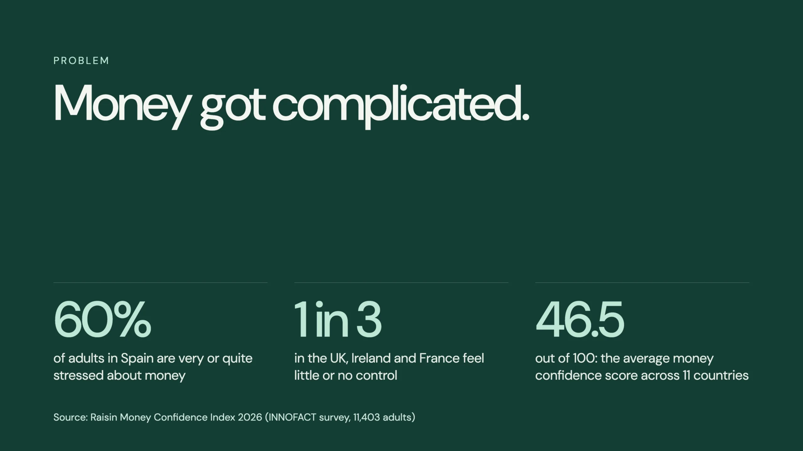
Below it, three large statistics illustrate the problem the proposed product intends to address.
The presentation cites the Raisin Money Confidence Index 2026, including findings concerning financial stress in Spain, perceptions of financial control in the UK, Ireland, and France, and an average money-confidence score across 11 countries.
These are external research claims reproduced from the concept deck, not FORMA customer research. They would need to be verified against the original reports before being included in a real investor presentation.
Visually, the slide is deliberately restrained.
One headline. Three figures. A source note.
That makes the argument easier to scan.
However, a fintech pitch needs more than broad evidence that people experience financial anxiety.
It needs to demonstrate that a clearly defined customer segment has a problem significant enough to adopt a new financial service.
A real startup would need to connect these market observations to customer interviews, behavioral evidence, and measurable demand.
This is where a data-driven story becomes more valuable than simply presenting impressive numbers.
3. The Solution Slide: One Clear View of Your Money
The solution slide introduces three principles:
Fewer steps: Remove unnecessary friction from everyday financial management.
One picture: Bring spending, savings, and plans into a single place.
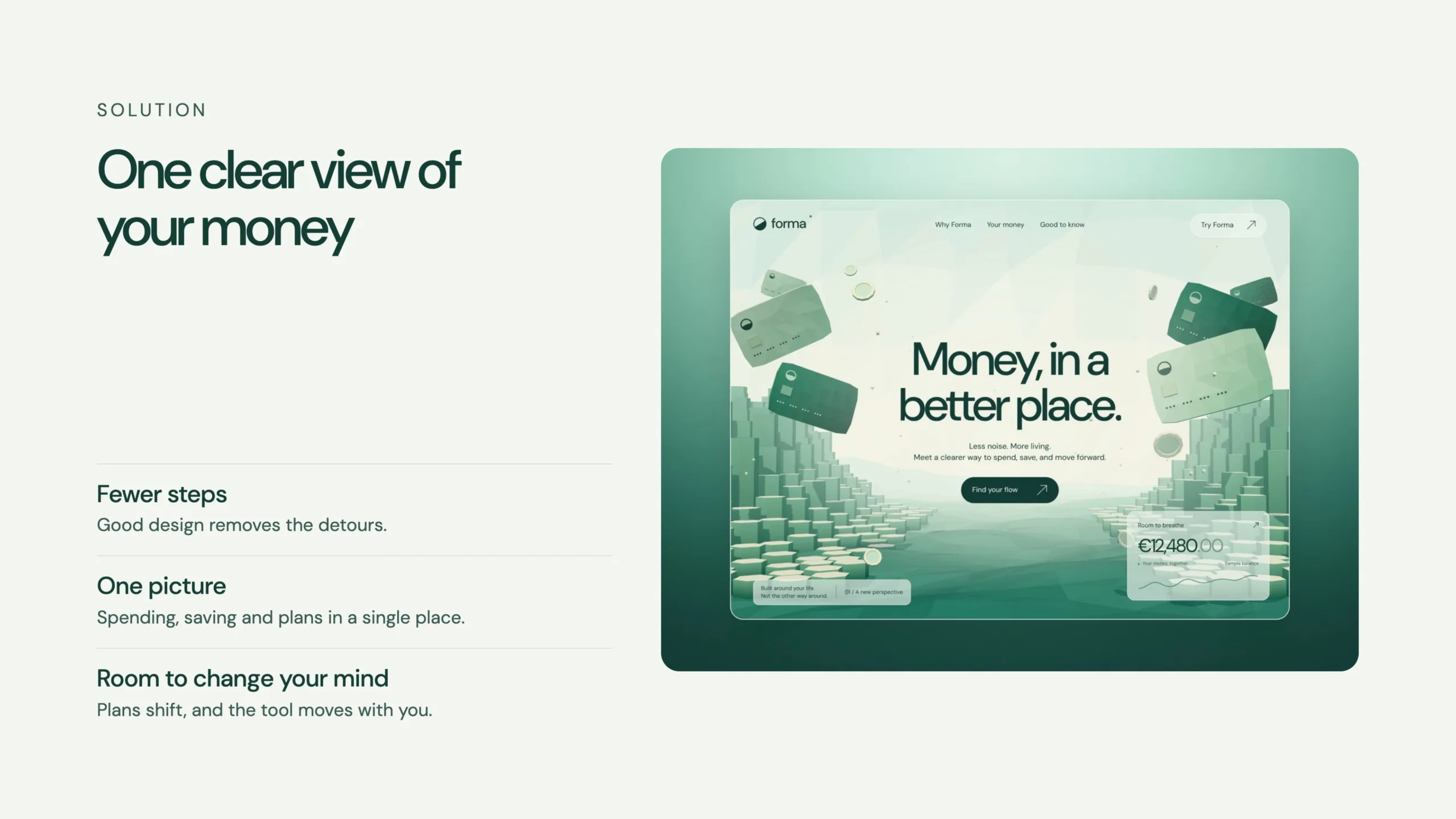
Room to change your mind: Allow financial goals to evolve as people’s circumstances change.
Alongside these statements is a visual of the FORMA website.
The slide translates the problem into a proposed product direction.
It doesn’t attempt to explain every feature.
Instead, it establishes what the product is intended to change about the customer experience.
That’s an important distinction when preparing startup pitch decks.
A feature list explains what a product contains.
A solution slide should explain why those features matter.
For FORMA, the intended differentiator is clarity rather than a greater number of financial tools.
If you’re developing this part of an investor presentation, my fintech pitch deck guide explains how the problem, solution, and business opportunity should connect.
4. Product Slide: Showing the Experience
Slide four displays three mobile interface mockups under the headline:
Spend, save and plan in one place.
The visuals demonstrate how the proposed product could organize financial information through an approachable interface.
This is one advantage of developing the brand and interactive website before producing the investor deck.
The product doesn’t exist only as a written description.
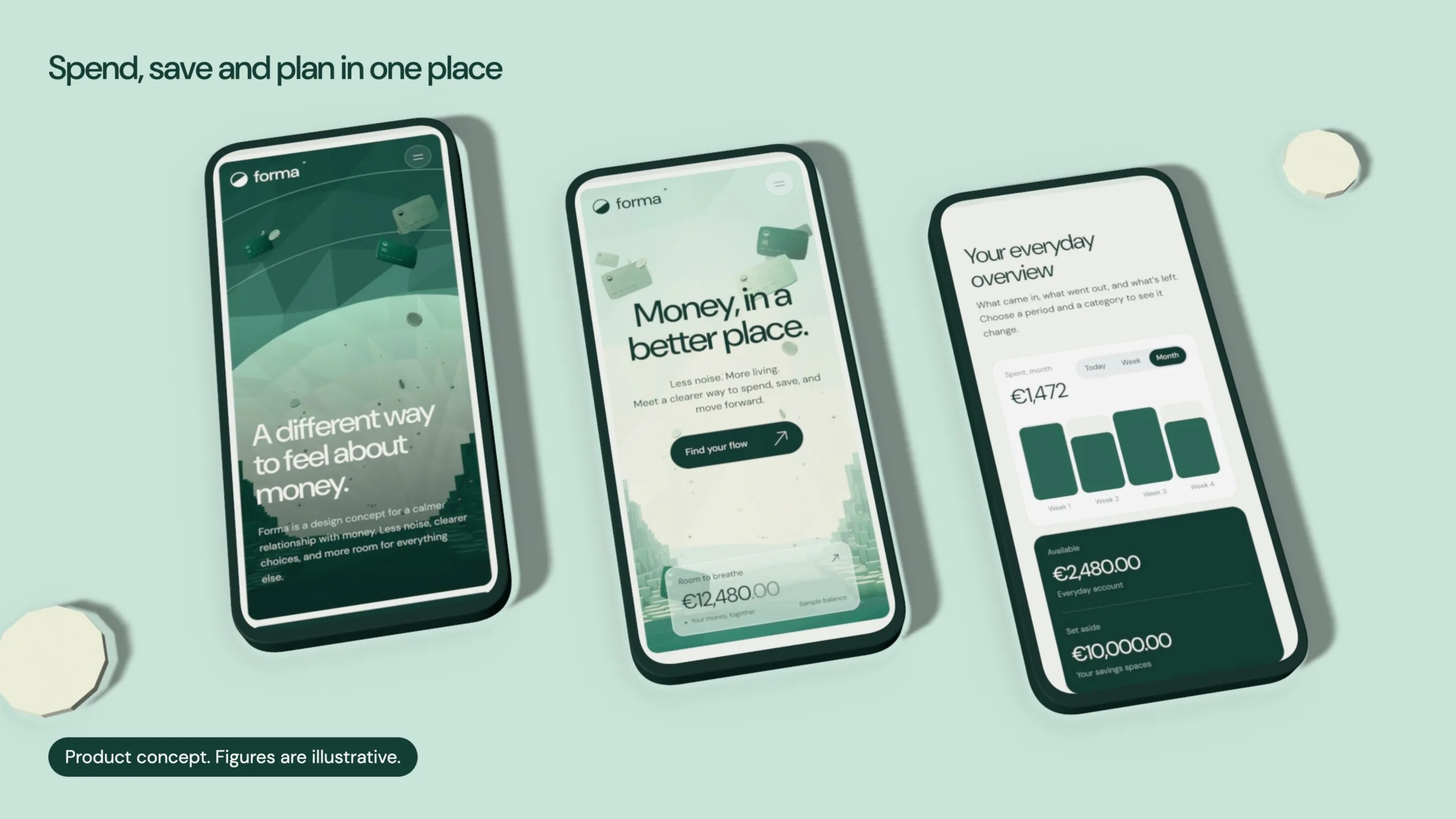
There are working interface demonstrations that illustrate the intended experience.
For a fintech company, product visuals can help investors understand complicated functionality.
That is particularly useful for businesses involving payment solutions, financial dashboards, budgeting tools, or embedded finance.
However, a visual prototype should not be confused with operational software.
FORMA’s product interfaces use illustrative information. They don’t process live transactions or connect to real banking accounts.
In an investor-ready presentation, I’d clearly separate completed functionality, planned features, and future integrations.
That helps build credibility without overstating the product’s maturity.
5. Why Now: Showing the Market Conditions
The fifth slide introduces the timing argument:
People already share their data and bank by phone.
The concept deck references open banking adoption and projected neobanking market growth in Europe.
It cites Statista, Mastercard via Yapily, and Mordor Intelligence for the figures used.
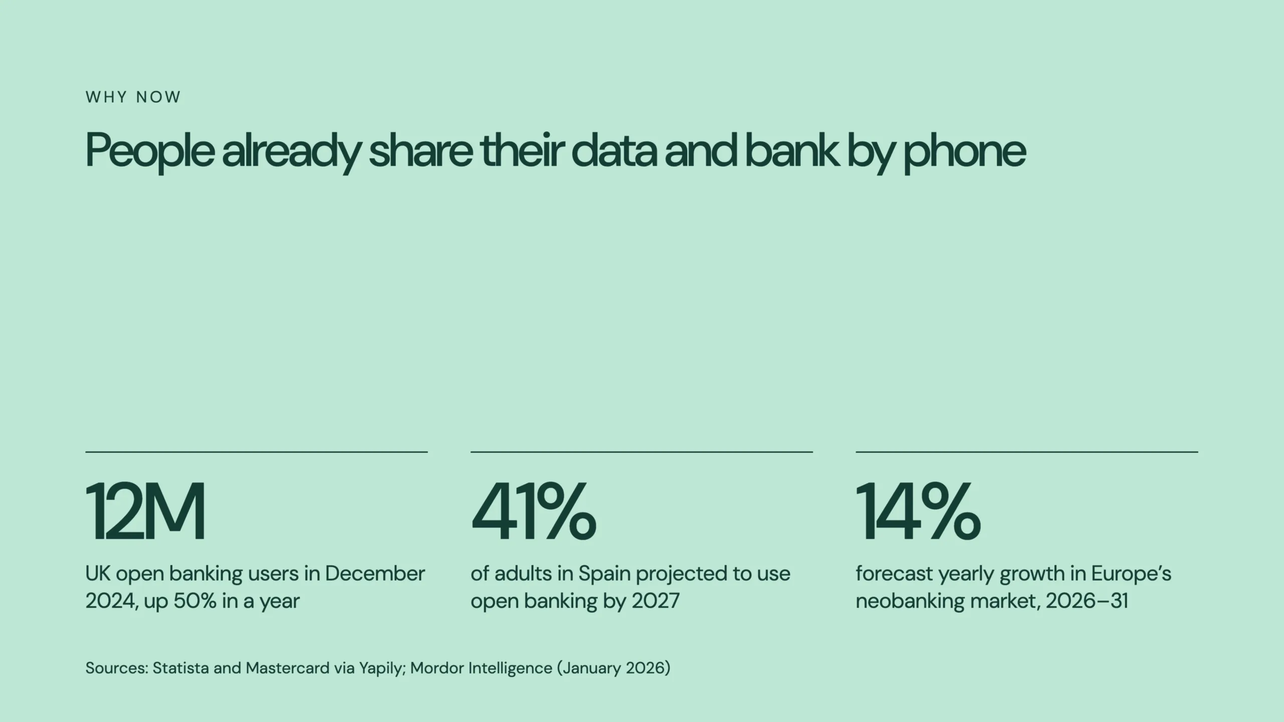
The design follows the same visual approach as the problem slide: three prominent figures supporting one clear argument.
But market timing requires more than showing that a sector is growing.
An investor will want to understand why this particular product should exist now.
Potential considerations include consumer adoption, changing banking behavior, access to financial APIs, competitive gaps, and regulatory tailwinds.
Those factors can create opportunities for new financial products.
However, they only become meaningful when connected to the startup’s specific business model and launch strategy.
For FORMA, the concept suggests that the increasing use of digital financial services creates an opportunity for a simpler, more unified consumer experience.
A real investment case would need to demonstrate that opportunity with more precise evidence.
6. Market Size: Making the Opportunity Believable
The market slide presents three horizontal blocks:
Europe’s neobanking market.
Serviceable market.
Year-three customer target.
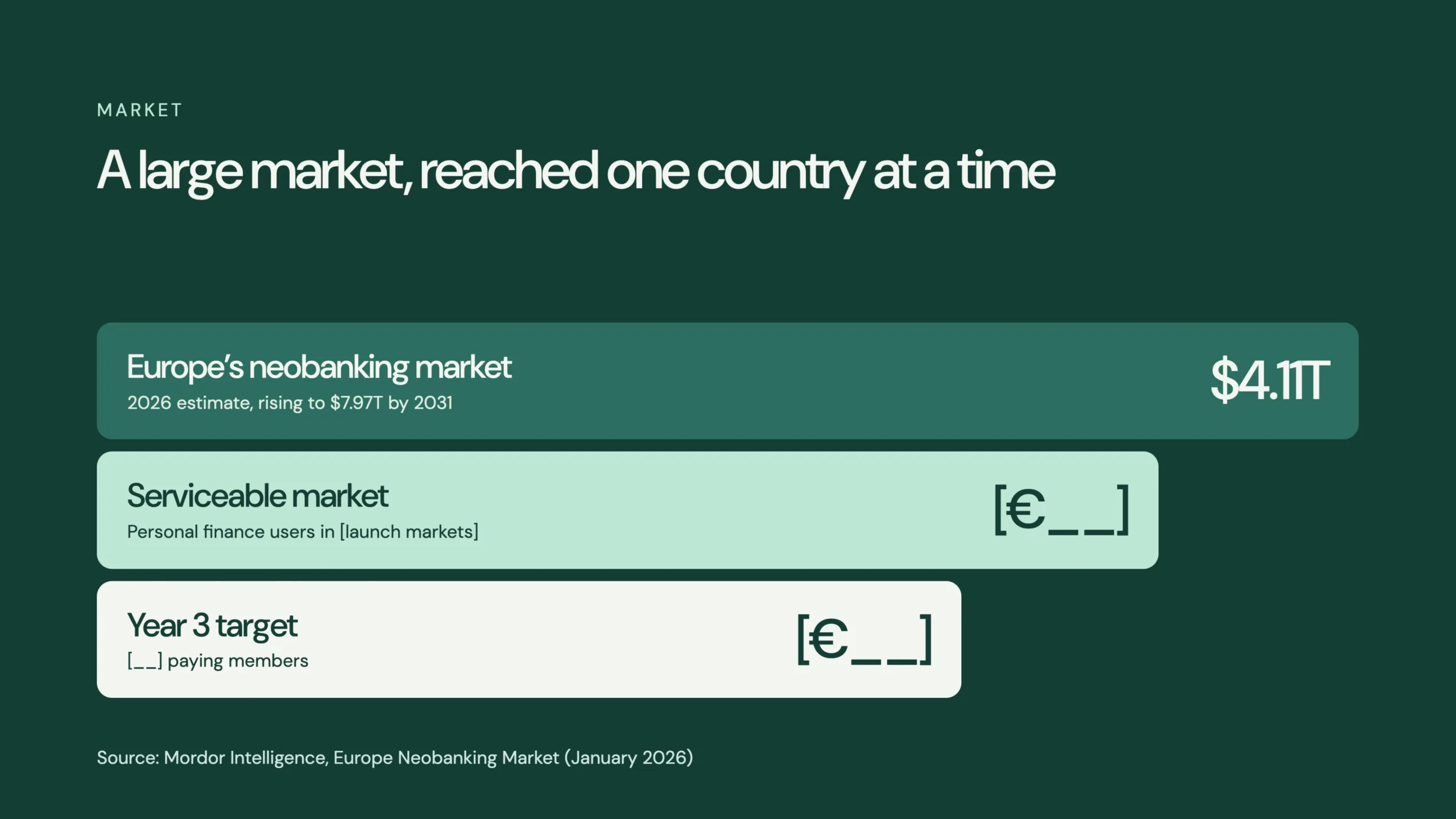
The first contains a market estimate attributed to Mordor Intelligence.
The other two retain placeholders because the proposed launch countries, customer segment, and operating assumptions haven’t been established.
From a design perspective, the hierarchy makes sense.
The largest market appears first, followed by the narrower opportunity and an achievable operating target.
From an investor perspective, however, the smaller figures are often more important.
A huge market doesn’t establish that a startup can acquire customers economically.
For a real fintech business, I’d want to know the specific launch geography, addressable audience, expected conversion rates, and customer acquisition assumptions.
This is particularly important for B2B or consumer fintech companies operating in crowded categories.
A credible market slide should connect opportunity to execution, rather than treating the entire industry as available revenue.
7. Business Model: Free to Start, Worth Paying to Stay
The business model slide introduces three proposed revenue streams.
FORMA Free: A basic financial overview and one savings goal.
FORMA Plus: Additional planning tools, unlimited goals, and a proposed payment card.
Partners: Potential interchange and savings partner revenue.
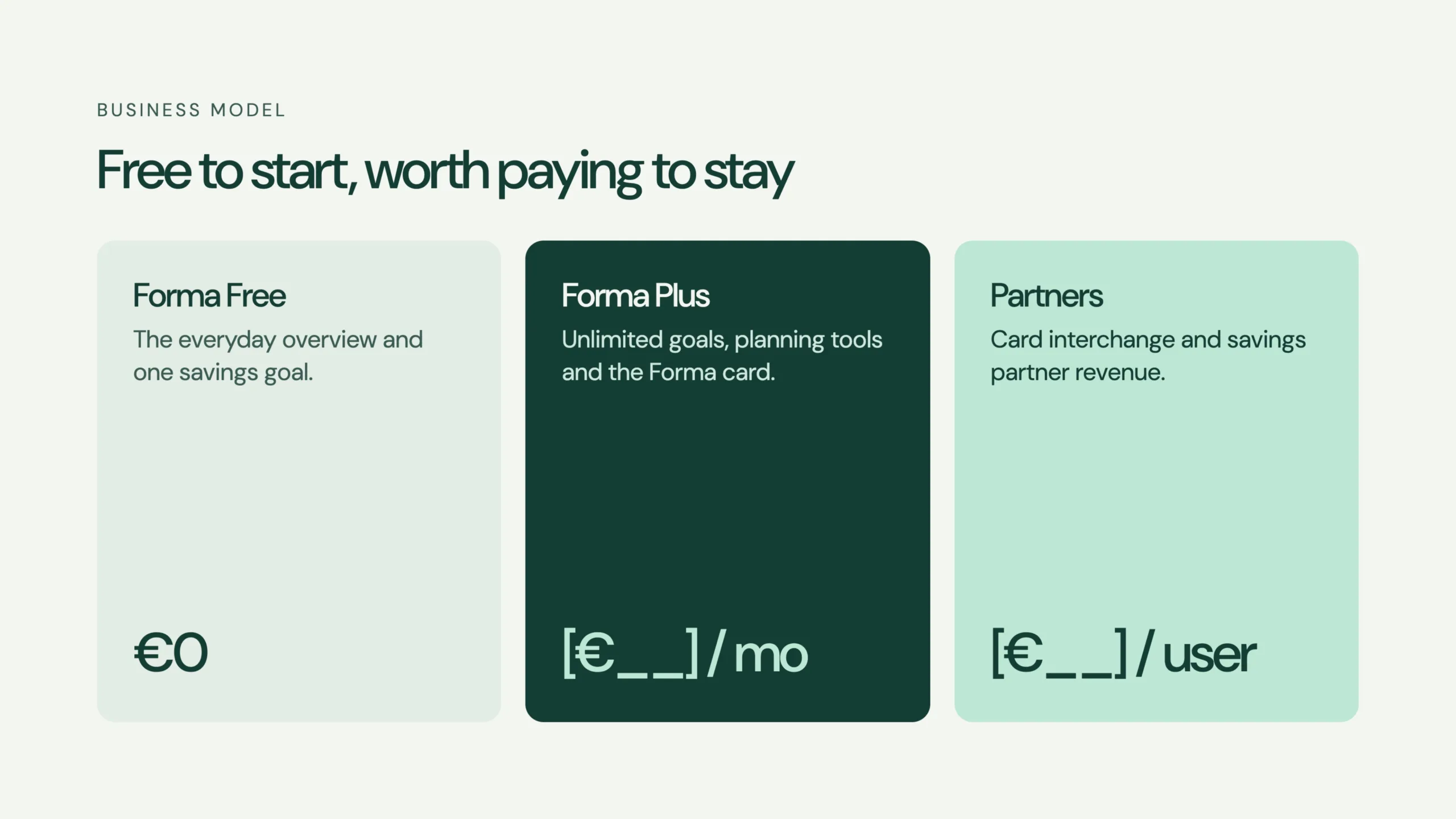
The free tier is priced at €0. The paid subscription and partner economics remain placeholders.
Three vertical cards separate these models clearly.
This makes the business easy to understand before reviewing more detailed financial assumptions.
But a winning pitch deck needs to establish how the economics could work.
An investor would want to examine customer acquisition cost, retention, paid conversion, gross margin, servicing costs, and potential partner revenue.
For a lending business, additional metrics might include underwriting performance, defaults, and loss ratios.
For a payment infrastructure company, transaction volumes, take rates, integration costs, and processing economics could be more relevant.
These businesses shouldn’t use identical financial slides simply because they operate in fintech.
FORMA is primarily positioned around consumer financial management, so the relevant unit economics would need to follow that proposed model.
More broadly, the business model needs to support the investor pitch deck structure, rather than simply fill a slide with possible revenue streams.
8. Traction: The Difference Between a Prototype and a Business
The eighth slide is one of the most important in the presentation.
Its headline reads:
The brand and experience are built.
The slide separates what exists from what remains unproven.
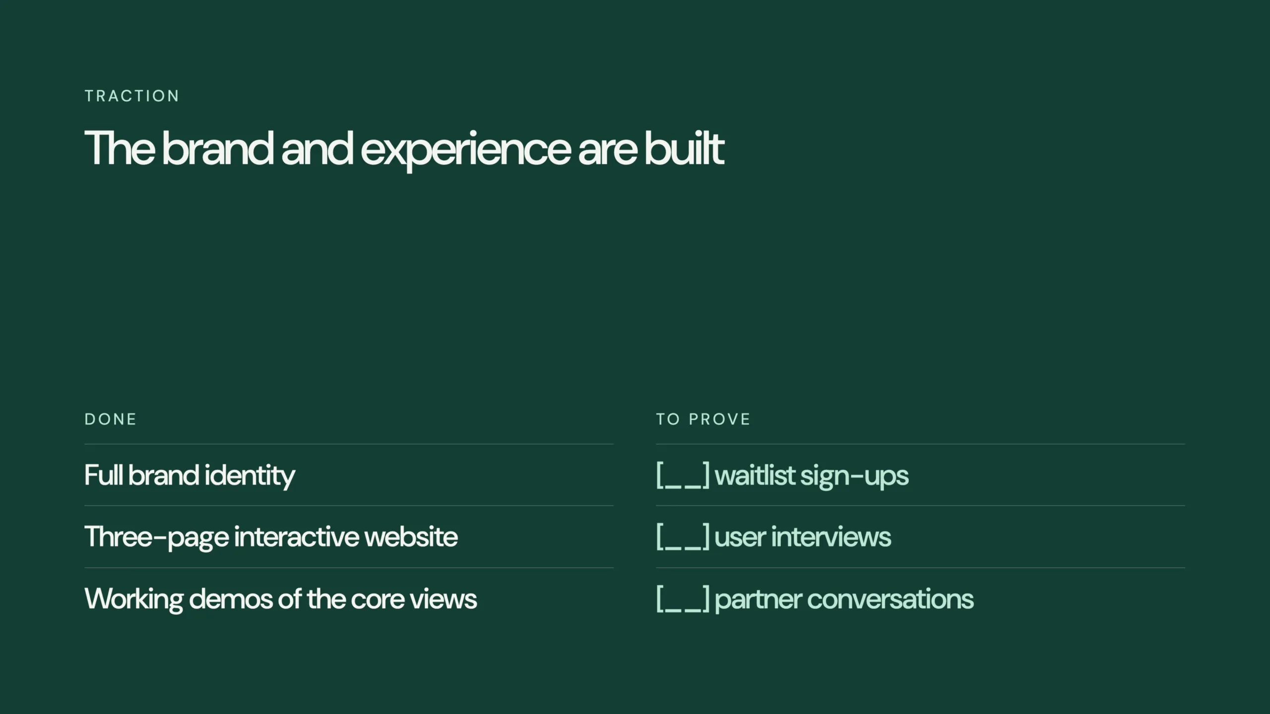
Completed:
- Full visual identity.
- Three-page interactive website.
- Working demonstrations of core product views.
Still to validate:
- Waitlist sign-ups.
- User interviews.
- Financial partner conversations.
This distinction is deliberate.
A complete website isn’t proof of customer demand.
A polished mobile interface isn’t evidence of product-market fit.
And an attractive brand doesn’t establish a viable business model.
For an actual startup, this slide would need measurable traction, dated milestones, and clearly defined evidence.
Depending on the company, that might include active users, recurring revenue, signed partnerships, retention, or early commercial agreements.
For a seed-stage business, investors may accept a smaller amount of evidence than they would at Series A, Series B, or Series C.
But the underlying principle is the same: claims should be supported by facts.
That is how a pitch deck starts building investor confidence.
9. Competition: Positioning Around a Different Experience
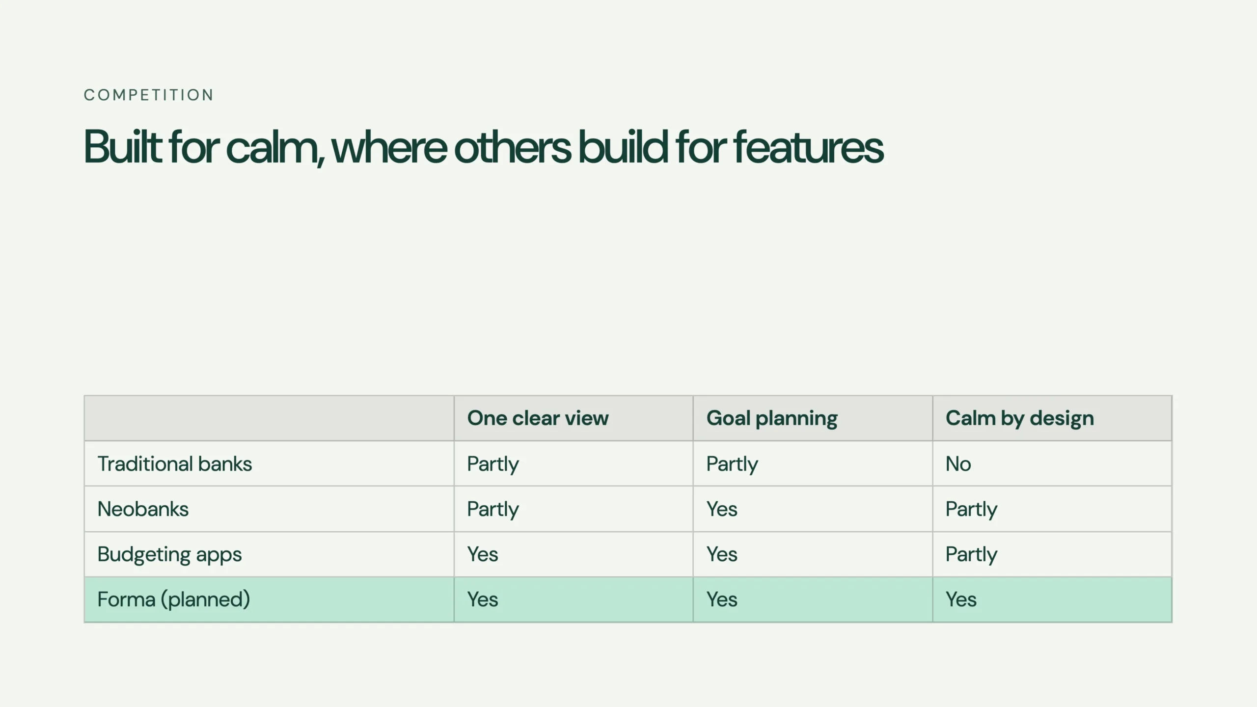
The competition slide compares four categories:
Traditional banks, neobanks, budgeting applications, and the proposed FORMA product.
The comparison uses three criteria:
- One clear financial overview.
- Goal planning.
- Calm by design.
The intention is to position FORMA around simplicity rather than competing on the number of features available.
The comparison table is easy to review, but its assessments are conceptual rather than independently validated.
A real presentation would need named competitors and defensible evaluation criteria.
Companies such as N26, Revolut, and Monzo provide useful reference points for European digital banking, although their products, markets, and regulatory arrangements differ.
The key question isn’t whether FORMA could present a cleaner dashboard.
It’s why a customer would choose it over an established alternative.
That answer might involve product experience, distribution, pricing, service quality, or a specific unmet need.
Visual design can support the differentiation argument.
It cannot replace the underlying commercial evidence.
10. Go-to-Market: Start With One Market
The go-to-market slide introduces a three-phase strategy.
Phase 1: Waitlist. Build early interest in one launch market.
Phase 2: Private beta. Introduce early users alongside a proposed licensed partner.
Phase 3: Public launch. Introduce paid functionality and expand when the initial model has been tested.
The concept avoids claiming that FORMA could launch across Europe immediately.
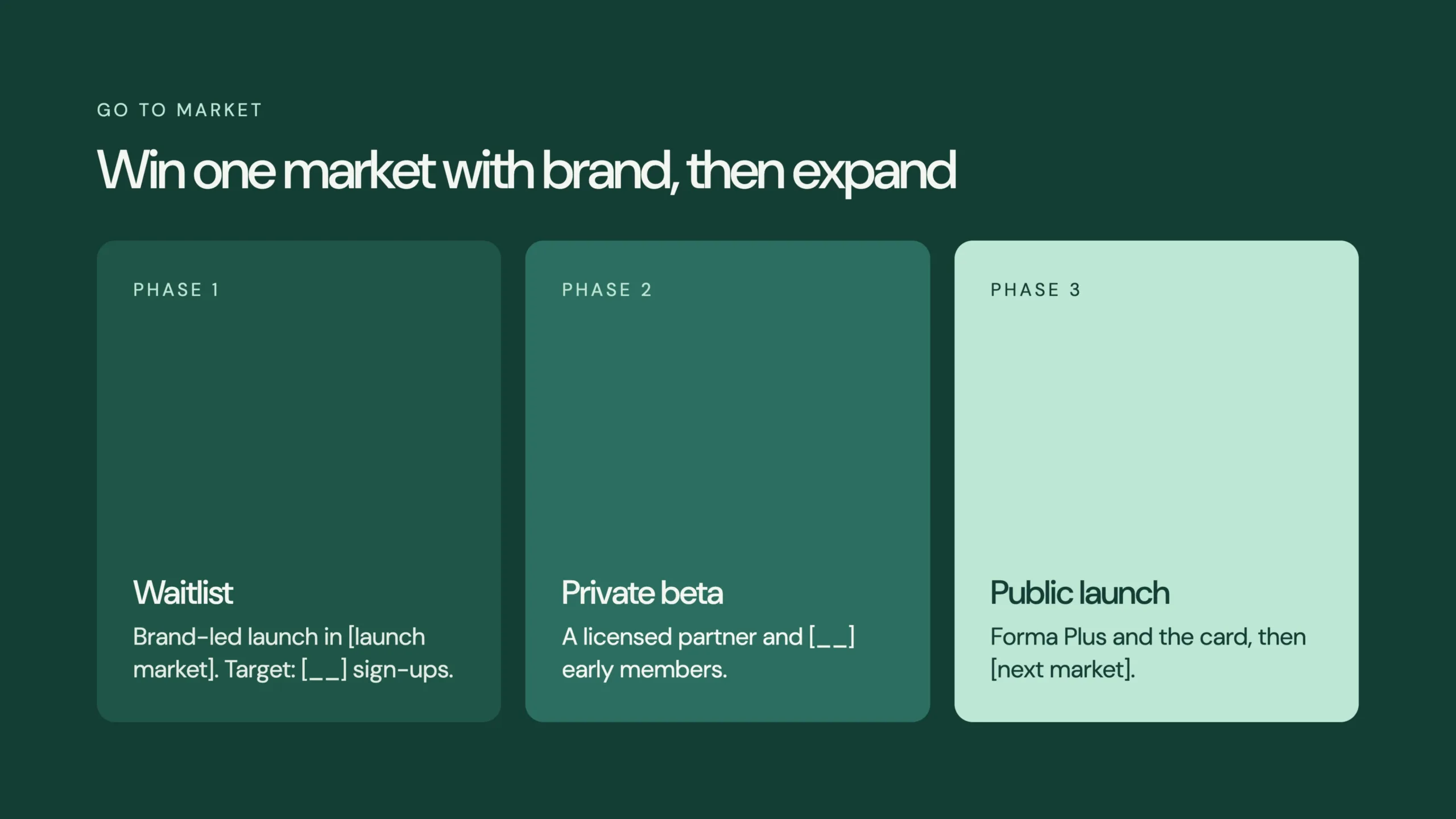
Instead, it suggests validating one market before expanding.
That makes for a more focused narrative.
However, a genuine fintech fundraising presentation would need specific channels, customer acquisition assumptions, launch milestones, and a clear explanation of any required banking relationships.
A go-to-market slide should show how the company intends to acquire and retain customers.
A sequence of phases is only the starting point.
11. Team: Matching Experience to Execution Risk
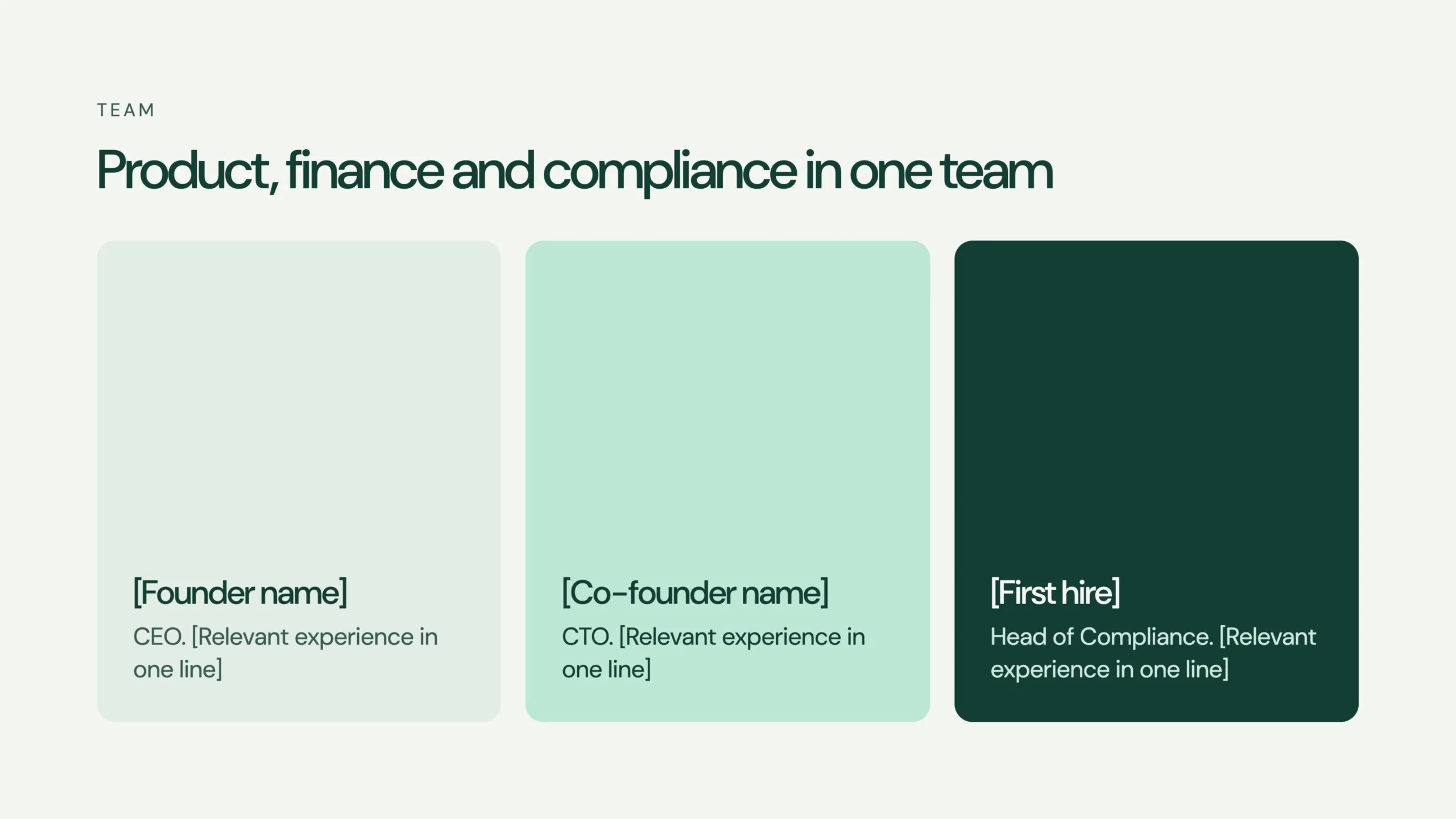
The team slide proposes three positions:
CEO: Commercial direction, strategy, and leadership.
CTO: Product development, architecture, and engineering.
Head of Compliance: Regulatory responsibilities and relevant financial oversight.
These positions contain placeholders rather than actual names and professional backgrounds.
For an investor, this would be a major gap requiring completion.
A fintech business can face significant execution risks involving technology, customer adoption, licensing, and operations.
Investors need to understand whether the people behind the company have relevant experience addressing those challenges.
A strong team slide should demonstrate more than job titles.
It should explain why those individuals are positioned to build the business.
For early-stage ventures, previous accomplishments, technical expertise, industry knowledge, and access to relevant partners may provide useful social proof.
12. The Ask: A Proposed €2 Million Seed Round
The final slide presents a hypothetical €2 million capital raise.
The proposed allocation is:
| Use of funds | Amount |
|---|---|
| Product and engineering | €1.0M |
| Compliance and partners | €0.4M |
| Growth and brand | €0.4M |
| Operations | €0.2M |
| Total | €2.0M |
Horizontal bars make the relative allocations easy to understand.
Half of the proposed funds are assigned to product and engineering, with the remainder distributed across regulatory, commercial, and operational priorities.
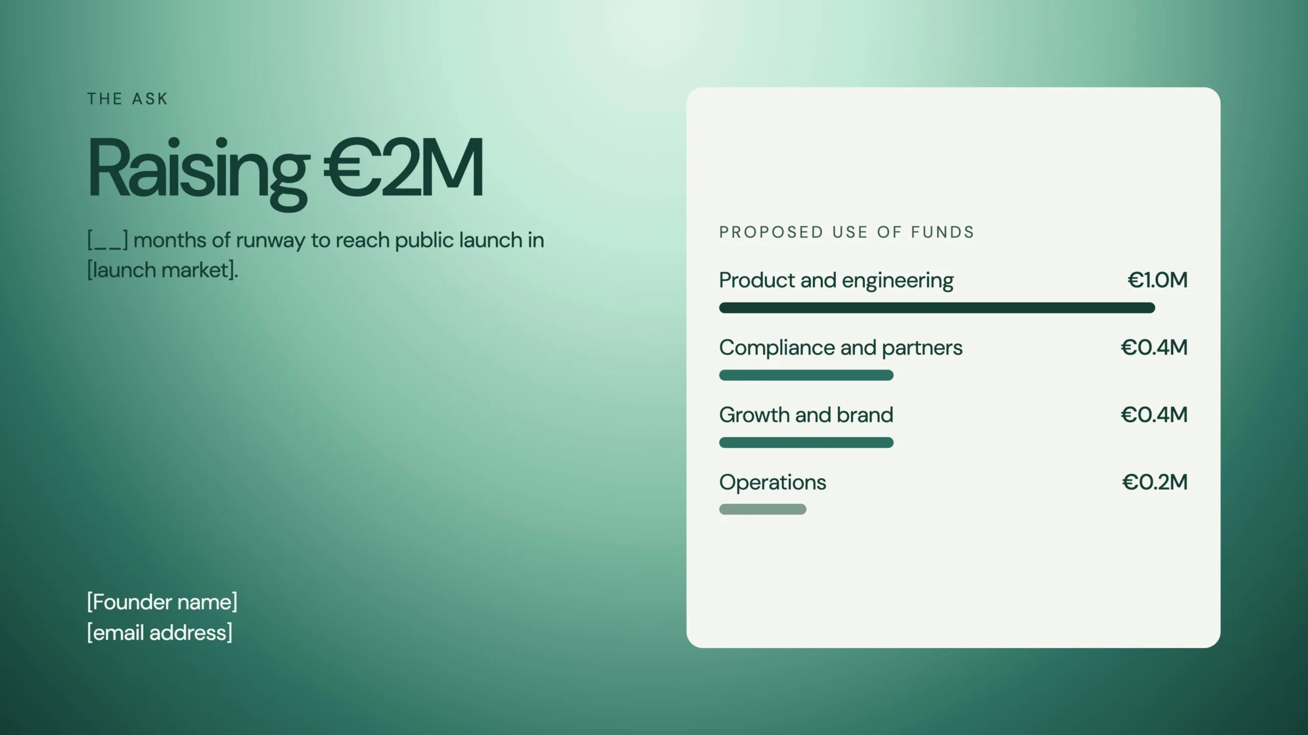
But the presentation still contains placeholders for runway and launch geography.
A proper capital pitch would need to connect the investment amount to specific milestones.
What would the business accomplish with €2 million?
How many customers would it aim to acquire?
What product functionality would be completed?
Which regulatory or partnership milestones would need to be achieved?
And what evidence would be required before raising another round?
Those are the questions that turn an attractive funding slide into a credible financing proposal.
How FORMA Compares With Other Fintech Pitch Deck Examples
When studying fintech decks, it’s useful to distinguish between the different business models behind them.
A consumer banking company, payments infrastructure business, and financial software provider may all belong to the same broad industry.
But their investment narratives should be different.
Here are several relevant companies and examples worth examining.
Finix Pitch Deck: Payment Infrastructure
Finix operates in payment infrastructure.
A pitch deck for this category needs to explain the economic opportunity behind enabling businesses to manage or monetize payment processing.
Investors evaluating an embedded fintech play may care about transaction volumes, processing economics, enterprise integrations, and the technical infrastructure required to deliver the service.
The Finix pitch deck is therefore a useful comparison category for understanding how technical financial products can be translated into an investment story.
Brex: Business Finance and Spend Management
Brex is another relevant reference, particularly when examining how financial products can target a defined customer group.
The investment story for a business finance platform differs from FORMA’s proposed consumer experience.
A company serving startups or SMBs needs to demonstrate its customer proposition, distribution strategy, financial economics, and the value it provides relative to existing alternatives.
For a business expanding across multiple financial services, that narrative can become increasingly complex.
TransferWise: Making a Financial Problem Easy to Understand
TransferWise, now known as Wise, is a useful reference for the importance of a recognizable financial problem.
Cross-border money transfers have historically involved fees, exchange rates, and service limitations that customers may struggle to compare.
The lesson for FORMA isn’t to copy another company’s business model.
It’s to explain the customer problem in plain language before introducing the proposed technology.
Other Fintech Decks Worth Studying
Other names that appear in fintech presentation research include ChangeJar, Gusto, Dwolla, Coinbase, and platforms operating in different areas of financial technology.
For example, a Gusto pitch deck would need to reflect payroll and workforce software economics, while a crypto company such as Coinbase has a very different product and regulatory context.
Likewise, businesses involved in embedded insurance, commercial real estate finance, lending applications, or B2B SaaS require distinct investment arguments.
The important lesson is that a fintech startup shouldn’t borrow an unrelated company’s metrics simply because the presentation design looks attractive.
A deck’s structure should reflect the actual product and operating model.
For examples from companies with documented fundraising histories, explore my collection of funded fintech pitch decks.
What Makes a Compelling Fintech Pitch Deck?
After developing the FORMA presentation, I’d summarize the most important lessons in five points.
1. Build a Narrative, Not a Collection of Slides
The problem should explain the solution.
The solution should establish the product.
The product should connect to an identifiable market.
And the market, business model, and traction should support the investment ask.
If the slides don’t connect, the investor has to assemble the argument independently.
That’s also why I recommend starting with the fundraising narrative and deck structure before working on the visual design.
2. Match the Financial Story to the Business
A neobank, crypto exchange, lending company, and payment processing platform require different metrics.
For example, a payments business might focus on transaction economics and processing infrastructure.
A lender might need to show underwriting performance and risk exposure.
A SaaS business might emphasize recurring revenue and retention.
The presentation should demonstrate that the founder understands how the business creates and retains value.
3. Make the Product Understandable
For complicated financial products, the investor shouldn’t need a technical background to understand the basic proposition.
Clear diagrams, interface demonstrations, and focused explanations can make the product more tangible.
That doesn’t mean technical detail should be removed.
It means information should be introduced in a sensible order.
4. Separate Evidence From Assumptions
The strongest pitch decks distinguish completed achievements, external research, projections, and assumptions.
FORMA intentionally does this in its traction slide.
A future investor-ready version would need to extend the same discipline across market sizing, financial forecasts, business economics, and regulatory plans.
5. Use Design to Strengthen the Argument
The goal of presentation design isn’t to make every slide visually impressive.
It’s to help people understand and evaluate the business.
Consistent typography, clear visual hierarchy, restrained graphics, and appropriately structured data can make a significant difference.
But design cannot establish commercial viability.
A deck should make good evidence easier to understand, not make missing evidence harder to notice.
If you’re looking for inspiration across industries, I’ve collected additional startup pitch deck examples that demonstrate different approaches to investor storytelling.
Is FORMA a Template or an Investor-Ready Pitch Deck?
FORMA isn’t a downloadable deck template and isn’t being presented as a funded startup.
It’s an original investor presentation concept developed from an existing brand and interactive website.
The deck template question matters because generic presentation structures can be helpful, particularly when founders are starting from an empty slide.
But a template cannot supply the business model, market evidence, customer traction, regulatory plan, or investment thesis.
Those need to come from the company.
What FORMA demonstrates is how a coherent brand and product concept can translate into a structured fundraising presentation.
What it doesn’t demonstrate is a validated financial business.
For anyone preparing a real investor deck, that distinction is fundamental.
Final Thoughts: From Brand Design to Fundraising Narrative
FORMA began as an independent fintech concept.
Its development included a visual identity, interactive website, financial dashboards, payment card demonstrations, and savings planning interfaces.
The 12-slide seed deck extends that creative system into an investor presentation.
It shows how the same brand can communicate consistently across digital products and fundraising materials.
But it also demonstrates the difference between a polished presentation and a company ready to raise capital.
An investor-ready deck needs evidence, coherent economics, an experienced team, and a credible plan for execution.
The visual design should help communicate those things.
Not substitute for them.
If you’re building a fintech startup and need help translating your business into a clear investor presentation, I provide pitch deck design services covering narrative structure, visual design, and presentation development.
Viktori — Pitch Deck Design & Fundraising Storytelling
Project note: FORMA is an independent fictional financial technology concept. The €2 million seed round, proposed business model, market assumptions, team roles, and funding allocation illustrate a hypothetical investor presentation. The project has not completed the fundraising round described in the deck.
