


Pitching a banking website design project is not the same as pitching a restaurant website, a SaaS landing page, or a Shopify redesign.
You are not selling “a modern website.”
You are not selling “clean UI.”
You are not selling “responsive design.”
Those are table stakes. That is the minimum. That is the design equivalent of saying your car comes with wheels.
When you pitch a banking, investment banking, M&A advisory, private equity, wealth management, or financial services website, you are really pitching something much more important:
Trust.
The website is just the visible layer.
Underneath it, the client is asking:
Will this make us look credible?
Will founders trust us?
Will investors take us seriously?
Will high-net-worth clients feel safe?
Will business owners believe we can handle a confidential transaction?
Will this reduce perceived risk before the first call?
That is the real pitch.
And if you understand that, you immediately sound different from 90% of designers who respond with some version of:
“Hi, I can create a modern, professional, responsive website for your brand.”
Beautiful. Also, completely forgettable.
A finance website pitch has to show that you understand the business consequence of the design.
Because in banking, design is not decoration.
Design is risk management.
The Solganick Example
Let’s take a boutique Tech M&A investment bank as the example.
The brief was simple:
A boutique investment bank specializing in software and technology services mergers and acquisitions needed a minimalist, professional, modern website.
The client referenced firms like Equiteq, Canaccord Genuity, and Piper Sandler.
At first glance, a designer might think:
“Okay, they want a website that looks like those competitors.”
Wrong.
Well, half-wrong.
They might like the look, sure. But that is not the real reason they referenced them.
When a client in finance says, “We want something similar to these firms,” they usually do not mean:
“Please copy their layout.”
They mean:
“We want to create the same level of confidence.”
That is the key.
The competitors are not design instructions.
They are perception references.
The client is pointing at brands that already feel established, serious, credible, and safe. What they are really saying is:
“Make us feel like we belong in that room.”
That is the pitch you need to make.
Not:
“I will design a website similar to your competitors.”
But:
“I understand the competitor references as trust signals. The goal is not to copy them visually, but to create the same perception of credibility, authority, discretion, and deal-readiness around your own brand.”
That is a much stronger position.
Now you are not just a designer.
You are thinking like someone who understands capital positioning.
A Banking Website Is a Pitch Deck in Website Form
This is where the Viktori lens comes in.
A banking website is not just a digital brochure.
It behaves like a pitch deck.
A good pitch deck has to quickly answer:
Who are you?
What do you do?
Why now?
Why this team?
Why should I trust you?
What is the opportunity?
What is the risk?
What happens next?
A banking website has to do the same thing, except the visitor is often more skeptical and less patient.
For an investment bank, M&A advisor, lender, fund, or wealth firm, the website has to establish credibility before the prospect gets on a call.
That means the page has to silently answer questions like:
Do these people understand my market?
Have they handled serious transactions?
Do they look discreet?
Are they senior enough?
Do they specialize in my category?
Will they waste my time?
Will they make me look bad?
Can I trust them with sensitive information?
That is a psychological sequence.
Not a design checklist.
And this is where many pitches fail. Designers focus on what the website will contain. The stronger move is to explain what the website must make the audience believe.
What the Client Says vs. What the Client Means
Finance clients often do not describe design in design language.
They describe it through references, adjectives, and competitor names.
They say:
“We want something clean and professional.”
They mean:
“We cannot look amateur.”
They say:
“We like these competitor websites.”
They mean:
“These firms feel established, and we want that kind of credibility.”
They say:
“We want a minimalist design.”
They mean:
“We want the site to feel premium, controlled, and not desperate.”
They say:
“We need clear service sections.”
They mean:
“Visitors should immediately understand what we do and why they should contact us.”
They say:
“We want a modern website.”
They mean:
“We do not want to look like an old financial firm stuck in 2009.”
Your pitch should show that you can translate those statements.
Because if you only repeat the brief back to them, you are not adding value.
For example, a basic designer response says:
“I can design a minimalist, professional website inspired by your references.”
A strategic response says:
“I understand the goal is to position the firm with the same level of authority and trust those references create, without simply copying their structure. For a boutique Tech M&A bank, the website needs to communicate discretion, sector expertise, senior-led execution, and confidence before the visitor ever books a call.”
See the difference?
One sells design.
The other sells judgment.
The Real Buyer Psychology Behind a Banking Website
The person visiting a banking or M&A website is not browsing casually.
They may be:
A founder considering selling their company.
A shareholder thinking about liquidity.
A CEO looking for a buy-side advisor.
An investor evaluating credibility.
A family office looking for discretion.
A business owner comparing advisory firms.
A CFO researching transaction support.
These people are not looking for “cool.”
They are looking for safety.
That does not mean the design has to be boring. It means every creative choice has to reduce doubt.
That is the foundation of the pitch.
For a banking website, your pitch should be built around four psychological jobs:
1. Reduce Perceived Risk
Financial decisions are high-stakes.
A founder selling a software company is not thinking, “I hope this website has a nice hover state.”
They are thinking:
Can I trust this firm with confidential information?
Will they understand my business?
Will they protect my position?
Will they attract the right buyers?
Will they make this process feel controlled?
The website needs to lower that anxiety.
So in the pitch, talk about clarity, structure, discretion, and confidence.
2. Signal Authority Quickly
Finance visitors judge fast.
The site has to feel credible within seconds.
That means:
Clear headline.
Sharp positioning.
No vague corporate poetry.
No overdesigned gimmicks.
No “we empower tomorrow’s growth through innovative strategic solutions” nonsense.
That sentence has been declared legally dead.
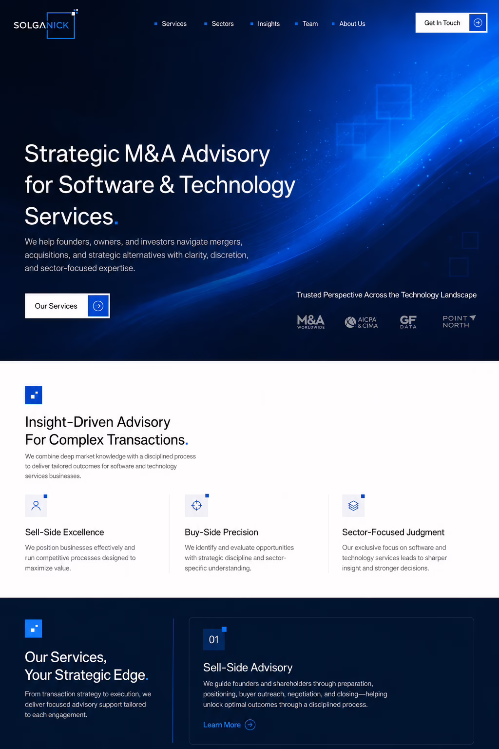
For a boutique Tech M&A bank, the headline should be specific:
“Strategic M&A Advisory for Software & Technology Services.”
That works because it tells the visitor exactly what the firm does and who it serves.
3. Make the Firm Feel Specialized
Generic finance positioning is weak.
If the firm specializes in software and technology services M&A, that should be obvious immediately.
Specialization creates trust.
It tells the visitor:
“These people understand my world.”
A founder selling a software company does not want a generic finance firm that also works with restaurants, mining companies, dog groomers, and someone’s cousin’s candle subscription startup.
They want sector fluency.
Your pitch should make that clear.
4. Create a Low-Risk Next Step
The CTA matters.
For a generic website, “Get Started” is fine.
For an M&A advisory firm, “Start a Confidential Conversation” is better.
Why?
Because it matches the emotional state of the buyer.
The buyer is not casually starting a free trial. They are considering a serious conversation involving sensitive business information.
The CTA should respect that.
That is the kind of small detail that makes your pitch feel smarter.
How to Frame the Pitch
When pitching this kind of project, do not lead with deliverables.
Do not start with:
“I can design five pages, responsive layouts, and a design system.”
Those things matter, but they are not the hook.
Lead with interpretation.
The client needs to feel that you understood the actual business behind the website.
A strong pitch structure would look like this:
1. Acknowledge the Real Objective
Start by reframing the brief.
Example:
“I understand the goal is not just to create a modern website. For a boutique Tech M&A bank, the website has to establish trust, discretion, and authority before a founder, shareholder, or investor reaches out.”
That sentence immediately separates you from template designers.
2. Decode the Competitor References
Then show that you understand why they mentioned those firms.
Example:
“The references to Equiteq, Canaccord Genuity, and Piper Sandler are useful less as layouts to copy and more as signals of the confidence the site should create. The design should feel established, focused, and credible, while still being specific to Solganick’s own identity.”
This is the money part.
You are showing strategy.
3. Connect the Brand to the Market
Use what you know about the firm.
Example:
“With Solganick’s existing navy and blue identity, I would build a restrained visual system that sits between finance and technology: institutional enough to build trust, modern enough for software founders, and clear enough to support a serious advisory conversation.”
Now the pitch feels custom.
Not “I saw your brief.”
More like:
“I understand your positioning.”
4. Explain the Page’s Job
Do not just list sections. Explain why they matter.
Example:
“The homepage should quickly establish what the firm does, who it serves, why the sector focus matters, and what the next step looks like. Services, market insight, team credibility, and a confidential CTA should all work together to reduce friction and support conversion.”
This connects design to business.
5. End With Confidence
Close simply.
Example:
“The final result should not feel like a generic finance template. It should feel like a serious boutique advisory firm with a clear point of view and a credible presence in software and technology services M&A.”
That is a strong ending.
The Mistake: Pitching the Website Instead of the Confidence
Most designers pitch the website.
They talk about:
colors
layout
responsiveness
typography
UX
sections
visual polish
modern style
All useful.
But not enough.
For finance, you need to pitch the confidence the website creates.
That is the actual buying decision.
The client is not only asking:
“Can this designer make a nice page?”
They are asking:
“Can this designer make us look like the kind of firm people trust with money?”
That is the difference.
A banking website pitch should be about perception.
The layout is the execution.
The trust is the strategy.
What to Say in the Actual Dribbble Pitch
Here is a strong version of the pitch logic:
“I understand the competitor references as perception references, not templates. The goal is not to copy Equiteq, Canaccord Genuity, or Piper Sandler visually, but to create the same feeling of credibility, authority, and confidence for Solganick’s own brand.
For a boutique Tech M&A bank, the site needs to build trust quickly with founders, shareholders, investors, and strategic acquirers. I would use the existing Solganick logo and navy/blue palette to create a restrained, premium landing page that feels institutional without becoming dated, and technology-focused without slipping into generic SaaS design.
The homepage should act like a capital-positioning tool: clear advisory positioning, sharp service framing, sector expertise, market insight, team credibility, and a confidential CTA. Every section should reduce perceived risk and make the next conversation feel appropriate.”
That is the pitch.
Not “I can make it modern.”
Modern is not the strategy.
Trust is.
How This Relates to Pitch Deck Thinking
This is why website pitching and pitch deck thinking overlap so much.
In both cases, the job is to control perception.
A pitch deck controls the perception of a business opportunity.
A banking website controls the perception of an advisory firm.
Both need:
clear positioning
audience awareness
risk reduction
proof
confidence
sharp hierarchy
credible language
a logical narrative
a next-step CTA
The difference is format.
The thinking is similar.
When I work on pitch decks, one of the biggest problems is that founders often focus on what they want to say instead of what the investor needs to believe.
The same applies here.
A banking website should not just say what the firm wants to say.
It should answer what the visitor needs to believe.
For Solganick, the visitor needs to believe:
This firm understands Tech M&A.
This firm works with serious companies.
This firm can handle confidential conversations.
This firm has senior judgment.
This firm is focused enough to be relevant.
This firm is credible enough to contact.
That is the story.
The design exists to make that story believable.
The Better Way to Approach Finance Website References
When a client gives competitor references, use them in three layers.
Layer 1: Surface Design
This is what most people see.
Colors, layout, fonts, navigation, spacing, imagery.
Useful, but shallow.
Layer 2: Category Codes
This is more important.
What visual codes tell people “this is finance”?
Examples:
Navy and white palettes.
Strong typography.
Restrained photography.
Minimal decoration.
Clear service structure.
Conservative spacing.
Proof-driven sections.
Professional tone.
These codes help the site feel category-appropriate.
Layer 3: Emotional Transfer
This is the real point.
What feeling does the reference create?
Authority?
Security?
Discretion?
Scale?
Specialization?
Prestige?
Innovation?
You are not copying the website. You are transferring the emotional effect into the client’s brand.
That is what you should explain in your pitch.
What a Banking Website Must Avoid
Sometimes the strongest part of a pitch is showing what you will not do.
For a finance or banking website, I would avoid:
overly playful visuals
generic fintech illustrations
fake futuristic gradients
loud animations
vague corporate language
too many buzzwords
startup-style hype
crypto-adjacent visual clichés
weak CTAs
stock-photo handshakes
excessive decoration
layout chaos
The site should feel controlled.
Not sleepy.
Controlled.
That distinction matters.
A good finance website has confidence. A bad one has either panic or boredom.
Neither helps.
Sample Pitch Angle
Here is the core idea I would build the Solganick pitch around:
“Solganick’s website should not imitate larger competitors. It should borrow the credibility signal those firms create, then translate it into a sharper boutique Tech M&A identity.”
That is clean.
That is strategic.
That shows you understand the assignment.
From there, the page direction becomes obvious:
Dark navy foundation.
Bright blue technology accent.
Geometric cues from the logo.
Clear M&A positioning.
Services framed around transaction needs.
Sector expertise focused on software and technology services.
Senior-led trust language.
Confidential CTA.
That is not just design.
That is capital positioning.
Why This Matters
In finance, people do not buy the website.
They buy what the website makes possible.
A better first impression.
A more serious conversation.
A stronger sense of trust.
A higher-quality lead.
A founder who feels safe enough to reach out.
An investor who does not bounce after three seconds.
A buyer who understands the firm’s specialization.
That is why the pitch should not be about “making a landing page.”
It should be about creating the right market perception.
And that is exactly how you should sell it.
Final Thought
The best design pitches do not simply respond to the brief.
They reveal the brief underneath the brief.
For a banking or investment banking website, the hidden brief is usually:
“Make us look credible enough to trust.”
Everything else is execution.
The colors.
The layout.
The typography.
The CTA.
The copy.
The structure.
All of it has to serve that one goal.
So when you pitch a banking website project, do not just say you will create something clean and professional.
Say you will create a digital trust asset.
Say you understand that the competitor references are not templates, but credibility markers.
Say the site has to position the firm properly before a confidential conversation ever happens.
Because that is what the client is actually buying.
Not a homepage.
A reason to be trusted.