


Most client briefs are not briefs.
They are clues.
You get a few lines, a budget, a timeline, maybe a reference image if the gods of freelancing are feeling generous, and then you are expected to respond like you have been sitting inside the client’s boardroom for six months.
A typical vague brief sounds something like this:
“We need a professional landing page for a healthcare startup. The design should feel trustworthy, innovative, clean, modern, and responsive.”
That is not a brief. That is a mood with a budget attached.
But here is the part many designers, agencies, consultants, and freelancers miss: a vague brief is not always a problem. Sometimes it is an opening.
When the client gives you limited information, they are not only testing whether you can “do the work.” They are testing whether you can create direction from ambiguity.
Can you interpret the category?
Can you understand the emotional goal?
Can you propose a visual or strategic path?
Can you make the project feel real before the client has even explained it properly?
That is where expert positioning begins.
Because when the brief is thin, your expertise has to do the heavy lifting.
This article breaks down how to pitch a client when the brief is vague, the company name is missing, the audience is unclear, and the only thing you know is the general industry and a few design guidelines.
I will use a real-style example from a healthcare startup landing page brief to show how to turn limited information into a confident, strategic pitch.
Not by pretending you know everything.
But by showing that you know how to think.
What Is a Vague Client Brief?
A vague client brief is a project description that gives you the desired outcome but not enough context to make final decisions.
It usually includes things like:
- The type of project
- The general industry
- A few adjectives
- A deadline
- A budget
- Maybe a reference design
- A list of required sections or deliverables
But it often leaves out the important stuff:
- Company name
- Brand positioning
- Target audience
- Product details
- Competitive landscape
- Existing visual identity
- Conversion goals
- Technical requirements
- Stakeholder preferences
- Business model
- Actual reason the project exists
In other words, the client tells you what they want to receive, but not what the work needs to solve.
That gap is where most weak proposals fall apart.
A beginner sees a vague brief and thinks:
“I do not have enough information. I should ask twelve questions.”
An expert sees a vague brief and thinks:
“I have enough information to propose a direction, while leaving room for refinement.”
That difference matters.
Because clients do not always reward the person who asks the most questions. They reward the person who makes the next step easier.
Questions are useful. But questions alone do not create confidence.
Direction does.
Why Vague Briefs Are Normal
Clients are not always bad at briefing because they are careless.
Often, they are vague because they do not have the vocabulary to explain what they need.
A healthcare founder may know they want the landing page to feel trustworthy, but they may not know how trust is created through spacing, typography, color temperature, information hierarchy, photography style, and call-to-action placement.
A SaaS founder may say they want something “modern,” but what they really mean is:
“Please do not make us look like a PDF from 2009.”
A real estate developer may ask for something “premium,” but premium could mean luxury editorial, institutional investor-grade, minimalist Swiss grid, or “make the logo bigger and add gold,” depending on who is approving it.
This is why vague briefs are common in service businesses.
The client knows the feeling they want the market to have.
They do not always know the system that creates that feeling.
That is your job.
You are not just being hired to execute instructions. You are being hired to translate messy business intent into something concrete enough to evaluate.
That could be a landing page.
A pitch deck.
A sales proposal.
A brand identity.
A website.
A campaign.
A strategy document.
Different format, same problem.
The client has an intended decision they want to influence, but the material is not yet structured to influence that decision.
Your pitch needs to show that you understand the decision.
The Real Goal of Pitching a Vague Brief
The goal is not to guess the final answer perfectly.
That is the trap.
When a client gives you a vague design or strategy brief, you do not need to magically read their mind. You need to prove that you can guide the process.
Your proposal has three jobs:
- Show that you understand the category.
- Show that you can create a reasonable direction from limited input.
- Show that working with you will reduce uncertainty, not add more of it.
That last one is the big one.
Clients do not only buy design, writing, strategy, or consulting.
They buy reduced risk.
They want to feel that you will not disappear into a cave for three weeks and return with something that looks like it was designed by a printer driver.
They want to know that you can make decisions.
That you can interpret references without copying them.
That you can ask the right questions later, but still move the project forward now.
That you have taste.
That you have process.
That you are not going to need babysitting.
This is why a strong proposal for a vague brief should not sound like:
“I can do this project. I have experience. Please check my portfolio.”
That is not a pitch. That is a polite knock on the door.
A stronger proposal sounds like:
“Based on the industry and the direction you shared, I would approach this with a calm, trust-led visual system, clear hierarchy, and a landing page structure that makes the product feel credible quickly. I would use the reference as a structural inspiration, but rebuild the palette, typography, messaging, imagery, and UI details around your brand.”
That sounds like someone already thinking.
And thinking is the product before the product.
The Five-Signal Framework for Reading a Vague Brief
When a brief is vague, do not panic.
Break it into signals.
A vague brief usually gives you enough information to create a first direction if you know what to look for.
Use these five signals:
- Industry
- Audience
- Desired emotion
- Functional requirements
- Reference material
Let’s break each one down.
1. Industry: What Category Are We In?
The industry gives you the first set of expectations.
A healthcare landing page cannot feel like a gaming landing page.
A financial services pitch deck cannot feel like a streetwear launch.
A climate tech proposal cannot look like a nightclub poster unless your goal is to confuse everyone in the room.
Industry tells you what the audience expects before they read a word.
For example, healthcare usually requires:
- Trust
- Calm
- Clarity
- Accessibility
- Human warmth
- Regulatory seriousness
- Professional restraint
- Clean information hierarchy
That does not mean every healthcare website should be blue, white, and boring enough to qualify as a hospital corridor.
But it does mean that your design choices need to respect the category.
If the brief says “healthcare startup,” you already know the landing page needs to balance two things:
- Medical trust
- Startup innovation
Too much “medical” and it feels cold.
Too much “startup” and it feels unserious.
The pitch needs to show that you understand the balance.
2. Audience: Who Needs to Trust This?
A vague brief may not name the exact audience, but the industry can help you infer likely audience groups.
For a healthcare startup landing page, the audience might include:
- Patients
- Doctors
- Clinics
- Healthcare administrators
- Investors
- Partners
- Caregivers
- Employers
- Insurance-related stakeholders
You do not need to know the exact audience to make a first directional proposal.
But you do need to show that your design will adapt based on who the final audience is.
That is where your wording matters.
Instead of saying:
“I will design a beautiful healthcare landing page.”
Say:
“The design direction would be built to establish trust quickly, with clear messaging, calm visual hierarchy, and flexible sections that can be adapted depending on whether the primary audience is patients, providers, partners, or investors.”
That sentence does two things.
First, it shows you understand healthcare is not one audience.
Second, it signals that your design process can absorb more information later.
That makes you sound like a strategist, not just a pixel mover.
And yes, “pixel mover” sounds like a rejected Marvel villain, but unfortunately, a lot of designers position themselves that way.
3. Desired Emotion: What Should the Client Feel?
Most vague briefs are full of emotional words.
Clean.
Modern.
Premium.
Trustworthy.
Innovative.
Friendly.
Bold.
Professional.
Approachable.
Elegant.
These words are not useless.
They are just incomplete.
Your job is to translate them into practical design and messaging decisions.
For example:
“Trustworthy” might become:
- Conservative spacing
- Clear navigation
- Legible typography
- Human-centered imagery
- Specific benefit statements
- Subtle proof points
- No aggressive visual gimmicks
“Innovative” might become:
- Modern interface elements
- Product-led visuals
- Light motion cues
- Soft gradients
- Modular layouts
- Tech-forward but not chaotic composition
“Clean” might become:
- Strong whitespace
- Short copy blocks
- Simple section structure
- Reduced visual noise
- One primary CTA per section
When you pitch, do not just repeat the adjectives from the brief.
Translate them.
Anyone can say, “I will make it clean and trustworthy.”
An expert says, “I would use clear content hierarchy, a calm serif-led typography system, restrained colors, and a split hero layout that communicates credibility before asking the user to take action.”
Same concept.
Different authority.
4. Functional Requirements: What Must Be Included?
Even vague briefs often include a list of required sections.
In the healthcare startup landing page example, the required sections were:
- Concise headline
- Value proposition
- Brief about the startup
- Call-to-action
- Contact information
- Responsive design
That tells you the page is not meant to be a complex 20-section website.
It is likely a focused landing page.
So the pitch should not overcomplicate the scope.
You can propose a clean structure:
- Hero section with headline, short value proposition, and CTA
- Trust or credibility section
- Brief explanation of the startup
- Key benefits or features
- Visual product/service concept
- Contact or inquiry section
- Mobile-responsive version
This shows you can turn a loose requirement list into an actual page architecture.
That is useful.
Clients like useful.
Useful beats “passionate” almost every time. Passion is nice. Structure pays invoices.
5. Reference Material: What Are They Really Showing You?
When a client provides a reference design, they are usually not saying:
“Copy this exactly.”
They are saying:
“This is the kind of feeling or structure I like.”
But you need to be careful.
If you copy too closely, you look like an amateur.
If you ignore it completely, you look like you did not listen.
The correct move is to separate the structure from the surface.
Structure includes:
- Layout
- Section rhythm
- Content hierarchy
- Hero composition
- CTA placement
- Visual balance
- Navigation style
Surface includes:
- Colors
- Fonts
- Copy
- Imagery
- Brand elements
- Iconography
- UI details
- Illustration style
A strong proposal might say:
“I would use the reference as a structural direction rather than copying its visual identity. The final concept would keep the clarity and layout logic, but rebuild the palette, typography, content, imagery, and brand details around your startup.”
That one sentence does a lot of work.
It tells the client you respect the reference.
It tells them you will not plagiarize.
It tells them you understand what makes a design direction useful.
And it positions you as someone who can interpret taste professionally.
That is the game.
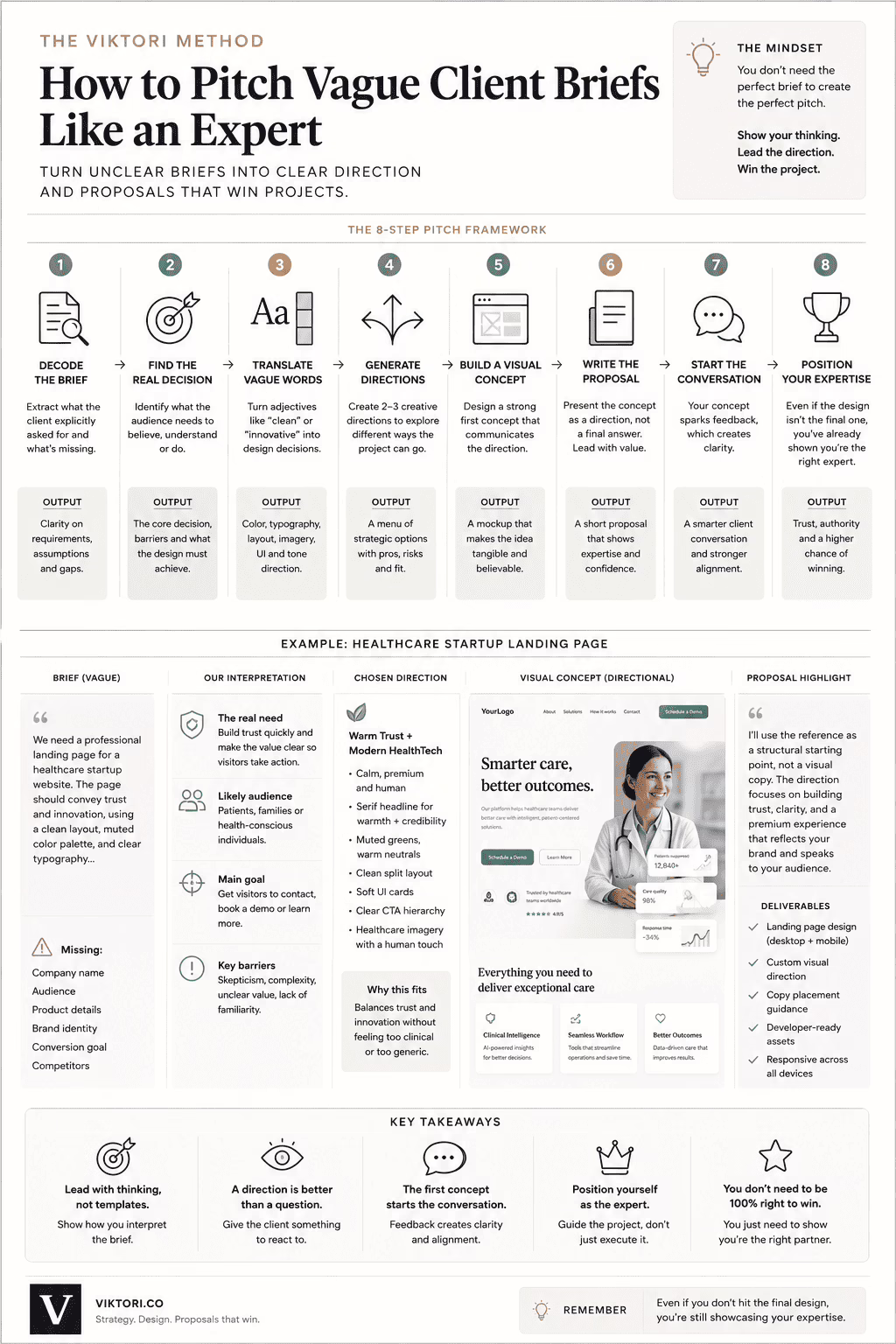
Case Study: Pitching a Healthcare Startup Landing Page With Limited Information
Let’s use the healthcare startup landing page example.
The brief says:
A professional landing page is needed for a healthcare startup website. The page should convey trust and innovation, using a clean layout, muted color palette, and clear typography. Key sections include a concise headline, value proposition, brief about the startup, call-to-action, and contact information. Imagery should reflect healthcare themes and the design must be responsive across devices.
That is not a terrible brief.
But it is incomplete.
There is no company name.
No brand identity.
No product description.
No audience.
No competitors.
No existing site.
No conversion goal beyond a general CTA.
So how do you pitch it?
You do not complain about missing context.
You create a directional concept.
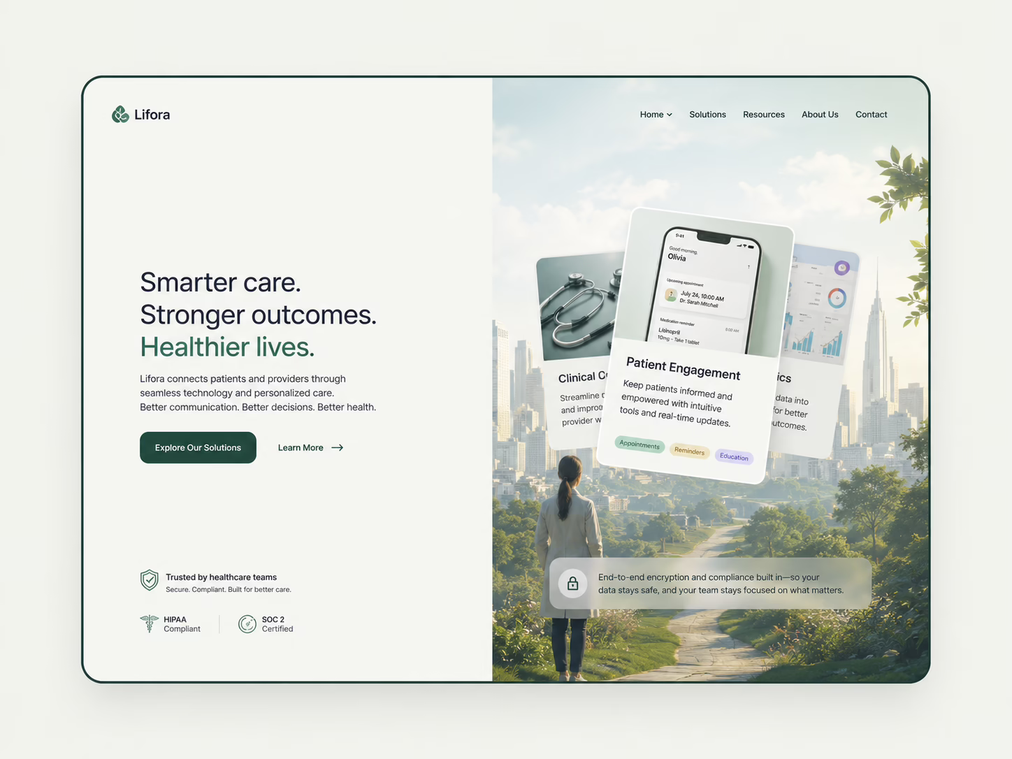
For this kind of project, I would pitch a clean split-layout landing page with a calm editorial feel:
- Left side: headline, value proposition, CTA, and trust cues
- Right side: healthcare-themed visual system or product illustration
- Palette: muted, warm, and clinical without feeling sterile
- Typography: serif-led headline for a more premium, human feel
- Layout: generous whitespace and strong hierarchy
- UI details: soft cards, subtle feature blocks, clean contact area
- Responsive behavior: condensed mobile version with the same hierarchy
The key is that the concept is not pretending to be the final brand.
It is a visual hypothesis.
That is what a pitch should do when the brief is vague.
It should say:
“Here is a strong direction based on what you gave me. Once I understand the company, audience, and product better, I can refine the system.”
That makes the client feel guided.
And guidance is what they are actually paying for.
Why Showing a Visual Concept Works Even If It Is Not Final
This is the part many freelancers misunderstand.
A concept does not need to be final to be valuable.
The point is not to hit the exact final design immediately.
The point is to show how you think.
A visual concept demonstrates:
- Taste
- Speed
- Interpretation
- Strategic judgment
- Category understanding
- Ability to create from ambiguity
- Communication skills
- Confidence
That is why showing a concept can be powerful even if the client later says:
“We like the structure, but can we make it more clinical?”
“We like the typography, but we need a younger feel.”
“We like the calm palette, but our brand uses warmer colors.”
“We like the hero, but our audience is doctors, not patients.”
That is still a good outcome.
Because now the conversation has moved from abstract adjectives to concrete decisions.
Before the concept, the client says:
“We want it to feel trustworthy and innovative.”
After the concept, the client can say:
“This feels too soft.”
“This feels right.”
“This feels too premium.”
“This feels too patient-facing.”
“This feels close, but the colors should be more institutional.”
That is progress.
A concept gives the client something to react to.
And in creative work, reaction is often the doorway to clarity.
The Proposal Structure for Vague Briefs
When responding to a vague brief, keep the proposal short but strategic.
Do not write a novel.
The client does not need your autobiography, your design philosophy, and a 700-word meditation on whitespace.
They need confidence.
Use this structure:
- Acknowledge the project
- Reframe the goal
- Explain your proposed direction
- Mention what will change from the reference
- Clarify deliverables
- End with confidence
Here is the structure in practice.
Proposal Example for a Vague Healthcare Landing Page Brief
Hi [Client Name],
I would love to help design the landing page for your healthcare startup.
Based on the brief, I would approach this as a trust-led healthcare landing page with a clean, modern structure and a more refined visual system. The goal would be to make the startup feel credible quickly, while still giving it enough warmth and innovation to avoid the usual generic healthcare website look.
For the visual direction, I would use the reference as a structural concept rather than copying its identity. That means keeping the strong layout logic, clear hero section, CTA placement, and polished landing page rhythm, but rebuilding the palette, typography, copy, imagery, and UI details around your brand.
One direction I would explore is a calm split-layout design with serif-led headlines, muted healthcare-inspired colors, clear value proposition messaging, and soft interface elements that make the page feel premium, human, and easy to trust.
The landing page would include the core sections from your brief: headline, value proposition, short startup overview, CTA, contact information, and responsive desktop/mobile versions.
The final result would be a polished landing page concept that feels ownable to your startup, easy for users to understand, and ready for development handoff.
Best,
[Your Name]
Notice what this proposal does.
It does not over-explain.
It does not ask the client to do all the strategic work.
It does not say, “I can make a clean modern website,” which is what everyone else will say.
It gives a point of view.
That is the difference.
The “Directional Concept” Rule
When you do not have enough information to create a final solution, create a directional concept.
A directional concept is not the finished answer.
It is a strategic first move.
It tells the client:
“This is how I would begin solving the problem.”
For vague briefs, this is usually enough to separate you from most competitors.
Because many people respond with:
“I have 5 years of experience.”
“I am interested in your project.”
“I can do this professionally.”
“Please check my portfolio.”
That is fine.
But it is passive.
A directional concept is active.
It shows the client that you have already started thinking.
For service businesses, thinking is a sales asset.
The client may not choose your exact idea, but they will remember that you had one.
How to Sound Like an Expert Without Sounding Arrogant
There is a fine line between confidence and sounding like you just discovered LinkedIn thought leadership.
The goal is not to say:
“I know exactly what you need.”
You probably do not.
The better framing is:
“Based on the brief, I would start with this direction.”
That phrase gives you authority without pretending to have complete information.
Use language like:
- “Based on the current brief…”
- “A strong first direction would be…”
- “I would treat the reference as…”
- “Once the brand and audience are clarified, this can be refined…”
- “The goal would be to…”
- “I would avoid…”
- “I would prioritize…”
This kind of language feels expert because it shows judgment.
It also leaves room for collaboration.
You are not forcing a solution.
You are leading the first step.
That is usually what clients want.
They do not want a dictator.
They do not want an order-taker.
They want someone who can take the wheel without driving into a tree.
Common Mistakes When Pitching Vague Client Briefs
Mistake 1: Asking Too Many Questions Before Showing Value
Questions are important.
But if your first response is only a list of questions, you may accidentally create more work for the client.
A better approach is:
“Based on what you shared, here is how I would approach it. A few details I would clarify before finalizing the direction are audience, brand tone, product specifics, and primary CTA.”
That gives value first.
Then asks questions.
Order matters.
Mistake 2: Saying “I Can Do This” With No Point of View
Almost every proposal says some version of:
“I can do this.”
That is not enough.
The client already assumes applicants can technically do the work. The real question is who understands the project best.
Instead of saying you can do it, show how you would think about it.
Weak:
“I can design a modern healthcare landing page.”
Stronger:
“I would build the page around trust, clarity, and quick comprehension, using a calm visual hierarchy, premium typography, and a clear CTA structure that works across desktop and mobile.”
Same skill.
Better framing.
Mistake 3: Copying the Reference Too Literally
References are direction, not permission to clone.
If the client shares a design they like, your job is to understand why they like it.
Maybe they like the spacing.
Maybe the hero section.
Maybe the calm palette.
Maybe the structure.
Maybe the typography.
Maybe they do not even know what they like, they just felt something and clicked “attach.”
Your pitch should show that you can extract the useful design logic without copying the exact visual identity.
That is how you avoid looking like someone who learned design by right-clicking.
Mistake 4: Overexplaining the Process
Some freelancers try to prove expertise by explaining every step.
Discovery.
Research.
Moodboards.
Wireframes.
Design system.
Prototypes.
Development handoff.
Revisions.
Testing.
Launch.
Retrospective.
Possibly a small spiritual awakening.
There is a place for process.
But a proposal is not always that place.
For a short gig response, focus on what the client cares about:
- What direction would you take?
- What would they receive?
- Why does your approach make sense?
- Can they trust you?
Keep the process visible, but not heavy.
Mistake 5: Making the Pitch About Yourself
Your experience matters.
But the pitch should not start with your life story.
The client wants to know whether you understand their project.
Start there.
You can mention credibility later, but do not lead with:
“I am a passionate designer with years of experience…”
That phrase has been used so many times it should be retired and given a small pension.
Lead with the project.
Then show why you are the right person.
How to Turn a Vague Brief Into a Strong Pitch
Here is the practical workflow.
Step 1: Extract the concrete requirements
Write down what the client definitely asked for.
For example:
- Landing page
- Healthcare startup
- Trust and innovation
- Muted palette
- Clear typography
- Headline
- Value proposition
- About section
- CTA
- Contact details
- Responsive design
This gives you the floor.
Step 2: Infer the strategic goal
Ask:
“What decision is this page supposed to help the user make?”
For a healthcare startup, the decision might be:
- Book a demo
- Contact the company
- Trust the service
- Understand the value quickly
- Believe the startup is credible
- Feel safe enough to take the next step
This gives you the pitch angle.
Step 3: Translate adjectives into design decisions
Do not repeat “clean, modern, trustworthy.”
Translate them.
Clean = whitespace, hierarchy, reduced noise.
Trustworthy = legibility, restraint, human visuals, proof cues.
Innovative = modern UI, product framing, refined interaction patterns.
Healthcare = calm palette, accessibility, credibility, warmth.
This gives you the creative direction.
Step 4: Use the reference intelligently
Separate structure from surface.
Keep:
- Layout logic
- Section rhythm
- CTA placement
- Composition style
Change:
- Colors
- Fonts
- Copy
- Imagery
- Icons
- Brand elements
- UI details
This gives you originality.
Step 5: Write the pitch as a guided first move
Do not oversell.
Do not apologize for missing information.
Say:
“Based on the brief, I would start here.”
That one sentence is magic because it makes you sound confident and flexible at the same time.
How This Applies Beyond Design Projects
This framework is not only for landing pages.
It works for many types of client pitches:
- Pitch deck design
- Brand identity
- Website redesigns
- Sales proposals
- Consulting projects
- Content strategy
- Marketing campaigns
- Product launches
- Investor materials
- Partnership decks
- Sponsorship proposals
Any time the client gives you limited context, your job is to create a structured interpretation.
That is especially important in pitch decks.
A pitch deck is not just information in slides. It is a decision surface. It compresses what matters so the evaluator can understand the opportunity, risk, timing, credibility, and next step.
A client proposal works the same way.
The buyer is evaluating:
- Do they understand the problem?
- Can they lead the process?
- Is their thinking clear?
- Does their work feel credible?
- Will this person make my life easier or harder?
That is why vague briefs are such a good test.
They reveal who can think.
The Expert Rule: Lead the Brief
Here is the simplest rule:
Do not just respond to the brief.
Lead the brief.
That does not mean ignoring the client’s instructions.
It means taking what they gave you and moving it one step closer to a decision.
If they give you adjectives, turn them into a direction.
If they give you a reference, explain how you would adapt it.
If they give you a category, show that you understand the category expectations.
If they give you required sections, turn them into a page structure.
If they leave out the company name, do not freeze. Create a flexible concept that can be adjusted once the identity is known.
This is how you come across as the expert.
Not because you claim to be one.
Because your response behaves like one.
A Better Way to Think About Freelance Proposals
Most freelancers think the proposal is where they ask for the job.
Better freelancers know the proposal is where they demonstrate the job.
You are not only saying:
“Hire me.”
You are showing:
“This is what it feels like to work with me.”
If your proposal is vague, generic, and passive, the client assumes your process may be the same.
If your proposal is clear, specific, and directional, the client starts to feel that the project is already becoming easier.
That feeling is valuable.
In many cases, the best proposal does not win because it has the fanciest portfolio.
It wins because it creates the most confidence.
That is especially true when the brief is vague.
The less clear the client is, the more they value someone who can create clarity
Final Thoughts
A vague brief is not a dead end.
It is a chance to show judgment.
Most people wait for perfect information before they start thinking. But in real client work, perfect information rarely arrives on a silver tray with a tiny umbrella in it.
You often get fragments.
A category.
A feeling.
A reference.
A deadline.
A budget.
A few required sections.
Your job is to turn those fragments into a credible first direction.
That does not mean pretending you know everything.
It means showing that you know what to do next.
When you pitch vague client briefs well, you are not just selling design, writing, consulting, or strategy.
You are selling clarity.
And when the brief is thin, clarity is the thing the client needs most.