


Most presentation advice is written as if the problem is technique. It isn’t.
People don’t disengage because slides are “bad.” They disengage because their brain doesn’t recognize relevance, safety, or cognitive order. Attention drops when information feels unstructured. Resistance shows up when intent is unclear. Confusion appears when hierarchy is missing.
That’s a human response pattern, not a design flaw.
The books below are often framed as “presentation skills” manuals. In reality, they document how people process narrative, visuals, contrast, and meaning under evaluation pressure. If you want to see how these response patterns are typically expressed as a repeatable structure, start with how a pitch deck is typically structured.
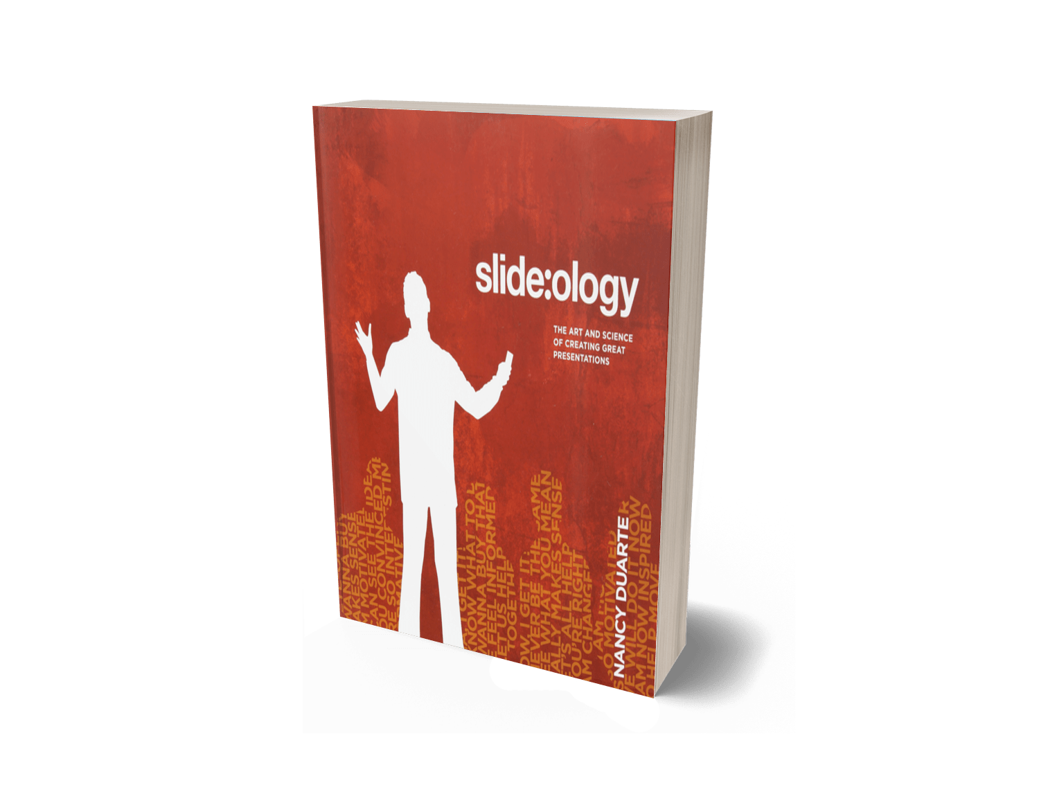
“Slide:ology: The Art and Science of Creating Great Presentations” by Nancy Duarte
Slide:ology reads like a design book, but it’s really a field guide to visual cognition: how people scan, prioritize, and assign meaning to what they see. Duarte shows why clutter creates stress, why contrast creates interpretation, and why spacing and alignment can signal credibility before a single sentence lands.
- Visual hierarchy: audiences read dominance (size/contrast/position) as importance
- Cognitive load: clutter creates friction; friction kills attention
- Signal clarity: the brain filters aggressively, keeping only what’s framed as essential
- Consistency as trust: alignment and repetition register as “controlled and deliberate”
This dynamic is typically expressed through the visual order expectations inside the standard investor deck format.
900+ Pros like yourself read the book
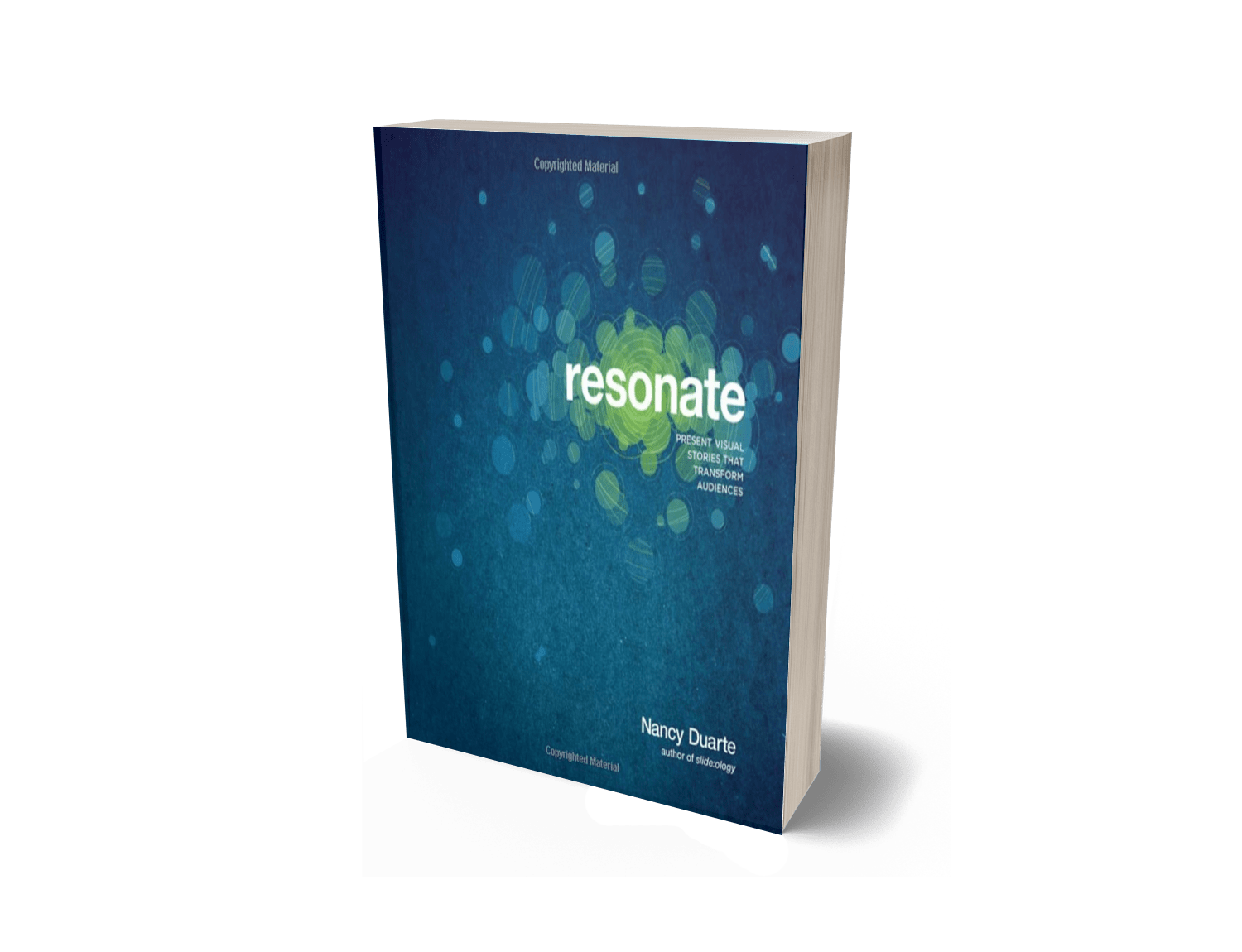
“Resonate: Present Visual Stories That Transform Audiences” by Nancy Duarte
Resonate is about narrative processing, not “being persuasive.” It maps how people track meaning through contrast, tension, and resolution — and why audiences only follow stories that help them orient themselves quickly: where we are, what’s changing, and what it implies.
- Contrast thinking: people interpret meaning through “before vs after,” not descriptions
- Tension and release: attention rises when outcomes are uncertain and structured
- Audience alignment: relevance is felt when the story matches the listener’s frame
- Memory hooks: repeated motifs and simple arcs are easier to retain and repeat
You’ll see this same audience-orientation logic show up in how marketing decks are typically structured.
1035+ Pros like yourself read the book
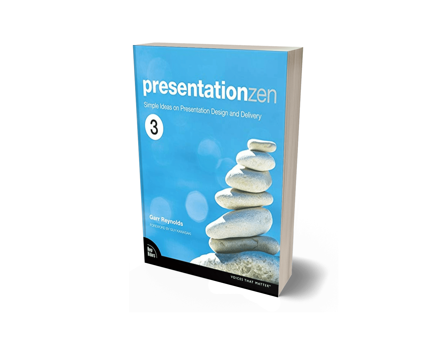
Presentation Zen: Simple Ideas on Presentation Design and Delivery” by Garr Reynolds
Presentation Zen is basically minimalism with a brain scan. Reynolds argues that most decks fail because they overload working memory: too many points, too many competing signals, too much “explaining” instead of showing.
The underlying message is simple: when information is reduced to what matters, audiences stop defending themselves and start following.
- Simplicity as comprehension: less content can produce more understanding
- One idea per moment: fewer simultaneous signals = higher retention
- Visual support: visuals should reinforce meaning, not decorate it
- Delivery naturalness: rehearsed clarity beats frantic completeness
That reduction-and-clarity pattern is commonly expressed in how consulting decks are typically structured.
278+ Pros like yourself read the book

Gallo’s Jobs breakdown is often treated like “stagecraft,” but the real value is structural: Jobs created comprehension momentum. He reduced complexity, built curiosity, and used deliberate sequencing so the audience could predict where the story was going — which is a big part of why it felt clear.
- Message compression: one clear theme beats ten decent points
- Sequenced reveal: clarity increases when information arrives in the right order
- Concrete demonstration: showing reduces skepticism faster than explaining
- Rhythm and pacing: audiences track changes in pace as importance cues
This sequencing logic is typically expressed through how SaaS decks are typically structured when the product needs to become obvious quickly.
918+ Pros like yourself read the book
Talk Like TED is a catalogue of audience attention triggers: emotional relevance, story framing, novelty, and simplicity. The key idea isn’t “be entertaining.” It’s that audiences remember what feels human, concrete, and easy to repeat.
- Story as comprehension: stories package complexity into a trackable form
- Emotion as salience: feelings act like a highlighter for memory
- Novelty signals: “new” wakes attention — but only if it’s still clear
- Speakable ideas: what’s easy to retell is what spreads
That “repeatable idea” dynamic is commonly expressed in how nonprofit decks are typically structured.
4443+ Pros like yourself read the book
Show and Tell documents how people process information visually. Roam’s core observation is simple: the brain understands faster through shape, contrast, and spatial relationships than through language alone. When ideas are drawn, mapped, or diagrammed, audiences orient themselves more quickly and experience less cognitive resistance.
This isn’t about being “visual.” It’s about reducing abstraction so the brain doesn’t have to work as hard to locate meaning.
- Visual reasoning: people think in pictures before they think in words
- Spatial logic: position implies relationship
- Simplification through shape: complexity becomes manageable when it’s visible
- Shared reference: drawings create a common mental model
This pattern is typically expressed through how clarity is visually supported in how architecture decks are typically structured.
351+ Pros like yourself read the book

LeFever focuses on how people absorb unfamiliar ideas. His work shows that confusion rarely comes from complexity itself — it comes from missing context. When audiences can’t place an idea within something they already understand, resistance shows up.
Explanation, in this sense, is not simplification. It’s orientation.
- Context anchoring: people need to know “what this is like” before “what this is”
- Analogy processing: the brain uses familiar patterns to decode new ones
- Progressive disclosure: meaning lands when information is layered, not dumped
- Cognitive comfort: clarity reduces defensive filtering
You’ll see this same orientation logic show up in how medical decks are typically structured where unfamiliar information has to feel safe before it can feel credible.
314+ Pros like yourself read the book

Made to Stick is a study of memory behavior. It explains why some ideas persist and others evaporate. The authors show that the brain retains what is simple, concrete, emotional, and story-based — not because it’s “better,” but because it’s easier to process and retrieve.
Stickiness is a neurological outcome, not a creative trick.
- Simplicity bias: the brain prefers core ideas over nuance
- Concreteness effect: tangible beats abstract every time
- Emotional tagging: feeling marks memory
- Story encoding: narratives are easier to store and recall
This memory logic is commonly expressed in how FMCG decks are typically structured, where recall and clarity matter more than detail.
5042+ Pros like yourself read the book
Berkun’s book is a study of performance pressure. It documents how audiences react to uncertainty, mistakes, and tension in real time. The key takeaway isn’t “be confident.” It’s that people read emotional signals before they process content.
Presence is interpreted long before logic.
- Anxiety detection: audiences pick up stress instantly
- Authority signaling: calmness registers as competence
- Opening bias: first moments shape the entire perception curve
- Recovery effect: how you handle mistakes matters more than the mistake
This response pattern typically shows up in how government decks are typically structured, where composure and stability are interpreted as trust.
584+ Pros like yourself read the book
Port’s work examines performance as a social signal. He shows how tone, posture, pacing, and presence shape how messages are received before the message itself is even evaluated. This is about status perception, not charisma.
Audiences assess the messenger before they assess the message.
- Non-verbal dominance: posture and stillness communicate authority
- Vocal control: pace and tone signal certainty or doubt
- Attention framing: what you emphasize guides what is remembered
- Behavioral consistency: alignment between words and body builds trust
This dynamic is commonly expressed in how consulting decks are typically structured, where credibility is inferred through delivery and clarity.
712+ Pros like yourself read the book

Despite the aggressive reputation, Pitch Anything is really about status dynamics and attention control. Klaff documents how people respond to hierarchy, scarcity, and narrative tension. The book explains why certain behaviors trigger respect and others trigger dismissal.
This is not persuasion. It’s social pattern recognition.
- Status sensitivity: people track who is “above” and “below” instantly
- Scarcity response: limited access increases perceived value
- Frame alignment: whoever defines the context shapes interpretation
- Attention gating: curiosity keeps the brain engaged
You’ll see these dynamics structurally reflected in how fintech decks are typically structured, where authority and clarity are evaluated quickly.
3777+ Pros like yourself read the book

Flip the Script explores how people resist external influence but accept internal conclusions. Klaff shows that the brain defends against being “sold” but relaxes when it feels in control. The core insight is psychological: ownership of the idea matters more than the idea itself.
Agreement is an identity response, not a logical one.
- Autonomy bias: people trust what they believe they chose
- Resistance reflex: pressure triggers defense
- Narrative self-insertion: audiences adopt ideas they can see themselves inside
- Control illusion: perceived agency reduces friction
This pattern typically expresses itself in how nonprofit decks are typically structured, where alignment and shared ownership matter more than authority.
747+ Pros like yourself read the book
Excellent will explore further